Hi,
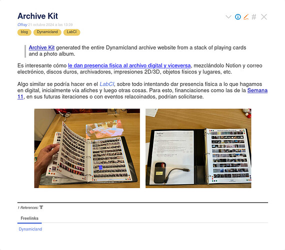
I’m taking some notes on my wiki and I would like to combine flexgrid with lightbox. Currently, the tiddler looks like this:
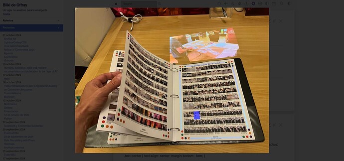
and when I click on the image, I get the lightbox view with transprent background, which I want to keep, as it gives some context on where the image appears
But, when I click outside the image, to close it, the tiddler looks strangely “up” and I need to scroll down the tiddler to center it again on the screen.
My lightbox gallery CSS was adapted from some codepen, but it is just a half hacked “solution”. I would like to have something like @Mohammad’s flexgrid gallery combined with his lbox macros or some combination of @saqimtiaz’s lightbox and macy plugins.
The idea is to have side by side gallery images that can be enlarged for more detail, while seeing the wiki as a transparent background for context.
TIA,


 This one looks and feels pretty similar to what I’m looking for. Could you point me to the CSS tiddler as I can find the buttons or any way to access the underlying WikiText behind (which, BTW, shows a lot of mastery on how TW UI can be pretty fine tuned).