FishForYou Tiddlywiki

Demo: FishForYou (oeyoew.fun)
Repo: oeyoews/tw5: :bookmark_tabs: TiddlyWiki5 Fishing record english words (github.com)

Features

  • customize file struct, ui and etc
  • base web browser
  • support vercel
  • support simple gtd todo
  • embed music player and hitokoto
  • change font easily
  • note manager
  • diary support
  • support export pdf, markdown, html
  • customize shortkeys
  • powerful search
  • random notes
  • support pwa devops
  • hundurds of plugins, many themes
  • support multiple language
  • save all data in local
2 Likes

Note to the nice music player with playlist at the left bottom!

2 Likes

FYI the music player is a plugin: https://github.com/oeyoews/twm

This is impressive, I’ve noticed though that some of the elements in the sidebar are a bit too big, such as the Tools, but otherwise it’s really well made.

this address tw5 is also available

@oeyoews
Thank you for this great job!

Few suggestions

  1. A button to be able to download an empty-FishForYou.html (you can learn from empty button in tiddlywiki.com, …)
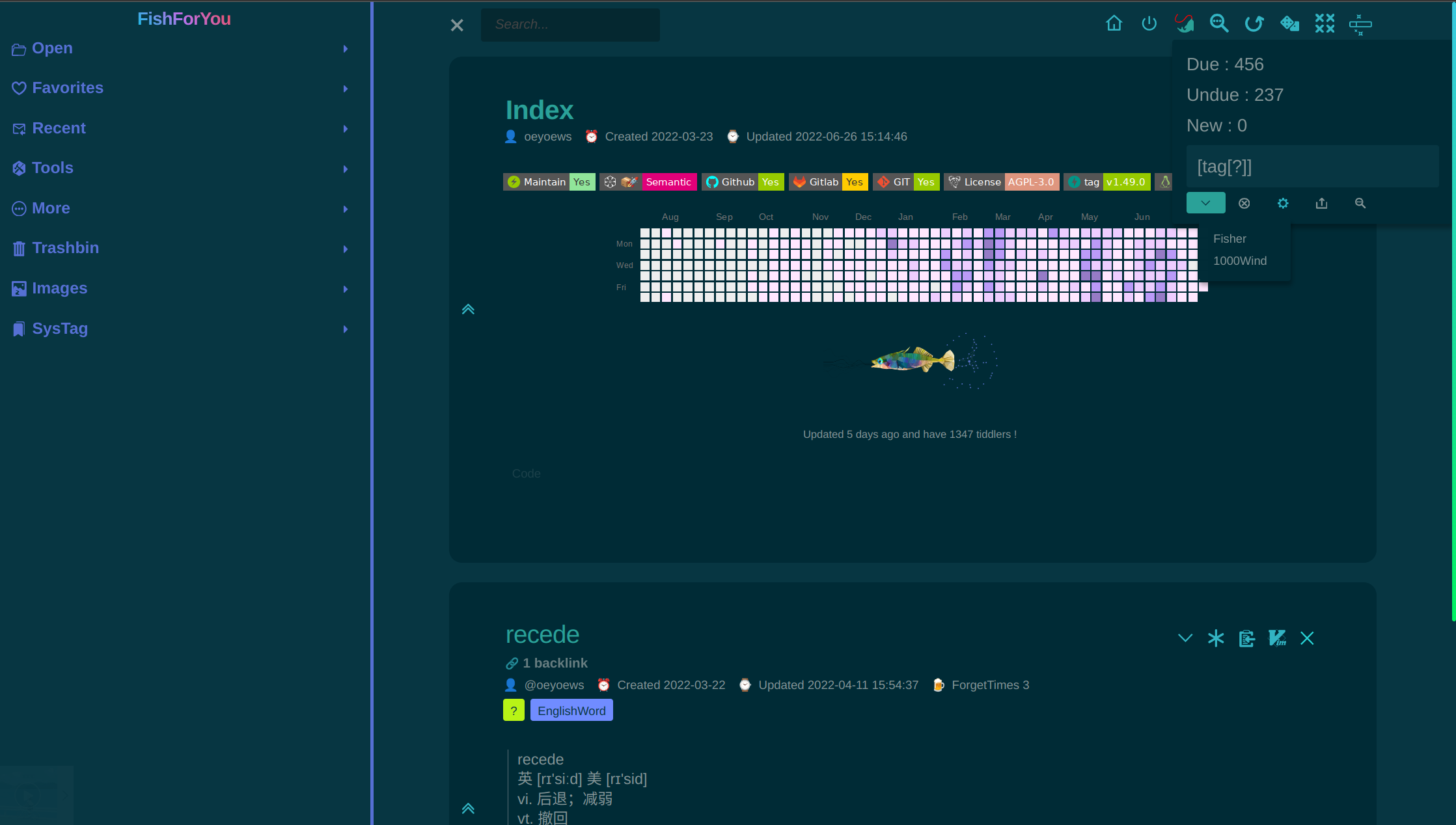
  2. Your color pallets looks very nice, the gradient colors in scrollbars, site title, the icon sets you have used, …
    Can a user export these settings (notebook theme + palette customization + icons)?

I’m doing this, it may take a while

3 Likes

this address preview is the music player plugin demo

2 Likes

Yes, though I just bought tw5.wiki … it won’t work yet. I will redirect to mother.

I also own tiddly.wiki that redirects to mother.

TT

Some nice features

  • The way FishForYou uses ContextPlugin is clever.
    It is in Advanced Search

  • The subtitle of tiddler uses icons

I personally can’t handle the contrast between background and text colour. Switching the palette doesn’t work with the sidebar.

The “Switch Off” icon doesn’t make much sense with the ControlPanel. … So there is room for improvement.

1 Like

yeah, This theme haven’t support switch other palette to better ui at the beginning of use, it’s just customize of notebook, but I will use colors in theme with palette,

pack notebook theme to 2.0.0 with my configuration and palette(WIP)

One comment … this is an awful colour scheme …

The CONTRAST is bad.

Just a comment, TT

I agree, it’s hard on the eyes unfortunately.

I’d recommend OP check out the 60 30 10 rule when making a color palette, and possibly revising their palette if for public use.

It reminds me much of Solarized Dark (which could use some work in my humble opinion) is there a reason that it isn’t used instead?

Just curious! Everyone has their preferences afterall.