The spacing in the tour plugin demo at https://tiddlywiki.com/prerelease/tour seems to have quite big spacing. The top margin above the instructions seems to be proportional to the window width. On standard 1920x1080 desktop screens the tiddlers in the demo and the “Next” button below them require scrolling in many cases, even though there is more than enough space to fit everything on screen.
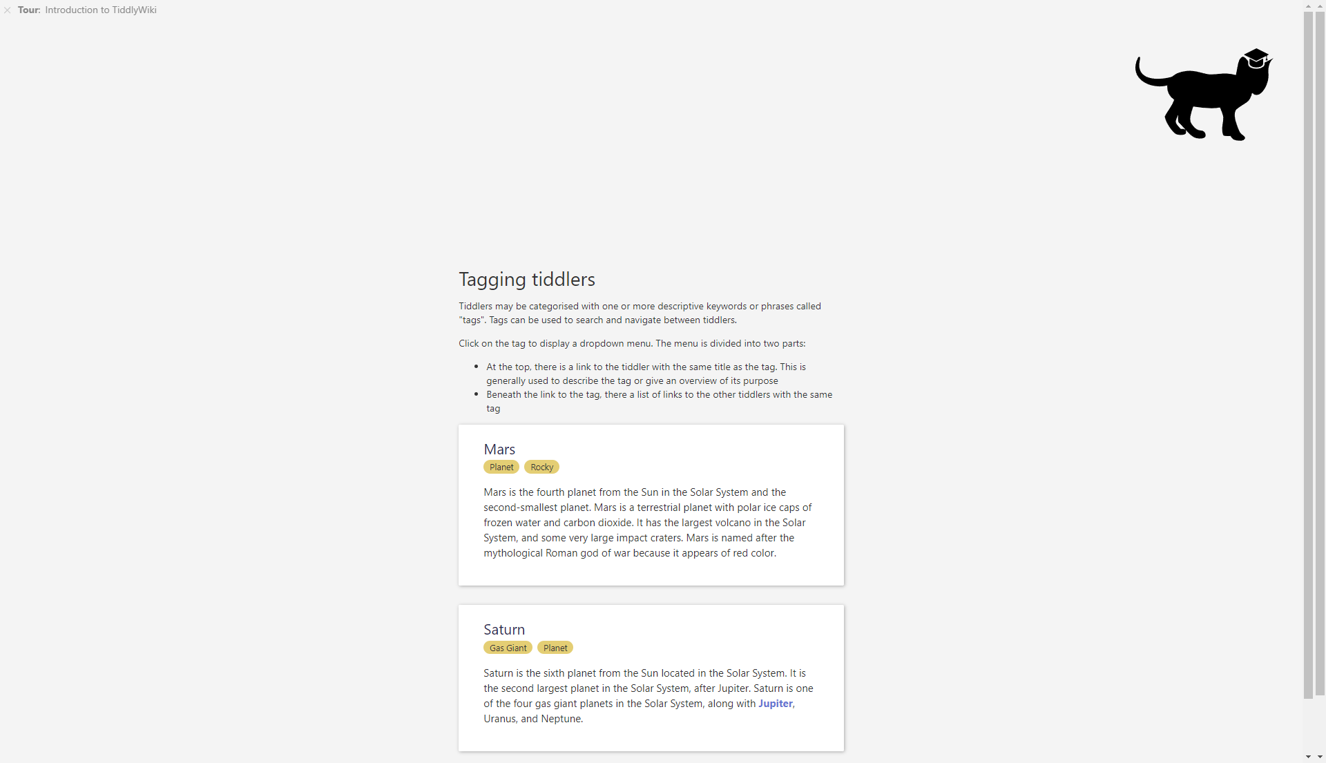
The screenshot below is on a 1920x1200 screen:
Screenshot on a window snapped to half of the screen, so 960x1200:
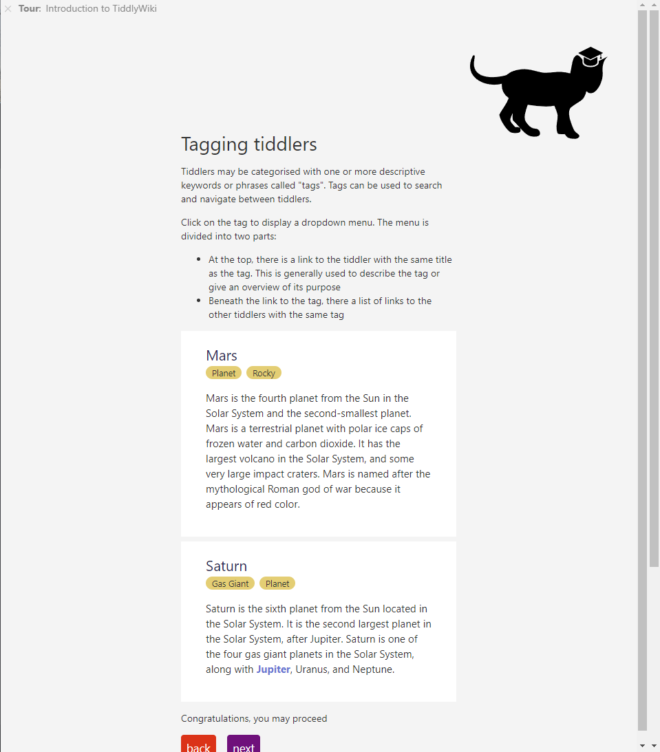
It’s a bit counterintuitive that more content is visible in a smaller window.
It seems that the instructions are more or less centered on the whole viewport – this looks good if they are short and there are no tiddlers below.
Does it depend on the configuration of this particular demo tour, or would any tour made with the plugin look similarly out of the box?
In any case, I think it would be nice to adapt it so that less vertical screen space is wasted on typical desktop screens.