Some of these ideas are difficult, some are easier. I will respond to each of them separately and post an update when (or if) changes are available…
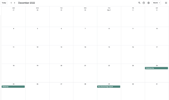
- It would be nice if there is a larger month view for the calendar like the apple or google calendar or the previous TW calendar implemenation by Inmysocks.
This is actually moderately difficult. This would require an entirely different variant of the showmonth() macro definition to produce a combination of the “month grid” and the “daily event list” display handling. In addition to rendering issues, there may be significant performance issues due to the amount of data that has to be processed. I need to think about this for a while.
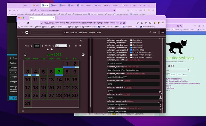
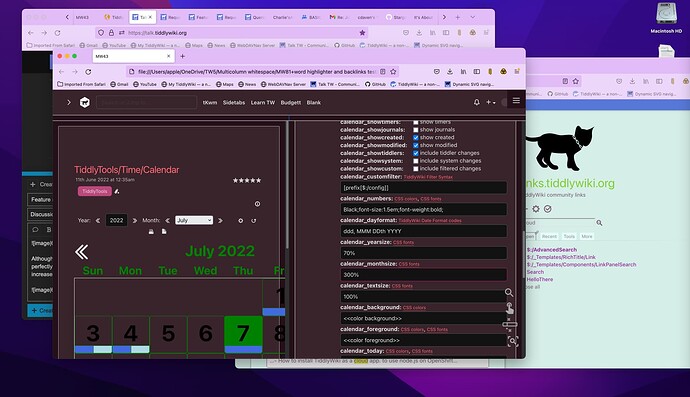
- Although there is an option to change the calendar month size, it’s not working perfectly. Sometimes the calendar overflows beyond the margins of the tiddler if we increase the percentage… Is there any way to make it fully fill the tiddler only, but not beyond it.
This is problematic. The percentage value for the month size is applied by using a CSS font-size:... attribute, which doesn’t lend itself to using “fill available” logic. As a temporary workaround, the only thing I can suggest is to wrap the calendar inside a <div style="overflow:auto;">...</div>, but this probably isn’t a satisfactory long term solution. While it will prevent the calendar display from overflowing the tiddler width, it doesn’t limit the width of the calendar, but simply adds a scrollbar if the calendar doesn’t completely fit inside the tiddler.
- Also i would like to change the colours of the borders of the month, day , text color for the days, borders of the popup window which appear on clicking the days in the calendar - It would be better if these could be added in the set up tiddler.
The text color (and any extra styles) for the day numbers can currently be controlled by the “numbers” Calendar Styles setting (e.g., <<colour foreground>>;font-size:1.5em;font-weight:bold;)
The day box borders can be controlled by adding extra styles to the “foreground” Calendar Styles setting (e.g., <<colour dropdown-tab-background>>;border:1px solid blue;)
I will consider adding extra Calendar Styles settings for the month and day popup borders. I’ll let you know when/if I have an update for that.
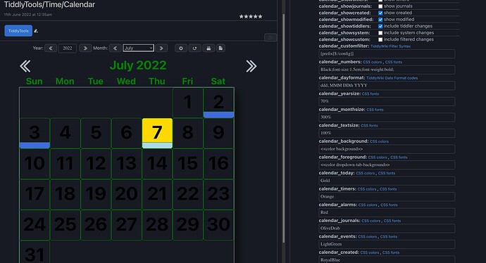
- Calendar foreground was not changing as expected. See the image and the demo wiki.
This was actually relatively easy! All of the color-related CSS Calendar styles settings (numbers, background, foreground, today, timers, alarms, journals, events, created, and modified) are now being wikified, so that use of the <<colour ...>> macro is now supported. Get the update here:
https://tiddlytools.com/timer.html#TiddlyTools%2FTime%2FCalendar
- Day view (filling the entire tiddler) similar to the month view in addition to the current popup window and this shall be configureable in the set up tiddler.
This is perhaps the most complex item in your requests. In addition to being an completely separate kind of calendar rendering, listing items by time-of-day is problematic. While timers, alarms, created, and modified each have specific times associated with them, events only have a date (or date range if it is a timeline event). As with request (1) above (the “large month grid view”), I will need to think about this for a while before I make any attempts to implement something.
-e
