Edit-text widget popup text area question

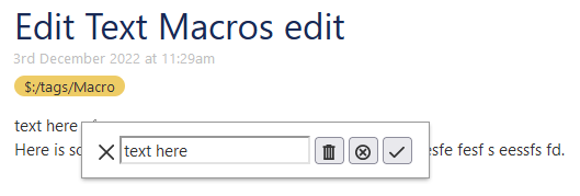
I have yet to experiment with popups in Tiddlywiki, especially where it comes to the edit-text widget. I’m thinking about changing my current implementation to a popup, but not sure where to start.

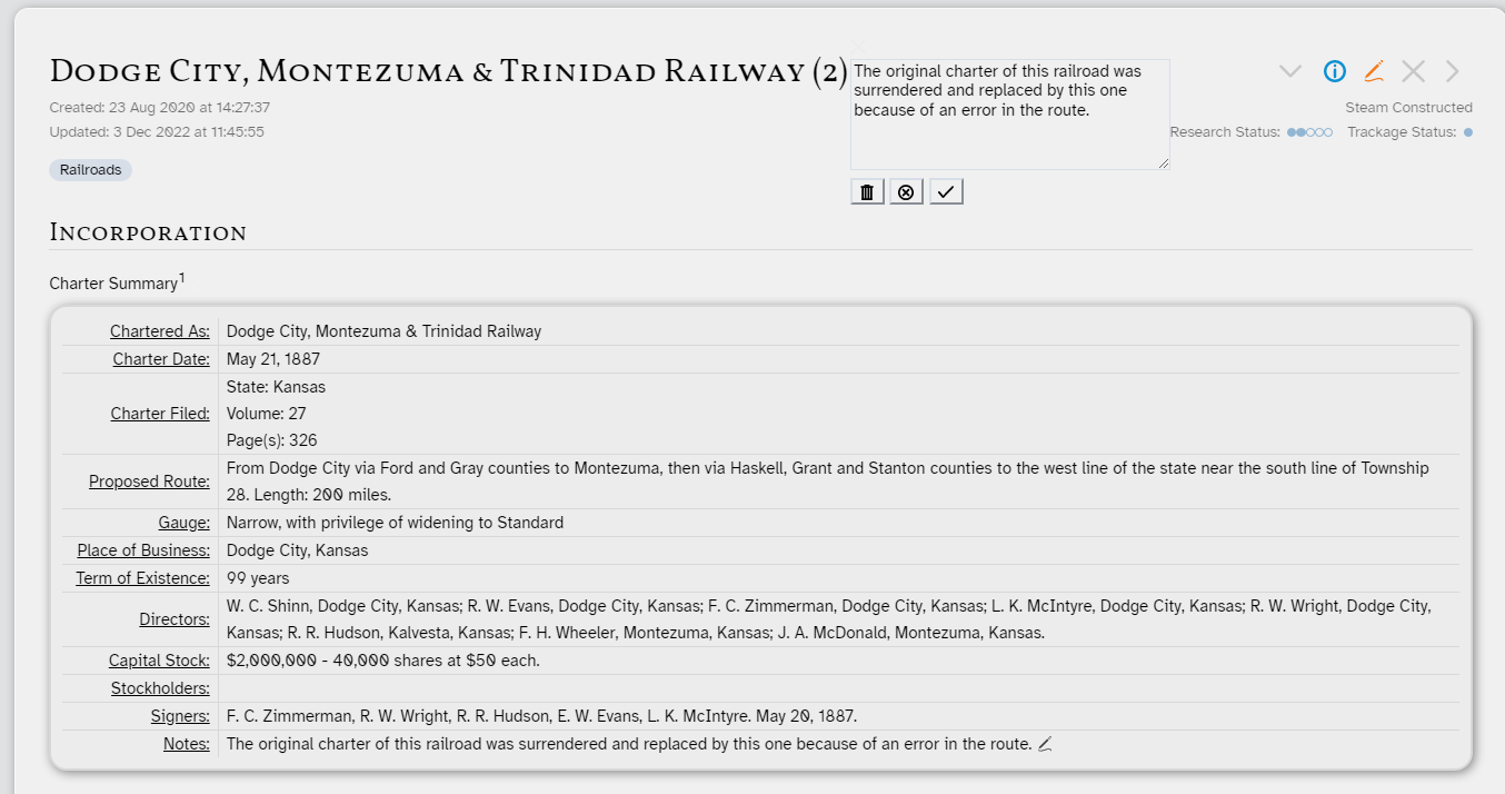
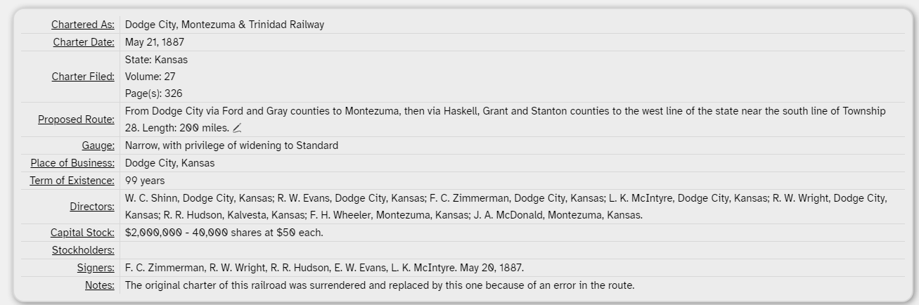
Below is a screenshot of my current implementation. I have a button that is invisible except with hover to edit the field in question. (The cursor doen’t show with the screen clipper. Look at proposed route.)

When I click the button, I get the following:

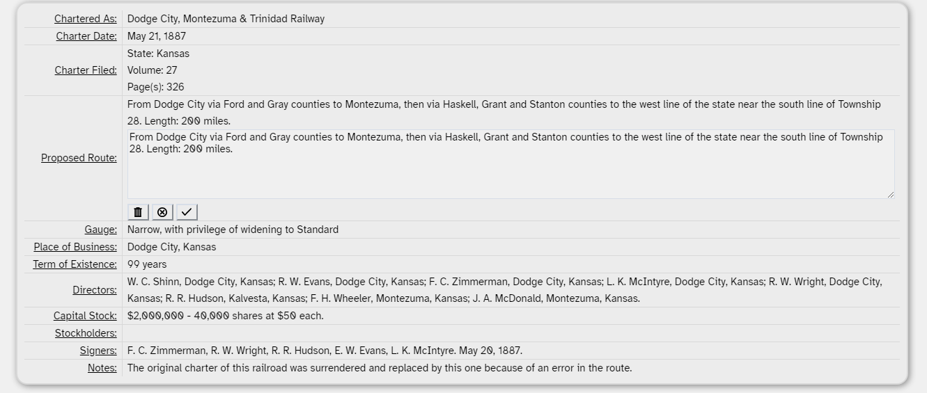
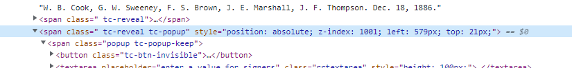
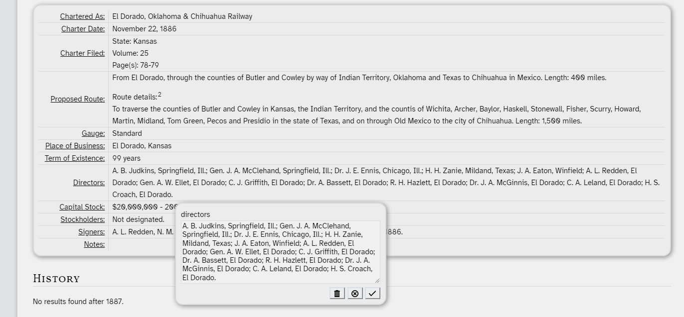
I am interested in having the text area of the edit-text widget show up as a popup window instead of inline as I currently have. I see the popup parameters, but my initial trials have not worked. I want to keep the three buttons as part of the pop up. I am really not sure where to start on this. How would I go about doing this? I’ve included my current code as a json attachment

.Edit Text Macros.json (3.6 KB)

Thanks in advance to this great community!

Here’s a quick example to get you started:

\define input(fieldname,size)
<$button popup="$:/temp/state/$(currentTiddler)$/$fieldname$" class="tc-btn-invisible">{{$:/core/images/edit-button}}</$button>

<$reveal type="popup" state="$:/temp/state/$(currentTiddler)$/$fieldname$">
<span class="popup tc-popup-keep">
  <$button set="$:/temp/state/$(currentTiddler)$/$fieldname$" setTo="hide" class="tc-btn-invisible">{{$:/core/images/close-button}}</$button>
  <$vars
     temp="$:/temp/volatile/$(currentTiddler)$/$fieldname$"
     default={{{ [<currentTiddler>get[$fieldname$]] }}}
     placeholder="enter a value for $fieldname$"
     >
    <$edit-text tag="input" tiddler=<<temp>> default=<<default>> placeholder=<<placeholder>> class="fieldinput" size=$size$ />
    <$button tooltip="delete field"> {{$:/core/images/delete-button}}
       <$action-deletefield $tiddler=<<currentTiddler>> $field="$fieldname$"/>
       <$action-deletetiddler $filter="[<temp>]" />
    </$button>
    <$button tooltip="cancel input"> {{$:/core/images/cancel-button}}
       <$action-deletetiddler $filter="[<temp>]" />
    </$button>
    <$button tooltip="save input"> {{$:/core/images/done-button}}
       <$list filter="[<temp>get[text]else<default>]" variable="newvalue" >
       <$list filter="[<default>compare:string:eq<newvalue>then<default>else<newvalue>]" variable="value">
       <$action-setfield $tiddler=<<currentTiddler>> $field="$fieldname$" $value=<<value>> />
       <$action-deletetiddler $filter="[<temp>]" />
       </$list>
       </$list>
    </$button>
  </$vars>
</span>
</$reveal>

<style>
.popup {
   box-shadow:
   0 0 0 1px <<colour modal-border>>,
   0 2px 3px 0 <<colour modal-border>>;
   background-color: <<colour modal-background>>;
   color: <<colour foreground>>;
   padding: 1em;
}
</style>
\end


{{!!test}} <<input test>><br>
Here is some test to be under the popup ndeurar; aeesefesfe fesf s eessfs fd.

PopupFieldEditor

1 Like

Thanks @Brian_Radspinner. I’ll take a look and give it a try.

Thanks again! After looking at the code, I realized what I was doing wrong. Thanks so much!!

@Brian_Radspinner

I’ve been playing with the popups and so far so good. The biggest issue I’m having at the moment is the positioning of the popup. I’ve tried using the position attribute of the reveal widget that contains the edit-text widget, but it has not effect. The position is set to way up to the left and way above the button. I’ve used the inspect tool of the browser and it says that this is being set by an inline style somewhere, but it’s not in my code. What am I missing?

Here’s a screenshot. I’m editing the Notes area which is the bottom line. I set the position attribute to “bottomright” but it didn’t do anything.

Popups are problematic on mobile. You should avoid them

I’m really only using desktop. I agree about mobile.

Here is the code the @Brian_Radspinner provided:

\define input(fieldname,size)

<$button popup="$:/temp/state/$(currentTiddler)$/$fieldname$" class="tc-btn-invisible">{{$:/core/images/edit-button}}</$button>

<$reveal type="popup" state="$:/temp/state/$(currentTiddler)$/$fieldname$">
  <span class="popup tc-popup-keep">
    <$button set="$:/temp/state/$(currentTiddler)$/$fieldname$" setTo="hide" class="tc-btn-invisible">{{$:/core/images/close-button}}</$button>
    <$vars
      temp="$:/temp/volatile/$(currentTiddler)$/$fieldname$"
      default={{{ [<currentTiddler>get[$fieldname$]] }}}
      placeholder="enter a value for $fieldname$"
      >
    <$edit-text tag="input" tiddler=<<temp>> default=<<default>> placeholder=<<placeholder>> class="fieldinput" size=$size$ />
    <$button tooltip="delete field"> {{$:/core/images/delete-button}}
      <$action-deletefield $tiddler=<<currentTiddler>> $field="$fieldname$"/>
      <$action-deletetiddler $filter="[<temp>]" />
    </$button>
    <$button tooltip="cancel input"> {{$:/core/images/cancel-button}}
      <$action-deletetiddler $filter="[<temp>]" />
    </$button>
    <$button tooltip="save input"> {{$:/core/images/done-button}}
      <$list filter="[<temp>get[text]else<default>]" variable="newvalue" >
        <$list filter="[<default>compare:string:eq<newvalue>then<default>else<newvalue>]" variable="value">
          <$action-setfield $tiddler=<<currentTiddler>> $field="$fieldname$" $value=<<value>> />
          <$action-deletetiddler $filter="[<temp>]" />
        </$list>
      </$list>
    </$button>
    </$vars>
  </span>
</$reveal>

<style>
  .popup {
    box-shadow:
    0 0 0 1px <<colour modal-border>>,
    0 2px 3px 0 <<colour modal-border>>;
    background-color: <<colour modal-background>>;
    color: <<colour foreground>>;
    padding: 1em;
  }
</style>

\end

His code positions the popup right by the button that initiated it.

My code (below) generates what is shown in the screenshot I included previously.

\define input(fieldname,size)

<$reveal type="nomatch" state="$:/temp/state/$(currentTiddler)$/$fieldname$" text="show">
  <$button popup="$:/temp/state/$(currentTiddler)$/$fieldname$" class="tc-btn-invisible">{{$:/core/images/edit-button}}</$button>
</$reveal>

<$reveal type="popup" position="belowright" state="$:/temp/state/$(currentTiddler)$/$fieldname$" >
  <span class="popup tc-popup-keep">
    <$button set="$:/temp/state/$(currentTiddler)$/$fieldname$" setTo="hide" class="tc-btn-invisible">{{$:/core/images/close-button}}</$button>
    <$vars
       temp="$:/temp/volatile/$(currentTiddler)$/$fieldname$"
       default={{{ [<currentTiddler>get[$fieldname$]] }}}
       placeholder="enter a value for $fieldname$"
       >
      <$edit-text tag="input" tiddler=<<temp>> default=<<default>> placeholder=<<placeholder>> class="fieldinput" size=$size$ />
      <$button tooltip="delete field"> {{$:/core/images/delete-button}}
         <$action-deletefield $tiddler=<<currentTiddler>> $field="$fieldname$"/>
         <$action-deletetiddler $filter="[<temp>]" />
      </$button>
      <$button tooltip="cancel input"> {{$:/core/images/cancel-button}}
         <$action-deletetiddler $filter="[<temp>]" />
      </$button>
      <$button tooltip="save input"> {{$:/core/images/done-button}}
         <$list filter="[<temp>get[text]else<default>]" variable="newvalue" >
         <$list filter="[<default>compare:string:eq<newvalue>then<default>else<newvalue>]" variable="value">
         <$action-setfield $tiddler=<<currentTiddler>> $field="$fieldname$" $value=<<value>> />
         <$action-deletetiddler $filter="[<temp>]" />
         </$list>
         </$list>
      </$button>
    </$vars>
  </span>
</$reveal>

\end


So here is what the browser inspect tool shows:

Depending on which field I edit, the left and top attributes are different. So there is some code somewhere that is calculating this.I’ve done several searches with the advanced search, but have not found any candidates yet.Next step is to disable some plugins to see if that has any effect.

The inline absolute positioning is coded into the Core so editing that is beyond me, but putting your edited code into TiddlyWiki.com doesn’t give the weird positioning, so I’m guessing there’s a custom stylesheet conflict somewhere.

Remove the “popup” class from <span class="popup tc-popup-keep"> — I only added the class to put some minimal styling in at the bottom of my code. Try it out with just the “tc-popup-keep” class applied.

You can also check your existing stylesheets to see if anything else is connected to an existing “popup” class.

I tried removing the “popup” class from that span, but it had no effect.

I just noticed an interesting behavior that I had not noticed before.If the field is empty when I click the edit button, the popup always goes to the same place in the corner of the tiddler. The inspect window shows “top: 21px” and “left: 22px;”. However, if the field has contents, then the position of the popup varies in the value of left depending on how long the text of the field is. This makes sense in that the popup is going to appear at some fixed offset from the button which is always at the end of the text of the field.

I haven’t found anything obvious in my stylesheets yet, but I’m continuing to investigate.

This is turning into one of those things that bothers you to no end, but doesn’t really matter in the long run. I started out on this just to have some fun to see if I would like it better. Now I’m bound and determined to figure this one out. if for no other reason than a learning experience.

Any other helpful hints along the way would be extremely appreciated. I’m far from being a CSS expert or TW expert. Not even close.

What part of the core would be handling the popup mechanism?

Edit:
So the macro for the edit text widget is called from a ViewTemplate. If I passed the exact same macrocall into the text of a tiddler, I don’t get the odd behavior. So it’s got something to do with the ViewTemplate, but I don’t understand how. Anyone have any thoughts on this? Attached is a copy of the ViewTemplate and the Infobox stylesheet in json format.

Railroad ViewTemplate.json (7.9 KB)

Infobox Styling.json (725 Bytes)

Edit again:
It’s got something to do with the macrocall being within a table.

Maybe you could use modals instead of popup created with reveal widget.
https://tiddlywiki.com/#Modals:Modals%20[[WidgetMessage%3A%20tm-modal]]

@Alvaro thanks for the modal suggestion. I’ve just played with it a little bit on tiddlywiki.com, but will have to delve into it further because I’ve never dealt with modals before. It looks promising, but so far I like popups better.

In the brief time that I’ve been playing with it, I’ve noticed that some of the styling of the modal (specifically, the backdrop) is using inline styles generated by the core. It’s my understanding that inline styles cannot be overridden so I’d be stuck with them unless I modified the core. I’m specifically interested in the opacity. Am I mistaken about this?

It also looks like the inline styles of the popups are being generated by the core because none of my styelsheets have anything to affect them. Somehow the fact that the popup originates within a table is the cause of the issue.

Here’s a few changes to help get you on your way in the right direction… (see notes below)

\define input(fieldname,size)
\define delete() <$action-deletefield $tiddler=<<currentTiddler>> $field="$fieldname$"/>
\define save()   <$action-setfield $tiddler=<<currentTiddler>> $field="$fieldname$" $value={{{ [<popid>get[value]else<default>] }}} />
\define close()  <$action-deletetiddler $tiddler=<<popid>> />
<$let popid="$:/temp/state/$(currentTiddler)$/$fieldname$">
<span style="position:relative;"> <!-- ADDED -->
<$button popup=<<popid>> class="tc-btn-invisible">{{$:/core/images/edit-button}}</$button>
<$reveal type="popup" position="below" state=<<popid>> >
  <span class="popup tc-popup-keep tc-block-dropdown ADDED" style="padding:0.5em; ADDED">
    <$button class="tc-btn-invisible" style="float:right; ADDED" actions="<<close>>">{{$:/core/images/close-button}}</$button>
    $fieldname$  <!-- ADDED -->
    <div style="clear:both;"/> <!-- ADDED -->
    <$vars default={{{ [<currentTiddler>get[$fieldname$]] }}} placeholder="enter a value for $fieldname$">
      <$edit-text tag="input" tiddler=<<popid>> field="value" default=<<default>> placeholder=<<placeholder>> class="fieldinput" size=$size$ />
      <div style="float:right;"> <!-- ADDED -->
         <$button tooltip="delete field" actions="<<delete>><<close>>"> {{$:/core/images/delete-button}} </$button>
         <$button tooltip="cancel input" actions="<<close>>"          > {{$:/core/images/cancel-button}} </$button>
         <$button tooltip="save input"   actions="<<save>><<close>>"  > {{$:/core/images/done-button}}   </$button>
      </div> <!-- ADDED -->
    </$vars>
  </span>
</$reveal>
</span> <!-- ADDED -->
</$let>
\end

Notes:

  • The delete(), save(), and close() macros are “local” to the containing input(...) macro, and provide convenient abbreviations for the actions performed by the popup. This helps make your code more compact and easier to read.
  • Similarly, the <$let popid="..."> provides an abbreviation for referring to the popup state tiddler. This helps later on when you need to close the popup.
  • The really important change is to wrap the entire macro output within <span style="position:relative;">. This establishes a new “origin” for the popup position, relative to the top-left corner of the popup $button widget, and causes the popup to appear where you expected it.
  • There’s no need to surround the popup $button widget within a $reveal. By default, popup buttons will toggle the associated popup state tiddler. Thus, clicking it will automatically show/hide the associated popup.
  • The class for the span enclosing the popup content has “tc-block-dropdown”, which gives it a proper “background and frame” around the popup content.
  • The style for the span surrounding the popup content has “padding:0.5em;” to give a nice even padding around the popup content.
  • The “close” button has a style of “float:right;” so that it appears in the upper right corner of the popup content.
  • The $fieldname$ is displayed on the same line as the close button to give the popup a visible heading
  • <div style="clear:both;"/> follows the heading so the field input that follows starts on a new line
  • The $edit-text control uses a field named value within the popid state tiddler rather than using the text field in a separate $:/temp/volatile/$(currentTiddler)$/$fieldname$ tiddler. This ensures that the temporary input value is discarded when the popup is closed.
  • The 3 action buttons (“delete”, “cancel”, and “save”) are enclosed within a <div style="float:right;"> so that they appear below the field input, and are aligned with the right side of the popup.
  • Notice that the <<save>> action does all the work of getting the current temp input, without needing any of the surrounding $list widgets.
  • You can remove the ADDED and <!-- ADDED --> markers. I put them there just to make it easier for you to see what I added.

enjoy,
-e

2 Likes

The inline styles have more preference than your (normal) stylesheets, to change it you need to use the !important in the end of your declaration of the style property.

Thanks so much @EricShulman. That worked great. I really appreciate the detailed comments. That’s goes a long way in helping me understand what and why you did what you did.

Now the only issue I’m still having is that the text input is always a single line no matter how long the input box is. I can size the input box and popup, but the text remains a single line. Any suggestions there?

Edit: I found that I wasn’t using the textarea attribute. That fixed the issue.

Results so far:

Fairly pleased with this. A little more tweaking and I’ll be quite happy. Thanks to all!

2 Likes