Hello @all,
trying to build a ToDo-Manager inside TW, I choosed now https://kookma.github.io/TW-Pikaday/ . The ToDo-List with a dynamic table inside there also almost fits my needs.
I combined the ToDo-List now also with the details-widget from @telmiger , to be able to show only the overdue tasks or only tasks from tomorrow and so on.
It works fine. But I almost cannot style it like I want.
The table is fine, when outside of the details-widget. But when inside the details-widget, then the table behaves /looks different and after hours now I gave up trying to style it.
Only the olive line between “Überfällig!” and the table-header I managed to get smaller.
What I want is:
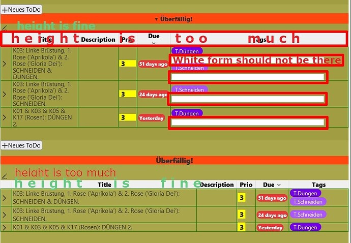
- The table-header should be less high- like it is outside of the details-widget (in the image at the bottom).
I guess it is because of the sorting arrow, but don’t know, why this only happens inside the details widget. - These white forms under the tags should not be there.
- The width of the columns should be like outside of the details widget (like in the table on the bottom). The Tags-column could be even a bit smaller, it is okay, when the tags are written one under the other.
- Attached an image to show, what I mean. On top the table is inside the details widget. On bottom the table is outside of the details widget. And here you can test it: Tests >Meine ToDos
How to solve these things?
Thank you all in advance, Noushka
TW 5.3.3, Firefox, Windows 10


 But when everything is solved, then I mark your answer of course!)