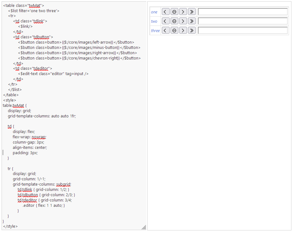
This table shows how an edittextwidget overlaps the fourth button. I want the two first columns (link+buttons) to be narrow, and the editor and its column to be maximally wide - but I don’t have any good solution.
For anyone kind enough to dabble around, a tip is to use the arrow button in that tiddlers toolbar, to open the SideEditor for easy and live css editing.
The code for reference:
<table style="width:100%;">
<$list filter='one two three'>
<tr>
	<td class="tdlink">
		<$link/>
	</td><td class="tdbutton">
		<$button class=button>{{$:/core/images/left-arrow}}</$button>
		<$button class=button>{{$:/core/images/minus-button}}</$button>
		<$button class=button>{{$:/core/images/right-arrow}}</$button>
		<$button class=button>{{$:/core/images/chevron-right}}</$button>
	</td><td class="tdeditor">
		<$edit-text tag=input class="editor"/>
	</td>
</tr>
</$list>
</table>

<style>
.tdlink {width:1%;}
.tdbutton {width:1%; white-space:nowrap}
X.button {min-width:30px;}
.tdeditor {width:100%}
.editor {width:100%; }
</style>

