This doesnt work because the tooltip that you get when you hover a link is produced by the title attribute of the link:
And this native tooltip can’t (as far as I know) be styled(edit: with css alone).
It’s not really recommended to use the title attribute for tooltip anyway, because assistive reader can’t access it.
Here’s an article on how to create inclusive tooltip, if I got the time I’ll try to do a macro from this and will update this comment. Tooltips & Toggletips See also Perfect Tooltips With CSS Clipping and Masking | CSS-Tricks
However, it IS possible to get the value of the title attribute with the attr() CSS function, then affect it to the content of a :after or :before pseudo-element.
E.g.:
<style>
a[title]{
position:relative;
}
a[title]:hover:after{
content:attr(title);
position:absolute;
left:0;
right:0;
text-align:center;
bottom:100%;
font-size:2em;
}
</style>
<a href="" title="tooltip">this link has a tooltip</a>
However, the original tooltip will show up too, so to prevent that you will need to use another attribute than title. But then you wont be able to use the tv-wikilink-tooltip variable..
You could disable the tooltip by using pointer-events:none; , but the link wont be clickable anymore.
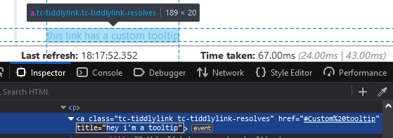
A hack to hide the tooltip is to use an element inside the link that has an empty title attribute, like this:
<a href="https://codepen.io/jmcclure/pen/MYZgGY" title="Title to Hide">
<span title="">Hover me !</span>
</a>
So you could do this :
\define tv-wikilink-tooltip()
<$transclude field="tooltip"><$transclude field="title"/></$transclude>
\end
<style>
a[title]{
position:relative;
display: inline-grid;
place-items: center;
}
a[title]:hover:after{
content:attr(title);
position:absolute;
bottom:100%;
font-size:1em;
pointer-events:none;
color:<<color background>>;
background:<<color foreground>>;
padding:.5ch;
}
</style>
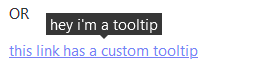
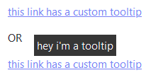
<a href="" title="tooltip"><span title="">this link has a custom tooltip</span></a>
OR
<$link to="Custom tooltip"><span title="">this link has a custom tooltip</span></$link>
But a more robust answer would be to use a button with aria attribute (see the article on accessibility component mentioned above)
EDIT: updated the demo to add a triangle to the tooltip: