I was looking for new User Interface elements and came up with an idea, must my CSS in tiddlywiki skills is not strong enough to solve this. So I am putting it out to the community. I am sure to some CSS gurus this is like a walk in the park.
I was wondering it we could have a “tiddler dashboard” (Like in a car) that sits at the bottom of the tiddler (view and/or edit) template and longer tiddlers scroll underneath this., with the dashboard staying in place until you scroll to the next tiddler.
My idea is I could make an additional accompanying toolbar for which buttons to go in this tiddler dashboard. It would then make sense using this space for buttons that affect the current tiddler (other than navigation) perhaps the tags could be displayed in the tiddler dashboard as well.
Where the standard toolbar is about the tiddlers existence in the story (the big view or tiddler Meta).
In a similar design method we could also have a wiki-dashboard or “floating” footer, similar to how the draft tiddlers appear along the bottom.
If you think you know how we may achieve this please help.
For something like your idea you need to add to viewtemplate a footer that have the following properties.
position: sticky;
bottom: 0;
But then there will be a issue while you are scrolling with the footer (of the next tiddler) will be hidding the first part of content of next tiddler until you have done more scroll. In Sticky titles is less annoying, IMO.
You can see it with a tiddler with tag $:/tags/ViewTemplate and this text.
I plan to add all these with additional toolbars and buttons to support this functionality along with other screen elements in a package so we can “turbo charge” the user interface.
And above the search field what I call “advanced search indicators” that respond to the content in the search temp. This is a package of tiddlers.
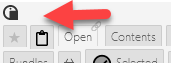
And what I call “indicators” above the sidebar tabs to display various wiki or active tiddler status info. And smaller indicator icons just above the tabs;
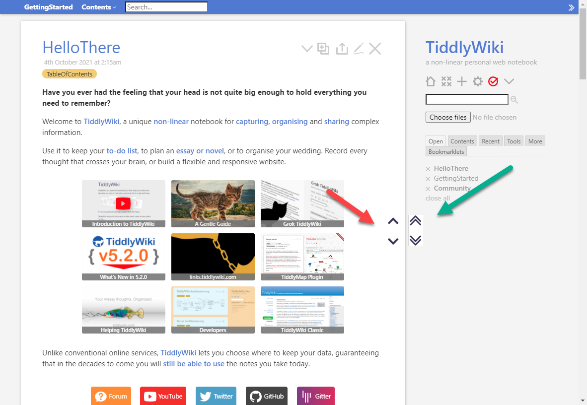
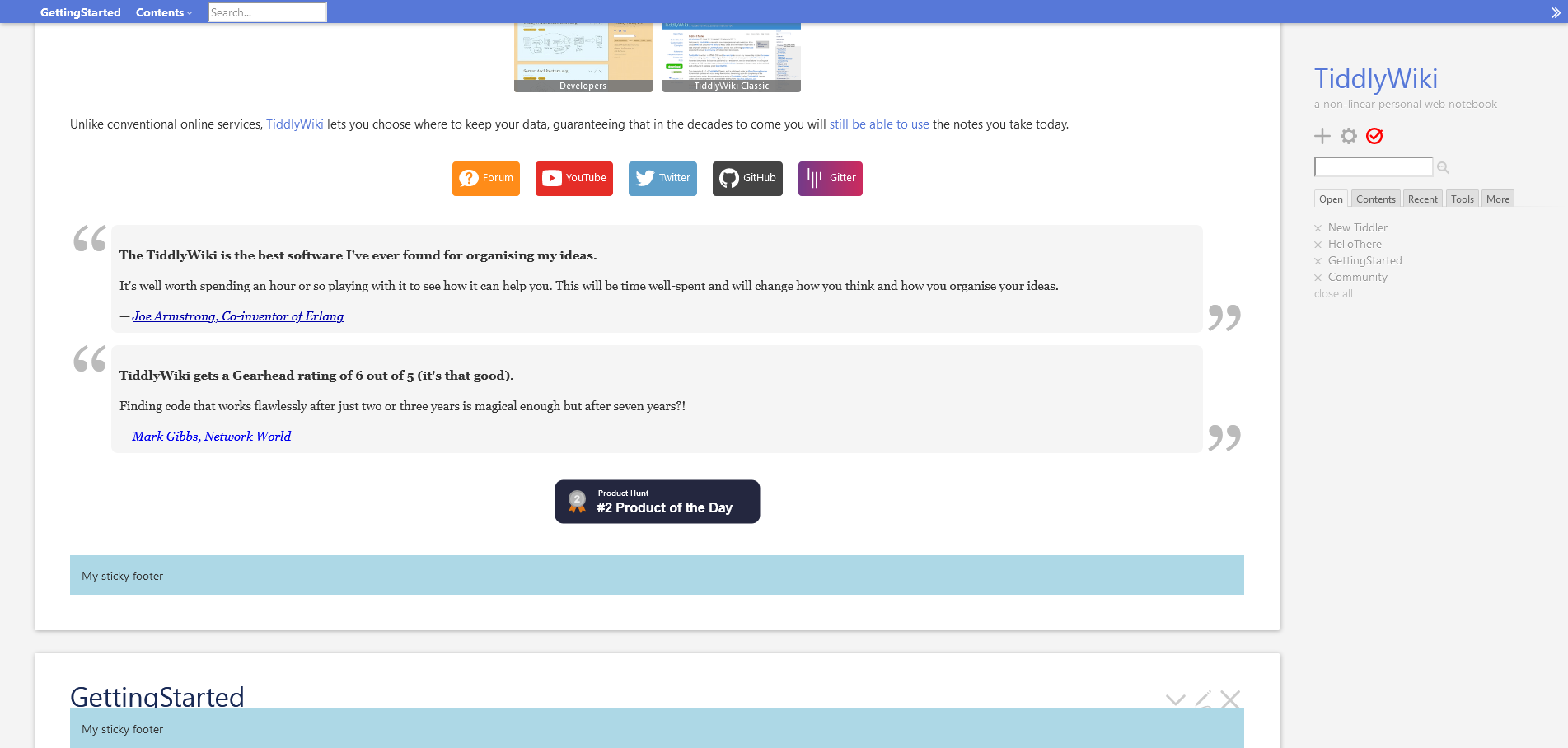
Maybe it is better show it with this image, I used my example but I expect the same behavior how you are using it. See in the botton, the title GettingStarted is partialy hidden by the footer, but with less scroll is fully hidden, as date and tag are hidden in the image.
I can’t help you much. It is part of UI/UX, I don’t have idea about it. I can think that is useful, but it can be add noise to UI and then it result confusing to the users. I don’t know…