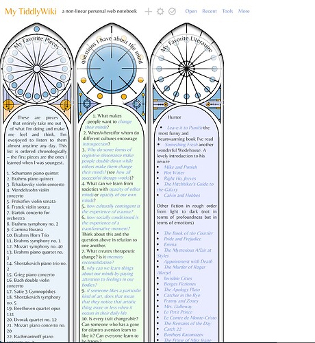
Css children of tc-tiddler-body

Hi all,
I’d like to conform the body text of each tiddler to fit within the arch. My initial thought was to start with something like

.tc-tiddler-body:first-child::first-line {
    margin-left: 80px;

added to a stylesheet-tagged tiddler. That would of course be the first step and I’d add a right margin and make sure both margins taper off on the second and third lines. But this code did nothing. Can anyone point me to the right syntax to select the first line of the first child of the tiddler body?
Thanks in advance!

I’m on a mobile device and can’t really test right now, but it looks like you forgot a space between .tc-tiddler-body and :first-child. Fixing that might let you change, say, the color of to the first line. However, the list of properties you can affect for ::first-line is quite limited. I rather doubt it in includes margin.

1 Like

I think to get this going, you first need to understand how CSS shapes work together with text. I did find an article, that might be helpful. Creative text flows using CSS shapes - LogRocket Blog

2 Likes

What a stunningly different tiddler layout! Thanks for sharing a glimpse of your work in progress!

In addition to incorporating the shape-inside css (at site linked by @pmario above), it seems the tiddlers would benefit from reducing the indent for ol and ul items (given the narrow column style), and perhaps reducing the opacity (or adjusting color) of the background window frame graphics, so that the end of text lines doesn’t intersect so dramatically with geometric elements at right edge (assuming you don’t want to make text width any narrower).

These are small little things, and surely already on your radar. You’ve figured out so much already about how to make tiddlers take on a totally different form!

1 Like

You’re completely right. Thanks for pointing this out.

Allowable properties

Only a small subset of CSS properties can be used with the ::first-line pseudo-element:

(::first-line - CSS: Cascading Style Sheets | MDN)

Thank you – completely agree about all this!

Ok, just to note down my progress (and lack thereof) before I sign off for today:

The consensus online (e.g. Using CSS To Set Text Inside A Circle | CSS-Tricks) seems to be to use shape-outside to define the space around the text where the text should not show up. In firefox, you can use their polygon tool in inspector mode to play around with the edges of the polygon to get it to cut off exactly the shape of the arch. Thanks, @pmario for the link. That site helped me see I need to use shape-outside with float: left as well as height and width defined.

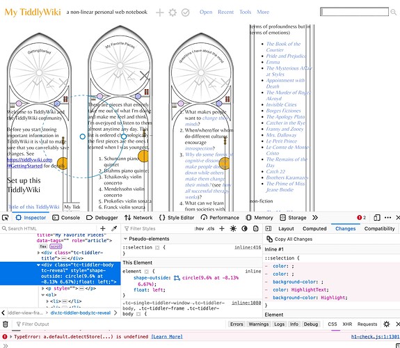
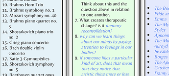
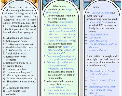
Unfortunately, when I try to apply a sample shape-outside, float, height and width to all tc-tiddler-body tc-reveal in one tiddler, nothing happens. (see image below)

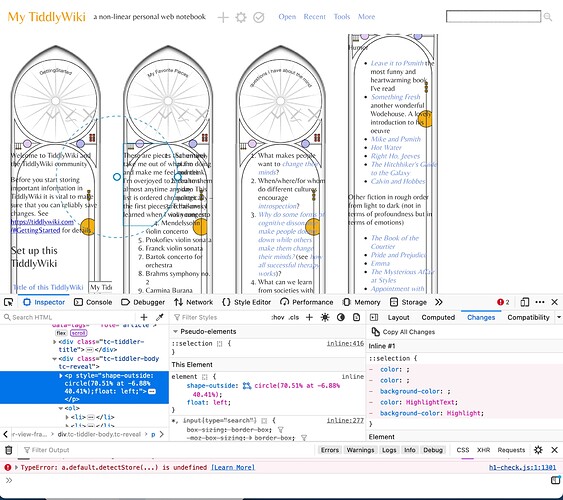
and of course when I apply it to only one paragraph of the text and not the rest, I get this overlap. Curiously, I applied the CSS style to the first paragraph of the text and the circle ended up being cut out of the second paragraph of text. (See image below)

That’s today’s report! If anyone has any thoughts, always happy to hear advice and pointers. In particular, does anyone have experience applying a style like this to all the body text while not disturbing the background (as would happen if I just applied styles to tiddler-body)? It clearly doesn’t make sense to do this paragraph by paragraph.

Thanks!

Sorry to be the bearer of bad news.

Also, I very much agree with @Springer. That is an unusual and gorgeous design for a TW!

1 Like

It’s a bit tricky, but MDN (Mozilla Dev Network) had an example that almost fits your needs.

How did you create your tiddler background image?

Looking at your screenshots only makes it hard to come up with a solution. IMO it is a bit problematic on the left and right sides.

The standard TW tiddler layout has some padding left and right, which would allow the image to fill that padding. So the text should not interfere with the image.

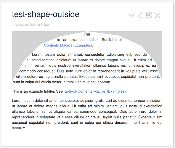
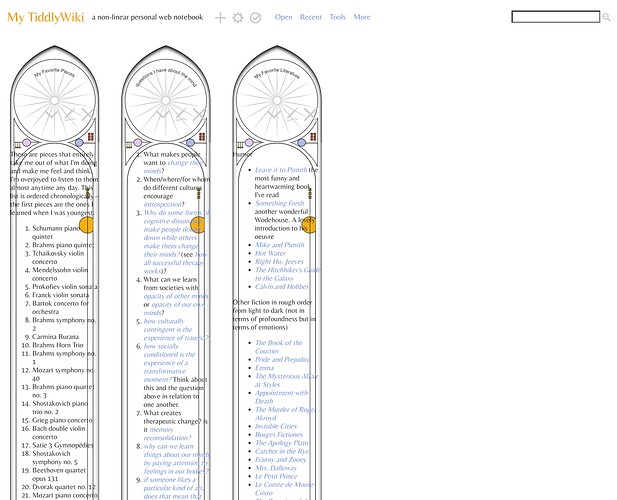
I did modify the MDN example a bit with a standard tiddler. The text content of the tiddler body contains 2 DIV elements, which use clip-path: polygon to create the gray areas, for visibility. Those 2 elements need to be “transparent” in production. So they will be invisible.

FireFox dev mode

  • allows us to modify the clip-path polygon and
  • then copy it over to shape-outside.
  • One DIV is float:left;
  • the other one float:right;

The text content needs: .tc-tiddler-body p {text-align:justify} to evenly fill the tiddler area.

As you can see. It should be doable. But from your screenshots I can not see, how your tiddler layout looks like. So it will be tricky to modify

The attachment contains 2 tiddlers, that you can import at tiddlywiki.com for experimenting.

test-shape-outside.json (926 Bytes)
5 Likes

Thank you so much! This is incredibly helpful.

The current progress is live on https://stained-glass.tiddlyhost.com/.

Things left to figure out on this topic:

  1. I have been manually adding
<div class="left"></div>
<div class="right"></div>

to the top of each tiddler. I attempted to manually add this to each tiddler with a list1 tag with a tiddler “arc body text macro in all tagged” tagged $:/tags/ViewTemplate

<$list filter="[all[current]tag[list1]]">
  <$macrocall $name="arcBodyTextMacro"/>

  
</$list>

and the macro “arcBodyTextMacro” tagged $:/tags/Macro

\define arcBodyTextMacro()
<div class="left"></div>
<div class="right"></div>
\end

but this doesn’t seem to be working.

  1. Within the text that is shifted by shape-outside, the list markers are getting shifted to the center of the text. I though this was a problem with .tc-tiddler-body p {text-align:justify} but when I removed it, nothing changed.

@noa - I’d say this is the kind of question that should peak the interest among the (real) css pundits. Maybe send off an email to Chris Coyer at CSS-tricks or some other popular CSS dedicated site?

Thank you! I’ll give that a shot. In terms of problem 1 which is tiddlywiki-related instead of CSS related, I’ve added the following button

<$button> add shape body text to arch
<$list filter="[tag[list1]]">
<$vars oldtext={{{ [<currentTiddler>get[text]] }}} 
newtext="<div class='left'></div><div class='right'></div> ">
<$action-setfield $tiddler=<<currentTiddler>> text={{{ [<newtext>addsuffix<oldtext>] }}}/>
</$vars>
</$list>
</$button>

based on Change text of filtered tiddlers - #2 by EricShulman. This works, but when I try to adjust the button so that it only occurs when oldtext does not already begin with <div class='left'>, I’m running into errors with

<$button> add shape body text to arch
    <$list filter="[tag[list1]]">
        <$vars oldtext={{{ [<currentTiddler>get[text]] }}} 
               newtext="<div class='left'></div><div class='right'></div> ">
            <$list filter="[all[current]search[-regexp[\A<div class='left'></div>]]]">
                <$action-setfield $tiddler=<<currentTiddler>> text={{{ [<newtext>addsuffix<oldtext>] }}}/>
            </$list>
        </$vars>
    </$list>
</$button>

Does anyone see what obvious thing I’m doing wrong? (Or if there’s any more elegant tiddlywiki way to automatically add a few lines of text to each tiddler body tagged “list1” rather than manually pushing this button whenever I want to make sure all the text is adjusted along the arches?)

The search filter syntax is incorrect. Try this:

<$list filter="[all[current]search:text:literal,anchored[<div class='left'>]]">

Notes:

  • The search[...] filter operator suffix syntax uses search:fieldlist:flaglist[...], where fieldlist is a comma-separated list of field names, and flaglist is a comma-separated list of keywords (see https://tiddlywiki.com/#search%20Operator for details)
  • We don’t need regexp, since we can use the :anchored flag, which means “starts with”. Note also that by avoiding regexp, we dont need to worry about the search text containing any special regexp characters.

enjoy,
-e

2 Likes

Thank you so much! Unfortunately, when I change it to

<$button> add shape body text to arch
    <$list filter="[tag[list1]]">
        <$vars oldtext={{{ [<currentTiddler>get[text]] }}} 
               newtext="<div class='left'></div><div class='right'></div> ">
           <$list filter="[all[current]search:text:literal,anchored[<div class='left'>]]">
                <$action-setfield $tiddler=<<currentTiddler>> text={{{ [<newtext>addsuffix<oldtext>] }}}/>
            </$list>
        </$vars>
    </$list>
</$button>

nothing happens when I press the button.
I’ve converted this to an action log like this

<$action-log> add shape body text to arch
    <$list filter="[tag[list1]]">
        <$vars oldtext={{{ [<currentTiddler>get[text]] }}} 
               newtext="<div class='left'></div><div class='right'></div> ">
           <$list filter="[all[current]search:text:literal,anchored[<div class='left'>]]">
                <$action-setfield $tiddler=<<currentTiddler>> text={{{ [<newtext>addsuffix<oldtext>] }}}/>
            </$list>
        </$vars>
    </$list>
</$action-log>

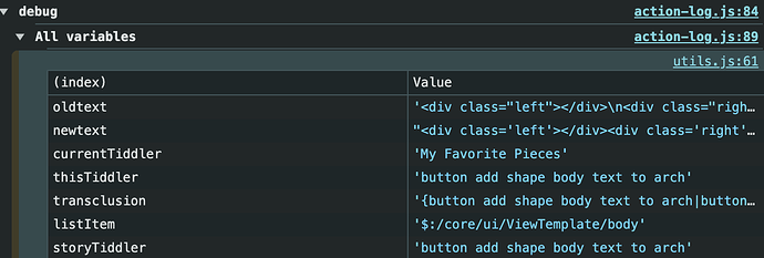
The JS console correctly four different currentTiddlers in a row for the four tiddlers that are tagged list 1. For each one, it correctly logs the newtext and oldtext. Here’s an example of one of the four logs:

Is there a problem with how I’m using the addsuffix operator? Since everything seems to be working up until that line? Am I misunderstanding this page https://tiddlywiki.com/static/addsuffix%20Operator.html and should there be brackets around the variables in some way?

https://stained-glass.tiddlyhost.com/ is now up to date with the current button

Thanks for your help and patience!

Oops! My bad. The above line of code should have been:

<$list filter="[all[current]!search:text:literal,anchored[<div class='left'>]]">

Note the leading ! before the search operator. This reverses the meaning of the operator, so it will only find tiddlers that do NOT have text starting with “<div class='left'>”, so it only performs the $action-setfield to add the starting text if it is NOT already there.

-e

3 Likes

Just came here to make the same suggestion, having tried it on the linked wiki, with success. :slight_smile:

1 Like

Thanks! This is perfect! Careful reading of code pays off :slight_smile:

1 Like

Ah ha! After a little more searching online I found html - Why don't UL bullets stay within their containing DIV? - Stack Overflow which solved the problem of the bullet points moving to the inside of the text. I added the following lines to a stylesheet tiddler

ol {
 list-style-position: inside;
}

ul {
 list-style-position: inside;
}

and that did the trick!

4 Likes
ol, ul {
 list-style-position: inside;
}
1 Like

To avoid this oddness (especially how the 3 and 2 mess up the visual reading of numeric sequence from 13. to 14.):

ignore partial solution bit here unless curious

You can try it this way:

ol, ul {margin-right: 20px;
 list-style-position: inside; 
 padding-inline-start: 22px;
 text-indent: -1.35em; margin-left: 1.25em; 
}

Gets you this:

PS:

Now I see that my suggested stylesheet intervention here does NOT play nice with your shape-css for fitting things elegantly within the arc at top.

Here's a bit better:
ol,ul{
  margin-right: 20px;
 list-style-position: inside;
padding-inline-start: 20px; }

ol li:not(:first-child), ul li:not(:first-child) {
text-indent: -1.35em; margin-left: 1.25em; 
}

1 Like