I was looking at methods of reformating one particularly wide table in a Wiki.
I came across this idea Responsive Data Tables With a few adjustments I was able to get this to work within TW.
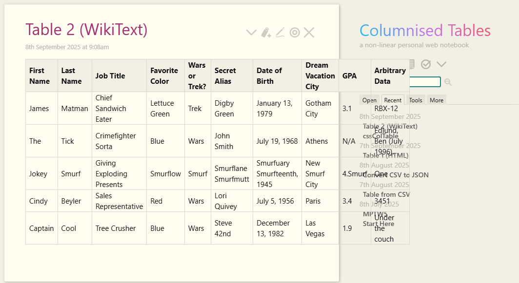
This sample table:
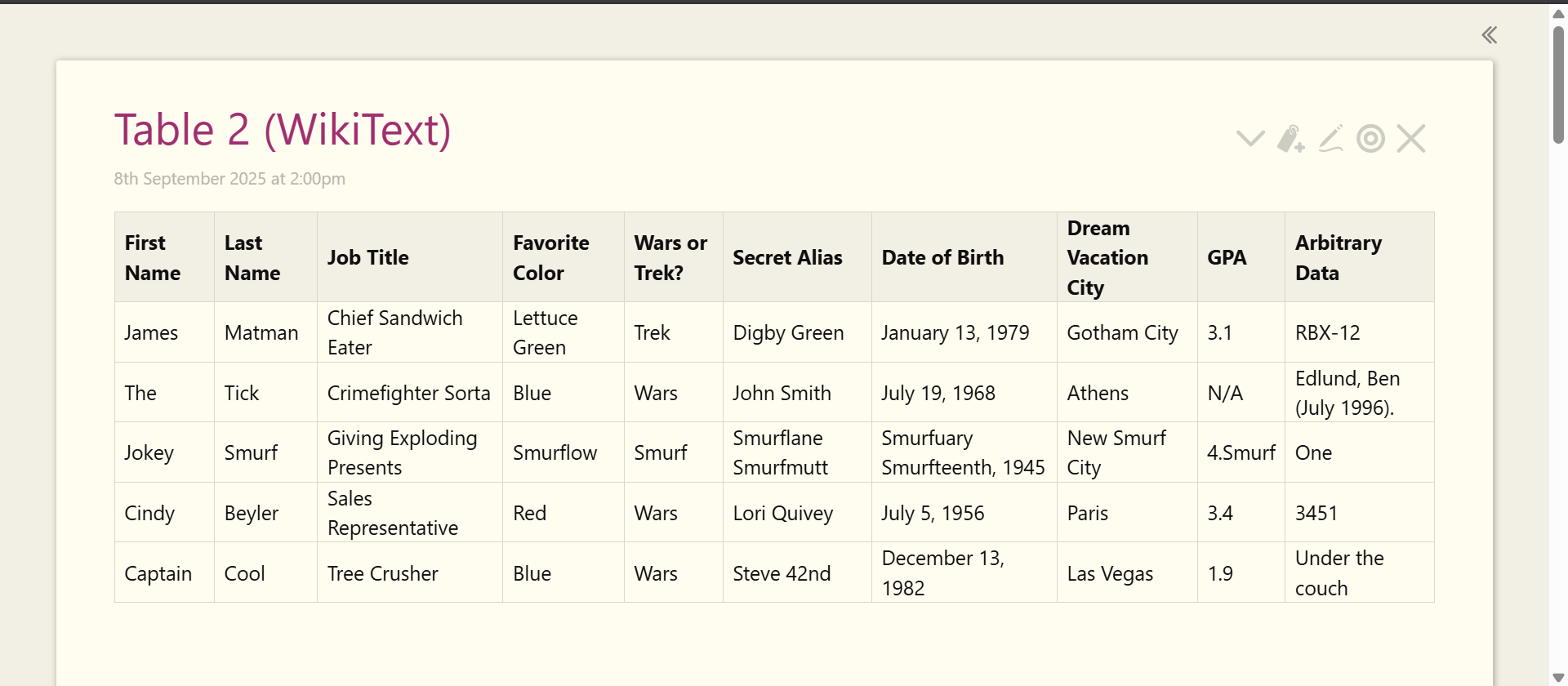
appears on narrow screens as:
The CSS is:
/*
Max width before this PARTICULAR table gets nasty
This query will take effect for any screen smaller than 760px
and also iPads specifically.
*/
@media
only screen and (max-width: 760px),
(min-device-width: 768px) and (max-device-width: 1024px)  {
    .narrowTab {
	/* Force table to not be like tables anymore */
	table, thead, tbody, th, td, tr {
		display: block;
        width: 100% !important;
	}

	/* Hide table headers (but not display: none;, for accessibility) */
	thead tr {
		position: absolute;
		top: -9999px;
		left: -9999px;
	}

	tr { border: 1px solid #ccc; }

    tr:nth-child(odd) {
      background: #ccc;
    }

	td {
		/* Behave  like a "row" */
		border: none;
		border-bottom: 1px solid #eee;
		position: relative;
		padding-left: 50% !important;
	}

	td:before {
		/* Now like a table header */
		position: absolute;
		/* Top/left values mimic padding */
		/* top: 6px; */
		left: 6px;
		width: 45%;
		padding-right: 10px;
		white-space: nowrap;
        font-weight: bold;
	}

	/*
	Label the data
	*/
	td:nth-of-type(1):before { content: "First Name"; }
	td:nth-of-type(2):before { content: "Last Name"; }
	td:nth-of-type(3):before { content: "Job Title"; }
	td:nth-of-type(4):before { content: "Favorite Color"; }
	td:nth-of-type(5):before { content: "Wars of Trek?"; }
	td:nth-of-type(6):before { content: "Secret Alias"; }
	td:nth-of-type(7):before { content: "Date of Birth"; }
	td:nth-of-type(8):before { content: "Dream Vacation City"; }
	td:nth-of-type(9):before { content: "GPA"; }
	td:nth-of-type(10):before { content: "Arbitrary Data"; }
}
}
Here is the WikiText for the Table:
|tc-max-width narrowTab|k
|First Name|Last Name|Job Title|Favorite Color|Wars or Trek?|Secret Alias|Date of Birth|Dream Vacation City|GPA|Arbitrary Data|h
|James|Matman|Chief Sandwich Eater|Lettuce Green|Trek|Digby Green|January 13, 1979|Gotham City|3.1|RBX-12|
|The|Tick|Crimefighter Sorta|Blue|Wars|John Smith|July 19, 1968|Athens|N/A|Edlund, Ben (July 1996).|
|Jokey|Smurf|Giving Exploding Presents|Smurflow|Smurf|Smurflane Smurfmutt|Smurfuary Smurfteenth, 1945|New Smurf City|4.Smurf|One|
|Cindy|Beyler|Sales Representative|Red|Wars|Lori Quivey|July 5, 1956|Paris|3.4|3451|
|Captain|Cool|Tree Crusher|Blue|Wars|Steve 42nd|December 13, 1982|Las Vegas|1.9|Under the couch|
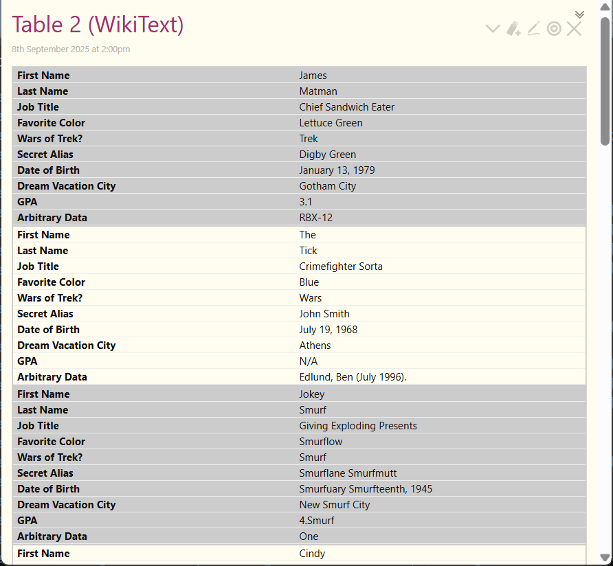
You can compare the result with a HTML table here Columnised Tables
Comments and feedback appreaciated.