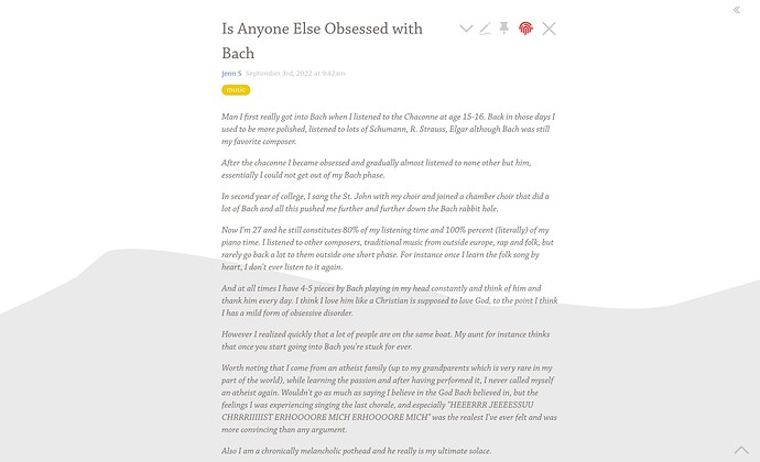
Centering the River

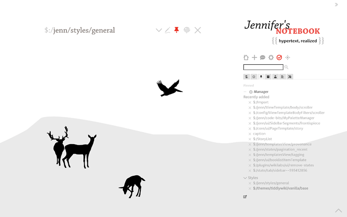
Hello. I am enjoying this modification I made to my wiki to allow for a river of centered fixed-width tiddlers. This style rule only becomes apparent when the sidebar is minimized. It helps me focus on the content without the content taking over the whole screen.

.tc-tiddler-frame {
max-width: 600px;
margin: auto;
}


3 Likes

The background image is amazing!

1 Like

Here’s another variation on your CSS:

.tc-tiddler-frame {
min-width: 600px;
max-width: 50vw;
margin: auto;
}

By using 50vw it allows the tiddlers to be responsive to the current window width while still maintaining the aesthetic feel of a centralized story column.

-e

3 Likes

Addendum:

Using margin:auto; will affect tiddler top and bottom margins in addition to the left and right margins. Instead, use margin-left:auto; margin-right:auto;. This will result in the same horizontal centering of the tiddlers within the StoryRiver, but avoids changing any top/bottom margins that provides vertical spacing between tiddlers.

Thus:

.tc-tiddler-frame {
min-width: 600px;
max-width: 50vw;
margin-left: auto;
margin-right: auto;
}

-e

3 Likes

This is the solution by Eric as Jennifer explained (works only with closed sidebar) for those like to give a try.

download centering-tiddler_style_whne_sidebar_closed.json (349 Bytes)

drag and drop to https://tiddlywiki.com

close/open sidebar to see the effect

2 Likes

Instructing the font size to resize along with the width of the tiddler will preserve relative line-lengths and support readability.

font-size: clamp(1rem, 1vw, 1.5rem);

Cf. clamp() - CSS: Cascading Style Sheets | MDN

This style doesn’t seem to fit the sidebar breakpoint well, due to this width limitation

This layout works great on the classic story view, but once I switch to zoomin, the story river is stubbornly left-aligned. Is there any way to overcome this? I’ve noticed that Grok TiddlyWiki has a centered story river in zoomin view, but with the solutions presented here (and even importing the relevant CSS from Grok) I could only replicate this effect when using the classic view in a fresh copy of 5.3.1.

Hmmm… I just tried using “zoomin” story view with TiddlyTools/Stylesheets/CenterStory, and it also had this tiddler alignment issue :frowning:

The TiddlyTools CenterStory stylesheet applies the following fairly simple CSS:

.tc-tiddler-frame { min-width:600px; max-width:50vw; margin-left:auto; margin-right:auto; }

This correctly centers the tiddlers for “classic” and “pop” story views, but when using “zoomin” story view, the alignment is as you described: “stubbornly left-aligned” (or “stubbornly right-aligned” if also using TiddlyTools/Stylesheet/TopBar with the “scrollbar on left” setting enabled.)

After some digging through the TWCore’s default “Vanilla” styles ($:/themes/tiddlywiki/vanilla/base), I was able to identify the CSS rules that are applied to the .tc-tiddler-frame layout when “zoomin” story view is selected. These rules (there are several) all refer to “.tc-page-container.tc-page-view-zoomin .tc-tiddler-frame”

The good news is that after a little bit of experimentation, I found that overriding the TWCore’s Vanilla “zoomin” CSS by creating a new stylesheet tiddler (tagged with $:/tags/Stylesheet) containing:

.tc-page-container.tc-page-view-zoomin .tc-tiddler-frame {
   position: static; width:100% !important;
}

fixes the tiddler alignment issue when centering the story river, while still permitting the “zoomin” story view to function as expected.

I tested this CSS fix with sidebar visible/hidden and “fluid/fixed” vs “fixed/fluid” layout on both https://TiddlyTools.com and https://TiddlyWiki.com, and “zoomin” mode looks good for all of those combinations, so I think it’s a fairly safe, generalized solution perhaps suitable for a TWCore PR.

I’ve also added this fix to TiddlyTools/Stylesheets/CenterStory, so if you import that tiddler and then click the “toggle center story” (double-arrows) button in the TopLeftBar, you should be all set. Note: you can also “ctrl-click” on the double-arrows button to get a popup that lets you set the minimum/maximum widths that are applied when the story column is centered.

Let me know how it goes…

enjoy,
-e
2 Likes

Works perfectly! Thanks so much for the solution and the thorough reply.