Category link in header

Hi, I am gradually learning how I like to use Discourse. I have noticed if I click Home (top left Icon) then select categories I get this nice view;

Fortunately I can book mark this Categories - Talk

However I am wondering if it may be useful to add it to the header (if possible).

It’s already in the list of Latest * Unread * Top * Categories * Bookmarks in the desktop view you’ve highlighted.

On mobile it’s a drop down in the same order.

We could make Categories the default instead of Latest, but it’s likely a toss up between what people want. I think theme experiments likely warranted.

The “header” which currently has Links (to external links aggregator) or Install (TW dot com) are both external links and I don’t think we should mix external and internal.

Let me know if I’ve misunderstood.

Boris

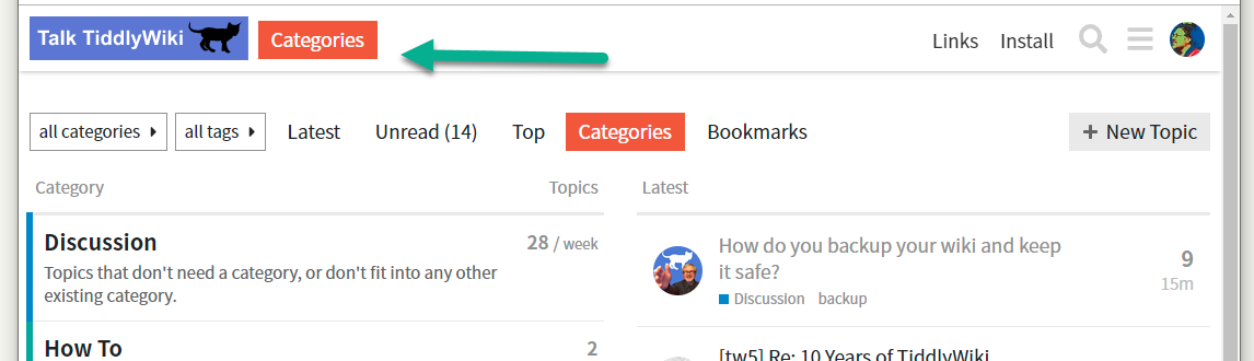
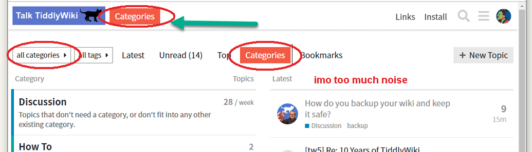
I understand your guidance, I was thinking something like this (quick hack) to make it more obvious that Discourse is structured by Categories at the top level

Alternatively make categories the home and add a latest button.

What ever the approach the idea is to bring the categories forward, I was delighted to see this view and feel if I was to do a new post that is where I would start. At present it needs click logo, Click Categories.

We did not have categories on GG and some people won’t realise its a key organisational element unless we bring it forward some how.

However I will trust your judgement

Actually I wish when I opened an actual discussion we did not loose the static header because if I scroll down I must scroll all the way back up to see the menu again, and then all the way to get the Home logo.

People can totally research and implement custom themes and we can experiment with making them available. Your suggested location would need someone to make a custom theme.

Also I just realized that that is in fact a per-user setting :wink:

Go to Preferences > Interface and you’ll have a number of personalized options, including defaulting to Categories instead of latest.

I also believe that we’ll want to ease people in to multiple categories, which is a big difference from a single topic mailing list.

1 Like

I think this line should be reserved for TiddlyWiki.org branding and not to the “talk.” forum

At the moment it links to links.tiddlywiki.com and tiddlywiki.com
In the future it may also link to tiddlywiki.org eg to a “Community” landing page

It think the image says it. … It’s a bit too many links to 1 “thing”

Boris / Mario

I accept your comments, I may change my default to categories but I also use a shortcut to open talk.tiddlywiki.org in its own window so can set the desired location there.

Perhaps we may not want to overwhelm people but sooner or later we want them to come to terms with and make use of the categories. This was in part why I though a top level option would be of value.

Is there a way to stop the top menu hiding when we scroll down?

Happy to experiment with custom themes if people in the community design them.

I think the main problem here is the mobile layout. You can’t block so much vertical space for an additional menu.

From my point of view the mobile already takes up too much space, because it is “always there”. … But that would be a completely new thread.

Thanks Boris, I did not know if this was a standard or theme setting. I just discovered you can get to categories from the hamburger menu any way so no worries.