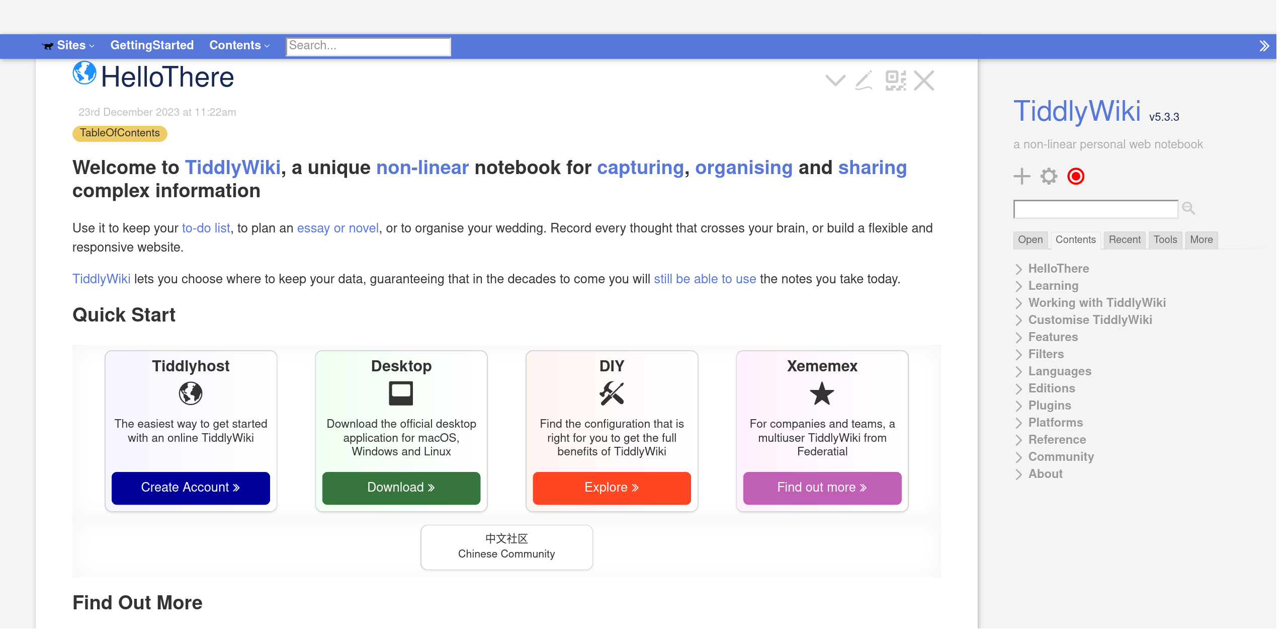
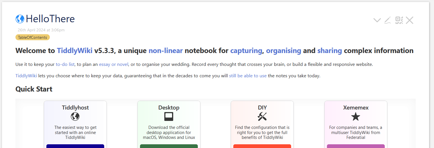
The “Hello there” tiddler is the first tiddler people see when they go to tiddlywiki.com.
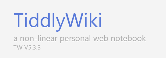
It would make it easier to see what the latest released version is so I don’t have to search for it. This value is held in a variable so when ever the variable is updated, anywhere it’s displayed is also updated.
This should be very easy to change and would make the process of looking for the newest version number convenient.
Thanks!
I use TW all the time to take notes at work on new computer tools I’m using. I actually store the HTML file on a network drive which is accessible to all the remote desktops I use. I can’t use tiddlyhost because it is blocked at work.
I also don’t know how to make a change on Github to do it myself.
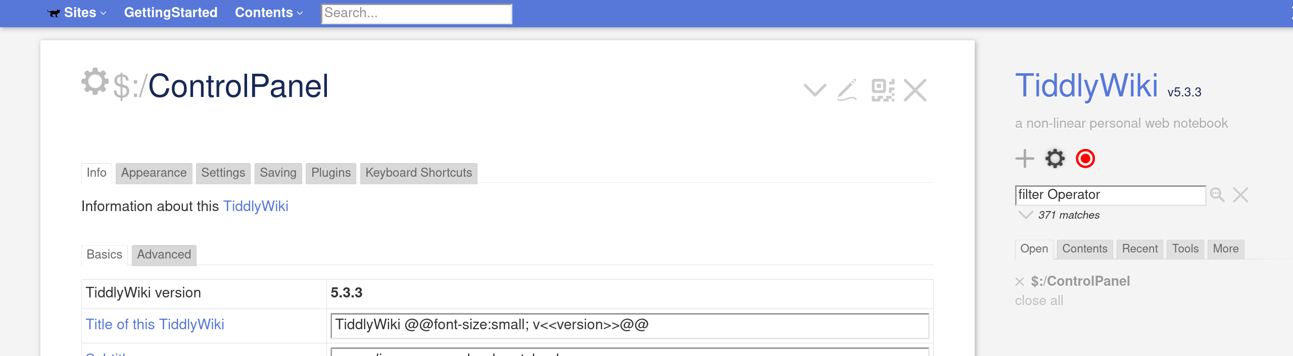
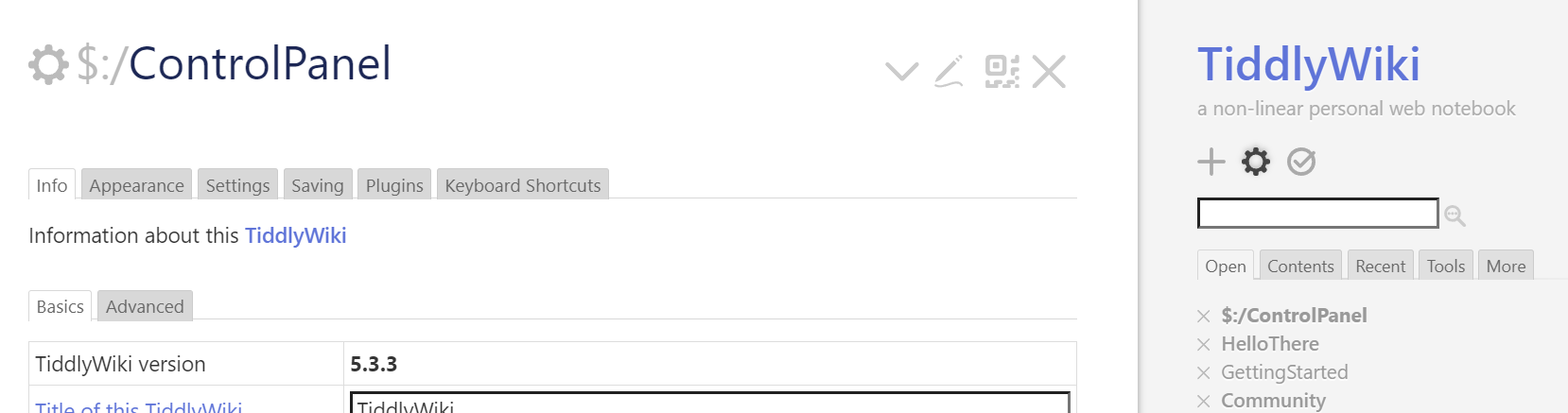
You are right. I do support that request. Seeing the actual version should be a “zero click” information. And should link to the $:/ControlPanel → Info tab.
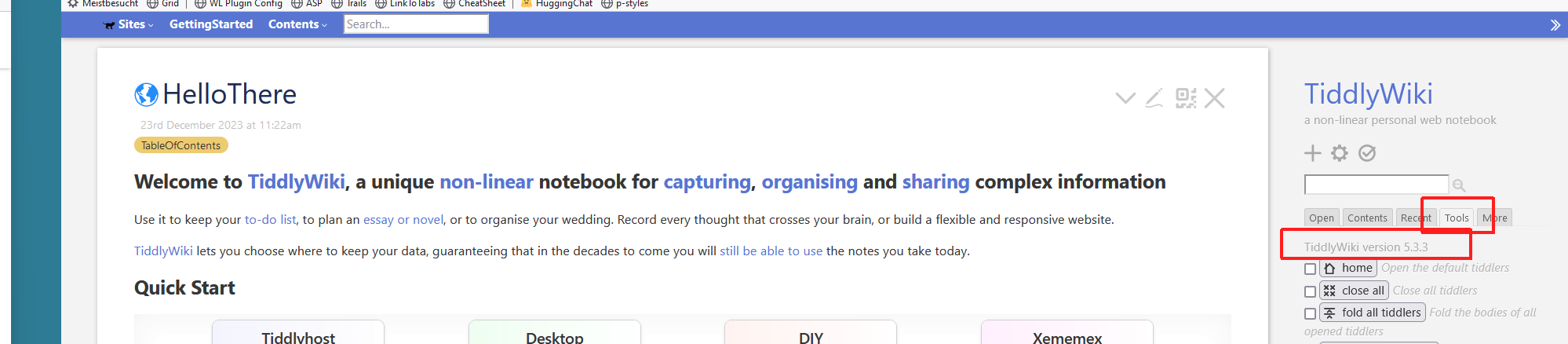
I usually open the right sidebar → Tools tab, because it does not scroll.
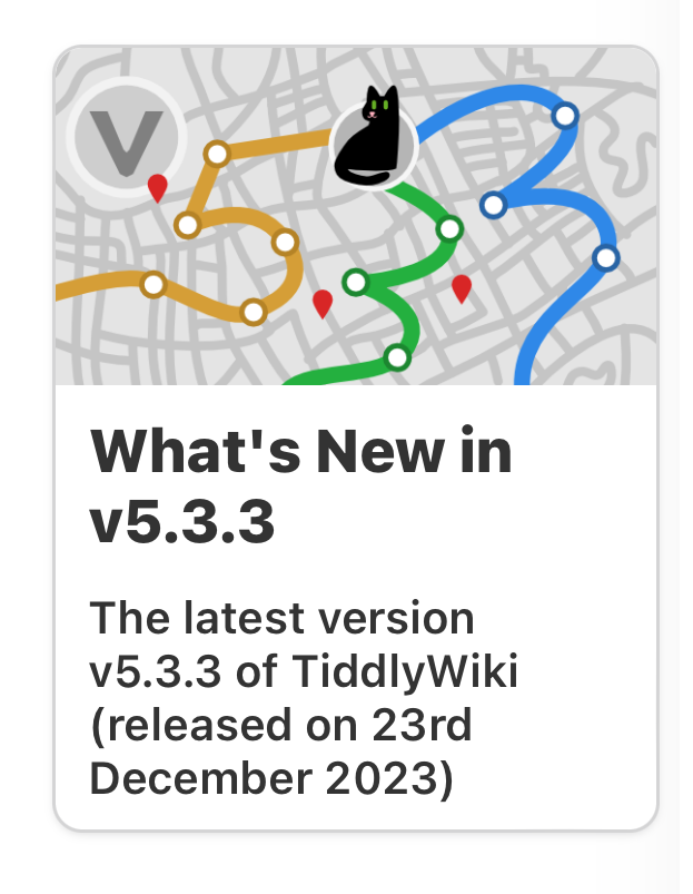
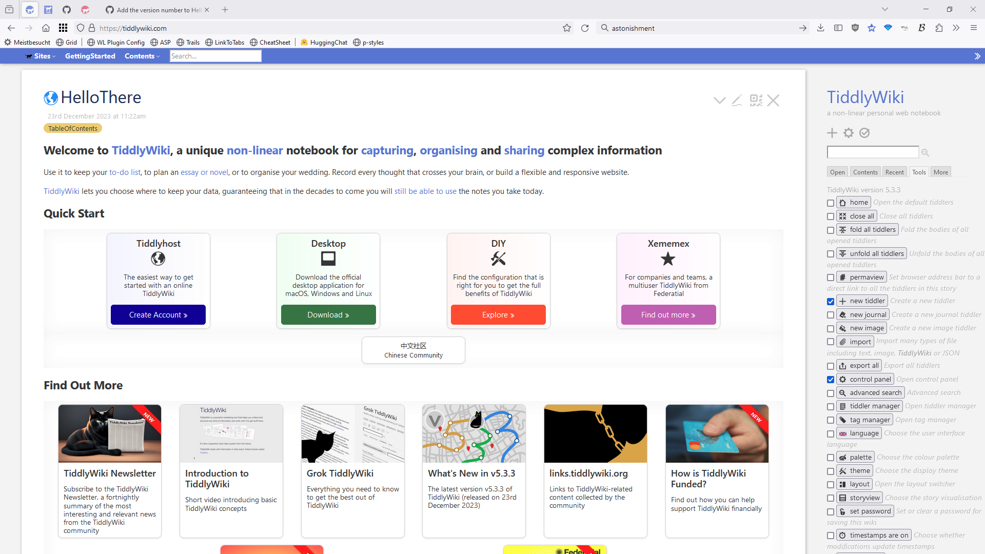
It stands out if the card is shown without any context. The problem is that it is hidden. On a full-hd monitor with 100% zoom level for me HelloThere looks like this.
Of course in this case we are talking about the Public website, the documentation, and to me this is perhaps more stable than any random wiki I come across.
Perhaps add something below the subtitle, with css so it does not consume much if any extra space, and a theme tweak to turn it off?
Yes, I was using ^^v<<version>>^^ but it was not that obvious.
But perhaps it makes sense as a separate element? eg $:/SiteSubtitle/suffix containing the version message, ie become part of the sidebar in $:/core/ui/PageTemplate/sidebar with $:/tags/SideBarSegment or in $:/core/ui/SideBarSegments/site-subtitle
Always visible would be an additional advantage. I do like this. Imo it also would be a good example for users, how they can style there one wiki title.
I was curious, why I did completely miss that card. I was looking at the OP request on my laptop, where I do use a zoom level from 170% (sceenshot) up to 200% (now for writing this post).
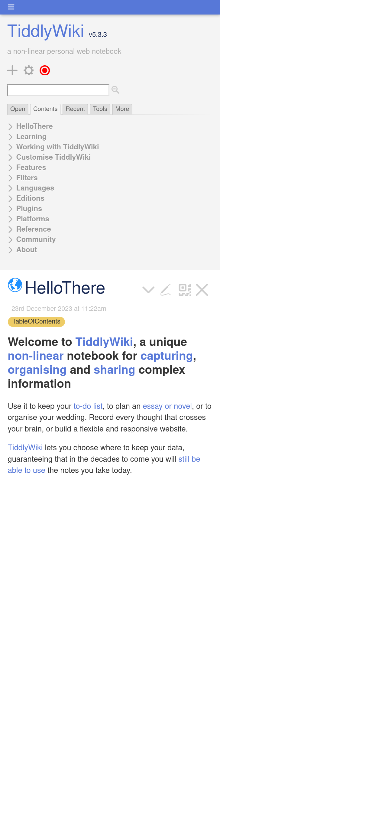
I see. My problem is I use a skinny browser window so I have to scroll down to see the version about one whole browser page. I do not even see the sidebar on tiddlywiki.com. I have limited screen space and need to use fonts that are a bit bigger than normal.
I like this idea and I didn’t see a PR so I created one.
Does anyone have an idea how to give it the sidebar-foreground color? It seems like it should be possible, but I couldn’t figure it out without adding a new css class for that purpose only. In the PR comments you can see what I was trying.
@simon, You should target tiddlywiki-com branch instead of master so it can be merged much faster. The target branch can be edited using the “title edit button”
 It looks great, fantastic, how are you today?