Can we make the Alert-mechanism less intrusive

May I add:

  • ability to drag and relocate notifications
  • ability for the user to dismiss notifications

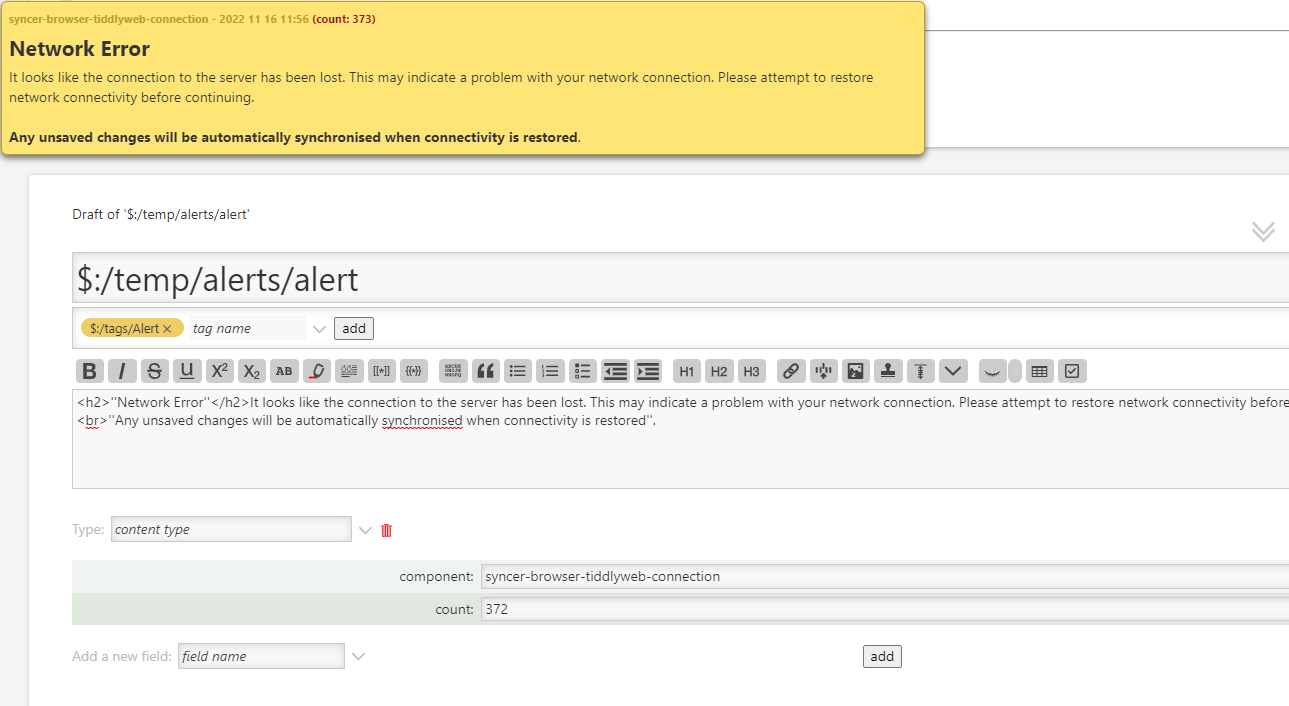
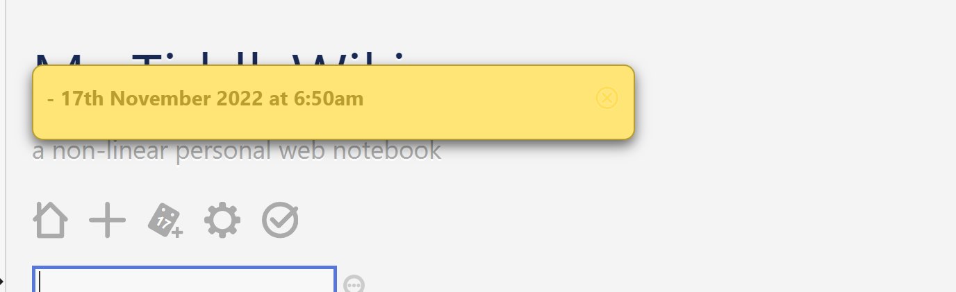
Use case: my node.js server hangs from time to time (runs in the Windows Subsystem for Linux). When the server hangs, the front-end web page notifies me that the changes can’t be saved (and there is even a counter showing how many times it tried). However, for the few minutes while I restart the node.js server (it does take a while), I can still use the front-end, search and even make changes; the changes will be saved when the service is back up.

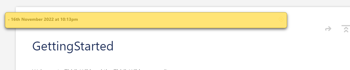
The challenge is the notification bubble hides the tiddler titles and a good portion of the start of the tiddler. It would be helpful if I could move the notification around or close it (even though in this case, it would likely re-appear with the counter increment).

I’ll try to add a screen capture soon.

1 Like

@fastfreddy This is actually a different mechanism – you’re talking about Alerts, the thread is about notifications.

(I also have the same problem with those alerts as you, though)

1 Like

@Maurycy already, my bad. Thanks…
Interestingly, the demo here has a dismiss button… I will investigate and try a few things about alerts when I have chance.

Should I remove my post from here? done by @pmario

Hi, I did move your post and the replies to a new thread.

I also would like to have less intrusive alert-mechanism, that is “annoying” enough to be seen. But the wiki should still be usable

1 Like

Some useful information here in this screen capture… investigating why the close button isn’t shown, whereas it is on the TiddlyWiki.com demo. It may be related to plugin conflict, my own notebook seems to consistently not show the close button…

…vs…

The button is there, just invisible.
Investigating further

Try zooming the view in out “ctrl +” and “ctrl -” or middle mouse roller. Perhaps the alert has not responded to the zoom level?

thanks @TW_Tones … feels I am getting close.

Fresh pre-release:

after dragging Stroll — A Roam-like experience in a free, downloadable file

will be diving into the stylesheets…

Great, perhaps then try and set the width to a view window “relative units” eg vh90 is 90% of the horizontal view window.

I think it is less about the zoom than about the font colour…

Stroll includes quite a few plugins, I’ll hone in on the one that changes the icon font colour by enabling/disabling them, in turn.

Stay tuned…

Here is the problematic style (after changing the fill colour using developer tools):

image

most likely as defined in: $:/.giffmex/.Stylesheet4Stroll

html body.tc-body .tc-image-cancel-button {stroke: white;fill:#ffdd55;}

easy fix…

I will still investigate ways to move the notification around or a smarter “dismiss” that prevents repeated errors from re-appearing after being dismissed (perhaps)…

Hi all. I, too, have found the alert banner too intrusive. I created an alert-suppression plugin that suppresses the alert banner if it repeats, as it does when the server connection is broken. It shows the banner initially to alert the user, and the sync icon continues to show red, but the banner then gets out of the way so you can edit without the banner interfering. There is a checkbox in the plugin settings to enable or disable suppression.

4 Likes