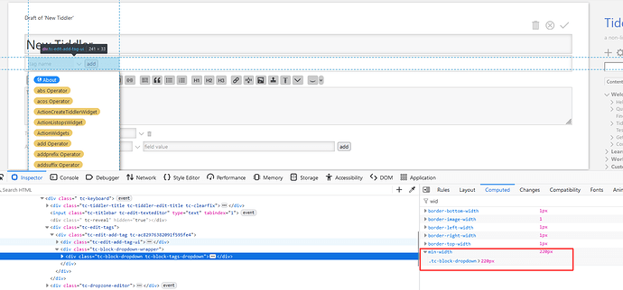
Can this blank space in the edit bar be fixed with CSS?

I’m trying to add a dropdown next to the “Add” button in the editor. The problem is that the existing box creates an unnecessary gap space. I assume this extra space is coming from CSS, but I can’t figure out which style is creating it.

I’m hoping that this can be fixed with CSS rather than having to make the code more complicated and inserting my dropdown inside of the “add” button code.

Thanks!

3 Likes

Well, the text input is set to 50% of the element .tc-edit-add-tag

So one trick would be something like:

.tc-edit-add-tag .tc-add-tag-name input {
	width: 65%;
}

(I’m not yet sure what determines the width of the whole thing, but the above overrides the shadow in vanilla/base that makes the text-input 50% of the parent.)

1 Like

This has been a minor but recurrent annoyance for ages — thanks @Mark_S for raising the issue and @Springer for identifying the root cause! As a minor tweak, I’d suggest using width: fit-content;, which should eliminate the extra space entirely.

2 Likes

Thanks for the reply!

That fixes the problem cosmetically on a big screen, but I was rather thinking in terms of eliminating the unnecessary block of space. At the moment I can’t even see how the DIV is determining the width off the container box .

See: This space seems to be defined with tc-block-dropdown as shown in the screenshot below. But I am not sure where exactly it is calculated.

Hm, I don’t think it’s block-dropdown @pmario, even though they are in fact lining up…

@Mark_S Maybe you can play with variations on the values below until you like what you see… This works for me and seems to scale ok:

.tc-edit-add-tag .tc-edit-add-tag-ui {
	width: 200px;
	}

.tc-edit-add-tag .tc-add-tag-name input {
	width: 60%;
}

Thank you!
That does indeed seem to work, though it all feels like black magic … as CSS is want to do.

1 Like