Just to see how it felt, I tried to reverse the order. Here’s what it looks like:
What do you think of this ? Do you like it ?
Fred

Just to see how it felt, I tried to reverse the order. Here’s what it looks like:
What do you think of this ? Do you like it ?
Fred
I don’t know. I would need to test it. … I’m using the existing version quite some time now. So I’m used to it.
The advantage of the existing version is, that the first link and the “tag-button” are very close together. I did make the first element “text only” at the beginning, but I did not like it. So they are all links now.
True.
I think links are very important in breadcrumbs, I wouldn’t like “text only” either.
Another try with tag pills (and their popup menu):
I’m not really fond of this one because newcomers could mistake the breadcrumb with the tag bar, or might miss the fact that even the first item of the tag pill popup is a link (it took time for me to get used to it). OTOH, with tag pills popup menus you can see more navigation targets at a glance…
Fred
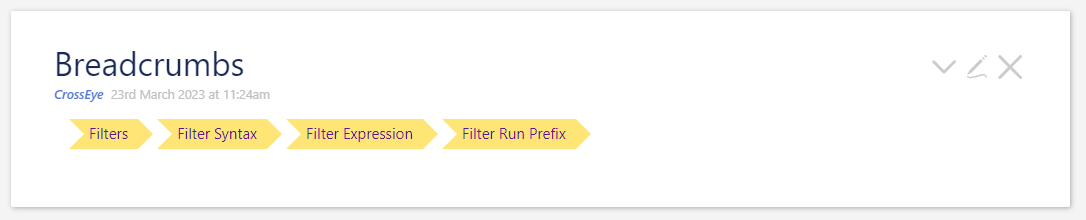
I like these alternatives a lot. I’m wondering if we could do something much like the tag pill, but with a slightly different shape. Please forgive the ASCII:
 __________    _______________   ____________________   ____________________
\  Filters \  \ Filter Syntax \  \ Filter Expression \  \ Filter Run Prefix \
/__________/  /_______________/  /___________________/  /___________________/
This might give the extra navigation help but not be confused for the tag list.
I do not like it either it’s way too visually aggressive
Thanks talking to tw-FRed that’s actually an easy fix. … I was thinking too complicated and “didn’t see the forest by the trees”.
This should be doable with some CSS. I think I even have it saved somewhere. … The internet will know for sure 
Love your work @pmario
Just an idea;
The domain name system is least significant first, breadcrumbs most significant first (that is where you started to where you are reading English left to right).
page.server.domain.tld
if we use most significant first we can use the >
tld > domain > server > page
This comes to mind;
<$button class="imgglow" style="font-size:1em; border: outset 3px; border-radius:0px 50px 0px 0px; padding:2px 20px;">The Stalwart</$button>
… which I think was a poor design decision right up front. Many, many urls are hierarchical and most-significant first, everywhere but in the host portion. org.tiddlywiki.talk would make much more sense. It’s too late for that now, but if we’re doing breadcrumbs, I would certainly stick to the conventional most → least significant, left → right ordering, however we present the actual nodes.
Like breadcrumbs were originally used – in ltr, anyway.
I guess in translation, they might be reversed (rtl)? Maybe not necessary…
Rough, but approaching what I was thinking of:
Breadcrumbs.json (1.4 KB)
<div class="breadcrumbs">
  <a class="crumb" href="#">Filters</a>
  <a class="crumb" href="#">Filter Syntax</a>
  <a class="crumb" href="#">Filter Expression</a>
  <a class="crumb" href="#">Filter Run Prefix</a>
</div>


<style>
div.breadcrumbs a.crumb{
  padding: 3px 10px 3px 20px;
  margin-left: 15px;
  display: inline-block;
  height: 30px;
  position: relative;
  background: #ffe476;
  text-decoration: none;
}
div.breadcrumbs a.crumb:after {
  content: "";
  position: absolute;
  left: 0;
  bottom: 0;
  width: 0;
  height: 0;
  border-left: 15px solid white;
  border-top: 15px solid transparent;
  border-bottom: 15px solid transparent;
}
div.breadcrumbs a.crumb:before {
  content: "";
  position: absolute;
  right: -15px;
  bottom: 0;
  width: 0;
  height: 0;
  border-left: 15px solid #ffe476;
  border-top: 15px solid transparent;
  border-bottom: 15px solid transparent;
}
</style>
Not sure I agree here, this is where I care less for the most significant and more for the most specific.
I agree with the issue about the host varying from the folder/file part.
My point is there are “horses for courses” and two ways to arrange them.
Not withstanding this;
To be honest I have done a lot of work on this and have a few topics relating to this in talk.tiddlywiki
Of note is; a tiddler in a tag tree such as TableOfContents already has its parent tag, as that is how it got in the tree in the first place, perhaps at least for tag trees we could list the tags towards the root tiddler after the tags?
I agree with you, it shouldn’t appear as a navigation trail, but I struggle to find a correct wording for what should represent “reader’s position in the learning hierarchy for this matter (i.e. Filters)”.
Any idea ?
This part is already working, Mario’s macro uses the same tag hierarchy as ToC.
See my second proposal above, although I think this proposal won’t work well without a dedicated style for those tag pills (I like @Scott_Sauyet’s proposal for this purpose) to differentiate them from tiddler tags.
Does anyone have an idea on the best way to style tag pills differently, but only for this use case? FYI the code for this example currently uses the <<tag>> macro.
Fred
That’s a good way to say it. I’m not sure that shortening it would lead to better clarity – the shorter you make it, the more abstract it will become: “active context” ← that’s horrible.
I think that ship has sailed. Breadcrumbs on the web are very rarely used to track your actual progress through a site. We have the Back button for that! But they are one of primary metaphors for expressing your position in a hierarchy. The other, used in either really deep hierarchies or more formal settings, is to show the path through a tree, sometimes with sibling nodes to various ancestors also displayed. We can use the TOC macros for that.
I have a continual frustration with trying to find reference documentation on the main site. This is an almost unavoidable consequence of its non-linearity; it’s hard to pair that with the sort of hierarchical view that reference documentation requires. I’d love if this were to help fix that problem. I’ve been thinking that it would require a separate documentation site to really fix well. And I probably will still work on that at some point, but it might move down the queue if this approach helps ease the pain.
The big problem is that TW demonstrates well that there are often multiple places data belongs, and multiple hierarchies that might include the same content. This makes it challenging as the main site serves so many purposes, and reference documentation is just one of them.
I love that notion! 
I think it’s simpler than that. Although we’d need a name to discuss it internally, we don’t need to name it at all publicly, just use it. We don’t have to have the word “breadcrumbs” or “hierarchy” or any such in the UI. People will still understand what is meant.
I absolutely love the double-use of the railroad diagrams for navigation, but that’s only useful in the limited cases where our hierarchy is related to syntax. Breadcrumbs are more general. But, as noted above, they are no panacea; there are multiple possible hierarchies, and we can’t have six different sets of breadcrumbs without getting far too confusing.
This looks great and makes the progression of ideas very clear!
Initially I was thinking making it use tc-muted and not as tags, but-
this would look better I think, and it reminds me of a linux terminal.
It would be nice to see them above or below the tags, and pulling their color from the color of the tiddler they represent.
Those breadcrumbs look great! Those would look good as tabs in the tabs macro too.
However, the vertical text alignment is not centered and too high on Firefox/Linux and they look a bit weird.
Adding line-height: 28px; to the div.breadcrumbs a.crumb section makes it look similar on Firefox and Chrome.
I chose 28px vs 30px just because it looks a bit better to my eye when the "p"s, "j"s and "q"s drop below the text baseline.
/Mike
Well, the whole point is to make the visually distinguished from the tab macro!
Sure, as I said very rough. I’m not a graphics person, and once I got them close enough I stopped. I feel the text should also shift a few pixels right. And I have no idea what CSS techniques are being used across the core. I don’t know the correct foreground and background to use (they probably need to be dynamic.) This was just to demo the concept.
you can set that simply enough with the colour macro, for instance color:<<colour foreground>>; takes care of that.
All things considered though, this is a really well made demo
Thanks. But let’s not forget that my first version was in ASCII.