Expected behavior:
Changing the current palette influences only colors, not other properties of elements, e.g. buttons.
Actual behavior:
If the current palette doesn’t define any of the button colors (button-foreground, button-background, button-border), e.g. Vanilla, the buttons take the default style, browser dependent, including reactions to hover and click. Screenshots with Vanilla palette:
Firefox or Chrome/Desktop or Android: 
Safari/MacOS:  Safari/iOS:
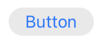
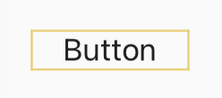
If the palette does define (some of?) those colors, e.g. Spartan Day, the default style is overridden, the button has a rectangular border, and does not react to hover. This altered style is also, to some degree, browser dependent (“3D” border on on Firefox and Chrome, solid border on Safari). Screenshots with Spartan Day palette, same order:
Firefox or Chrome/Desktop or Android: 
Safari/MacOS:  Safari/iOS:
Is this situation considered a bug, or is it intended? I see it as a bug, because:
- Functionality of palettes is inconsistent, if they influence things other than colors.
- The “custom” button style differs a lot from other similar UI elements (e.g. editor toolbar buttons, tabs), and looks quite outdated (kinda like Windows 98 buttons).
- The “browser default” button style is, obviously, not consistent across browsers, and not easy to modify thought palette only (e.g. if one wanted to change only its color, not other properties).
The only similar discussion I was able to find on here or GitHub is this one: [IDEA] Define button colours in every palette · Issue #5153 · TiddlyWiki/TiddlyWiki5 · GitHub
An argument made there in favor of the default button is, that it looks much more like a clickable element and that users are familiar with the button style of their browser.
I think the custom button style should be improved, in order to better match other UI elements (like editor toolbar buttons), react to hover, and make it consistent across browsers.
Another question is, whether the browser default buttons style should be used at all.
I think it is worth considering to always use a custom style that matches other TW elements. TW has many custom buttons/ clickable elements already anyway: editor toolbar (including dropdown menu), site and view toolbar, plugin library buttons, dropdowns for content type and field name.
Even if the default button style stays as an option, I’m not sure that choosing it through palette is the most intuitive way. Although it is easier to manage (requires less code changes) than a theme or plugin specifically for this single detail.
What do you think?