Button directly on TOC

Does anyone have an example of including a button directly on a selective expandable TOC?

I would like for parts of my TOC to be buttons that launch certain editing tiddlers. Has anyone done this? And even if not, do you have any suggestions for how to achieve it?

I am planning on trying the following tomorrow, but don’t know if it will work. So I’d like to see if there is any advice here first: The TOC macros have a template property. I thought I’d use a custom template that incorporates a cascade, and use a tag or field on each of these button tiddlers that a step of the cascade would catch to transclude the button tiddler rather than a link to the title.

Any examples? Any advice?

@EricShulman has developed templates and tools for TOC with button!
It is very small tool, but highly powerful.
See his TiddlyTools for TW5 v5.3.1 — Small Tools for Big Ideas!™ and search for TOC.

2 Likes

\define toc-selective-expandable(tag,sort:"",itemClassFilter,exclude,path)

As seen above, the selective-expandable has no template. But it would be possible to create a new itemTemplate similar to the list-links-draggable macros.

1 Like

Ah, mislead by the documentation again. The list of parameters to the widgets in Macros does not distinguish which ones have templates.

I’ll check that out at some point. This is a nice-to-have feature, nothing essential to my current work. If I can get it without inordinate effort I will, but I was already stretching my skills with the design I suggested.

Hmm, I can’t seem to find them. I don’t know if I’m just blind. I see two tiddlers, .../TOC and .../TOC/ItemTemplate. The first is a simple stylesheet. The second sounds promising, but I can’t figure out how to use it.

https://tiddlytools.com/#TiddlyTools%2FTOC is actually a stylesheet AND a set of global macro definitions, contained in a single tiddler! Just copy both …/TOC tiddlers. Then use

<<toc-tree "roottag">>

replacing “roottag” with the tag that you’ve used for “top level” tree items.

https://tiddlytools.com/#TiddlyTools%2FTOC%2FItemTemplate is a custom TOC template that is applied to the individual tree items.

Note that TiddlyTools <<toc-tree>> macro provides some extra features not present in the TWCore <<toc-selective-expandable>> macro:

  • Add tiddler icons and “more” menu dropdown to the tree items using https://tiddlytools.com/#TiddlyTools%2FTOC%2FItemTemplate. You can also customize this template to add your own custom item content.
  • Drag-and-drop to re-arrange the tree (adjusts tags on tree items). Just drag-and-drop an item to move it into a branch (makes it a “child” of the item dropped onto). Use CTRL- or SHIFT- drop to move an item before/after another item (makes it a “sibling” of the item dropped onto).
  • Navigating to a tiddler via normal tiddler links or sidebar lists will automatically open the corresponding branch of the tree. To assist with visual navigation in the tree, the current tiddler (based on $:/HistoryList!!current-tiddler value) is highlighted with a “blue bubble” and hovering over any tree item will highlight that item with a “white bubble”.
  • The <<toc-tree>> macro also allows you to specify a field parameter (defaults to “tags”) so you can use an alternative field to construct the tree structure (e.g., use “field:parent” to use a parent field instead of tags). This allows you to avoid “tag pollution” when building your tree.
3 Likes

Damn, I guess I should have listened to

Coda: “Use the source, Luke!”.

Thanks. I’ll give these a go as soon as I’m back to that part of the project.

This is great! I did not know TOC support parent field instead of tag.

I hope I can change css colors to follow the selected TW theme.

This is a good alternative to official toc macros.

You can define a custom stylesheet tiddler (e.g., “MyTOCStyles”, tagged with $:/tags/Stylesheet), like this:

<$list filter="[{$:/palette}!match[]then{$:/palette}!match[$:/palettes/Vanilla]]">
   .tt-toc-button:hover    { color:<<colour foreground>> !important; background:<<colour background>> !important; }
   .tt-toc-button-selected { color:<<colour background>> !important; background:<<colour foreground>> !important; }
</$list>
<$list filter="[{$:/palette}match[$:/palettes/GruvboxDark]]">
   .tt-toc-button:hover    { color:blue !important; background:white !important; }
   .tt-toc-button-selected { color:white !important; background:blue !important; }
</$list>

Notes:

  • The .tt-toc-button:hover styles define the colors to use when hovering over a TOC item.
  • The .tt-toc-button-selected styles define the colors to use when highlighting the “current-tiddler” item (as defined by the $:HistoryList!!current-tiddler field value).
  • The CSS rules are enclosed within a $list widget so they are only applied when a specific palette is in use.
  • The first $list widget in the example above is applied for any palette other than the default palette or $:/palettes/Vanilla.
  • Then, if $:/palettes/GruvboxDark is in use, those CSS rules are overridden with specific colors to be applied only for the GruvboxDark palette.
  • The !important is necessary in order to override the built-in colors set by the TiddlyTools TOC macro code.
  • You can use any valid CSS color code or X11 color name (e.g., #123456 or CornflowerBlue), or the TWCore <<colour ...>> macro with a name reference to any palette entry (as shown in the example above).

enjoy,
-e

3 Likes

@EricShulman Offline I was building my own TOC to add some additional features but given your fairly sophisticated toc-tree I wounder if you would consider adding some additional features?

One example would be to provide an alternate filler as the default filter on each item in the TOC but also for each node. We could edit an Item in the TOC to control its own children, For example, if a tiddler in the TOC has a child-filter then use that instead, to list the children. TOC’s could then include dynamic content such as open tasks etc…

  • Similarly being able to specify an alternate list item tiddler on any tiddler in the TOC you could then name a list item that that shows a check box to complete on a task etc…
  • If there is no child-filter just use the filter given to the toc. by default [all[current]tagging[]]

Thank you Eric! Works like a charm!

A minor suggestion:

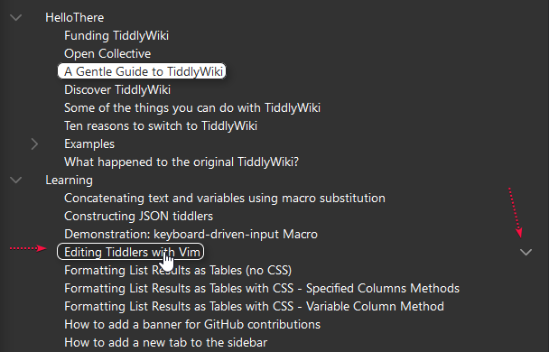
  • When hover mouse on an entry you see the more action button (1)

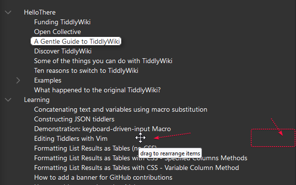
  • If the length of entry is short, moving mouse to the right (empty part of line) cursor is shown as move (2) but the more action is hidden

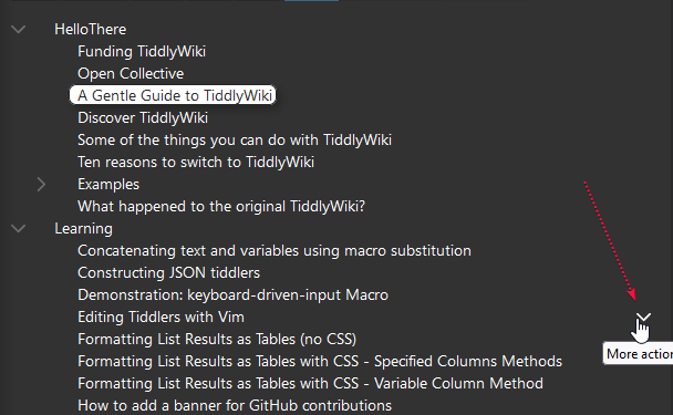
  • If you move the cursor to the right end, then the more action button is shown again, but it is not clear which item has been selected (3)

856_firefox

857_firefox

858_firefox

Expected behaviour: I like to have the whole row highlighted

Try adding this to your “MyTOCStyles” custom stylesheet:

.tt-toc-button, .tt-toc-button-selected { width:calc(100% - 3.75em); text-align:left; }

Notes:

  • The first line extends the .tt-toc-button and .tt-toc-button-selected so they occupy almost the entire row. The - 3.75em accounts for the space reserved for displaying a tiddler icon (to the left of the title), as well as avoiding overlap with the “more” button so that clicking the “more” button doesn’t also trigger navigation to the tiddler item.
  • Because the item button now occupies most of the row, the “move” cursor will only appear when the mouse is over the space to the left of an item title. However, dragging an item to move it will still work if you grab anywhere on the row.
2 Likes

Works like a charm.
Thank you very much