Hello all,
So one of the things I’ve been using TW for is to keep notes whereever whenever, and often times I do that using my phone.
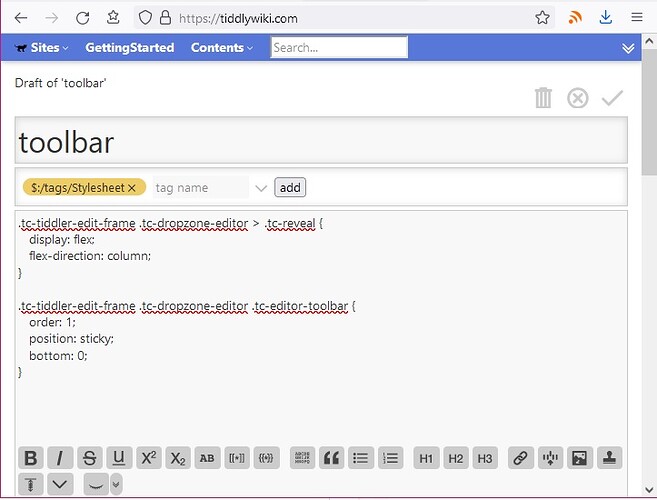
One of the issues I’ve run into in the past is having the editor toolbar at the top of a tiddler and having to scroll up to use it.
I’ve tried a few solutions to this, from setting a max height of the editor tiddler, to making the toolbar position:sticky at the top below the tiddler title, but now, I have a fun little new idea that I wouldn’t mind a bit of help on.
So one of the things I noticed on Reddit is their editor for comments has a bottom sticky toolbar, and I went poking around in the inspector to find out how.
I figured out the nifty way they got that to work, and I think it would be absolutely perfect for a mobile layout for TW.
If you’d like to see it in action, you can copy this bit of text below, and you’ll see it in action.
<style>
.tester-top {
  position: sticky;
  z-index: 101;
}
.tester-bot {
  bottom: 0;
  position: sticky;
  z-index: 100;
  background-color: yellow;
}
</style>

<$vars text="<tr>
<td>Goodbye</td>
</tr><tr>
<td>Goodbye</td>
</tr><tr>
<td>Goodbye</td>
</tr>">

<table style="width:100%;">
<tr>
  <th class="tester-top">Wow!</th>
</tr>
<<text>><<text>><<text>><<text>><<text>><<text>><<text>><<text>><<text>><<text>><<text>><<text>>
<tr>
  <td class="tester-bot">Goodbye</td>
</tr>
</table>
The part I’m asking for help on, is moving the editor toolbar to this bottom sticky area, as in the past I’ve noticed that the toolbar itself is a bit tricky to rearrange, at least in my experience.
I’m going to be working on this when I get the chance, but for anyone a bit more experienced, I’d love to see if you manage to get it to work before I fumble my way into getting it haha


 haha)
haha)