https://better-color-tools.pages.dev/
Some times we like to be more colorful!
Better-Color-Tools are helpful tools to colorify your Tiddlywiki.

https://better-color-tools.pages.dev/
Some times we like to be more colorful!
Better-Color-Tools are helpful tools to colorify your Tiddlywiki.
There is a new tool out there, which could revolutionize the way we can work with different colour spaces: https://colorjs.io/
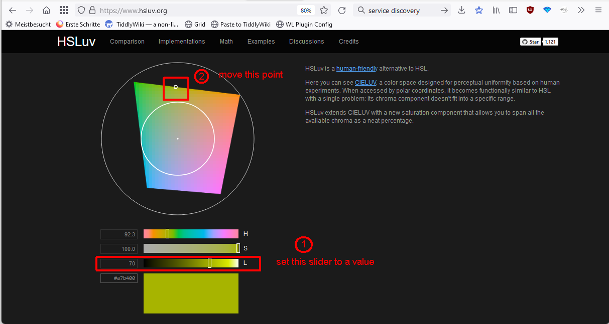
It allows us to easily convert colour values between different colour spaces. Where HSLuv is a very interesting one: Comparing HSLuv to HSL - Human-friendly HSL because it works with perceived lightness by humans.
An interesting article may be this one: Perceptually uniform color spaces - Programming Design Systems
Or https://stripe.com/blog/accessible-color-systems, which explains, why it is important to have a closer look
A GitHub discussion about color tools is at: https://github.com/Jermolene/TiddlyWiki5/issues/5236
And a tool created by cdruan mentioned at GitHub is at: https://github.com/Jermolene/TiddlyWiki5/issues/5236#issuecomment-890428532
Looks like an intriguing possibility, I like that it works with new P3 wide colours (which we have discussed before).
Hihi, … I think the gist of it is, that the HSLuv colorspace allows us to programmatically define colours, that have the same “lightness” perceived by the human eye.
eg: If you set the lightness slider to 70% (1), you can move the little dot (2) around the whole colour picker and it should show the colours in the big field below with the same lightness.
That’s not so easy if you use an RGB color picker, where you constantly need to mess with the sliders.
https://colorjs.io/ is a library that gives us functions to calculate high contrast complementary colours, which is needed eg: by the tag pill.
In the image below About (1) has a blue background and a white foreground colour
acos Operator has an “orange-ish” background and black foreground
In TW we use an algorithm somewhere that switches the foreground between black and white. …
As discussed in the article about stripe they needed different colours … not only black and white. BUT the contrast between foreground colours and their “icons and text” should be easy to read by humans and should have similar “lightness”. …
hope that helps.
Yes cdruan invented an absolute amazing tool Captivate:
Captivate Theme — gives your wiki a pop of color (cdruan.github.io). It has been also discussed in showcase