Banner Image Competition for v5.3.7

We don’t have impact yet, those dinos still “are”, most probably survived some time after, so it is still a somewhat accurate depiction of the situation. :wink:

I confess I didn’t look much into the new features, I just took Jeremy’s word for it being an interim release and his intention to mark the end of an era.

Hopefully I’ll be able to revisit the theme for the last of the 5.4 series before 6.0

1 Like

A vero.          

I think we may add elements of the text “v5.4.0” instead of the element of end of the era. An example for it may be a hand tearing “v5.3.7” at half, showing “v5.4.0” under it.

The only problem there (setting aside the challenge of being extra-careful to ensure that it doesn’t look like this is already the banner for the incoming 5.4) is that on at least two occasions (in recent years I can recall) we needed a speedy follow-up minor release (so fast that there wasn’t a full banner preparation interval).

Of course a quick-fix release is never something we positively expect. But surely we shouldn’t completely tie our hands so that v5.3.8 is ruled out. (But maybe a v5.4 subtly on the horizon wouldn’t have the same effect as a tear-off page …?)

Great to see all the entries, and the discussion is helpful.

We are indeed fairly likely to need to make further v5.3.8+ releases, but they would strictly be bug fix release, with no new features. In that situation, I would prefer the banner image to stay the same, just with the version number changing.

I will ask the winner of the banner competition to also prepare artwork for v5.3.8 and perhaps v5.3.9. If we need a bug fix release beyond that I think I would want to change the banner image to reflect the unexpectedness of the situation.

Minor points:

  • I agree that there is a risk of confusion if we include v5.4.0 in the banner
  • I prefer the banners that have resonant imagery, rather than just typography
  • I like the dinosaur idea as an exploration of depicting the end of an era. Perhaps there are other metaphors that might be fruitful: the end of one journey and the beginning of another, or a caterpillar turning into a chrysalis, or a bridge leading to the future. As others have noted, the difficulty is depicting the end of the era, and not the start of the next

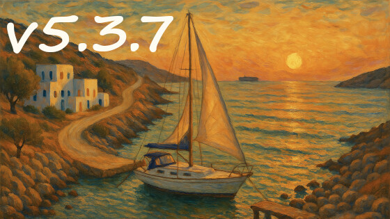
Title: It’s a Journey

image

PS: Completely AI generated using the Edge Copilot. With a prompt that took me 2 hours to refine :wink:

8 Likes

Maybe overstating the gap here - but illustrates the coming transition!

image

8 Likes

2 posts were merged into an existing topic: Discussion about AI created banner

Probably, one could find some inspirational images in the poem of the same name: The End of a Beautiful Era by Joseph Brodsky. An ax and a laurel? Or a tabby cat with a glass of wine?

I’d like to add: Springer’s entry and Xrizzy’s entries are very genuine and in keeping with the TW release tradition. Great work.

2 Likes

I like the general contrast of the tech. That kind of image does invoke tech change/evolution well.

FWIW, visually it caused me to think about the plot of Ayn Rand’s Atlas Shrugged.

Small point. If it is on a journey why is it moored?

I did want to leave it open if it is the start or an end of a journey.

Since the jib and the main sail are not secured, it can mean, that the boat is about to start or it just arrived. The crew is not finished to secure or to set sails.

In the prompt I defined “sun set” so it’s evening. There is almost no wind anymore, so it’s safe for the crew to be a bit “sloppy” :wink:

Jeremy indicated a desire for imagery beyond typography (and presumably the sunset gradient sky-imagery is not enough of that). If I have time, I’ll aim to add something. I’m determined, if I do more, to track at least one feature beyond the end-of-era theme.

1 Like

This picture reminded me about https://en.m.wikipedia.org/wiki/Xerxes’_pontoon_bridges

1 Like

Right.        

1 Like

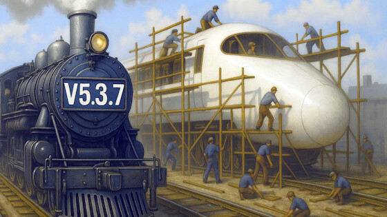
I think it is worth adding some people fixing the old train on the left, meaning that v5.3.7 has some bug fix.

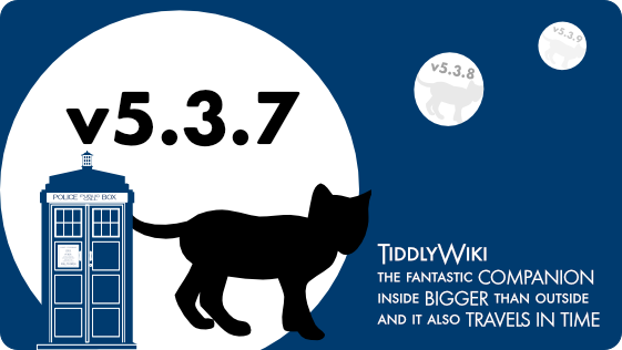
The Keywords journey and leading to the future inspired another banner. Maybe because for some reason unknown to me I always associated TiddlyWiki with the TARDIS:

TiddlyWiki Banner v5.3.7v2

I love all the other fresh banner ideas and the discussion is truely inspiring.

3 Likes

On the first glance the banner looks great and not like AI, but on the second glance it does, because it raises questions:

Shouldn’t there be a fairy? :thinking:
Shouldn’t the boat point in the opposite direction? :thinking:

Very inspiring though. :+1:

1 Like

Ha! Brilliant! The Tardis. Jeremy Ruston may be Dr. Who?