Autocomplete Plugin with Notebook theme

All,

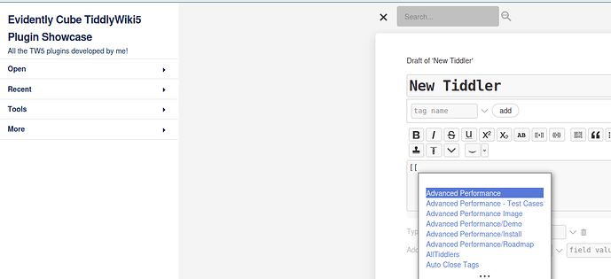
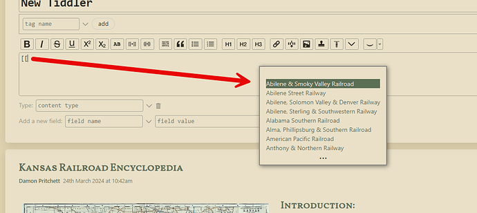
I recently updated my Kansas Railroad Wiki to using the Notebook theme. Ever since then the Autocomplete Plugin has been behaving strangely. See the screenshot below. As you can see, the popup when autocomplete is triggered is a considerable distance to the right and maybe even down slightly. This becomes a big problem if the trigger is towards the left of the screen.

I have unsuccessfully tried to use the developer tools to try to figure out what’s going on, but the popup disappears as soon as I invoke the developer tools. I’ve also dug through the Notebook theme and the Autocomplete plugin contents to see if anything pops out at me to no avail. I went back through my backup files to see when this started and it was immediately after I went to the notebook theme.

My version on tiddlyhost has been updated to this so you should be able to replicate the problem there. I tried and it happens.

Any help would be greatly appreciated.
Just bumping for attention. @Maurycy any thoughts?

I can confirm this happens, but only if the sidebar is opened.

I guess that AC calculates the horizontal position of the popup as if the whole page contents were inside one div (the one with tc-dropzone class), as it is in Vanilla theme regardless of sidebar visibility.
In Notebook theme however, the div.tc-dropzone shrinks when sidebar is opened, so the horizontal position of the popup will be off by the sidebar’s width.

I suspect this is the responsible part in $:/plugins/EvidentlyCube/AutoComplete/integration-core.js:

		function getCaretCoordinates() {
			const baseCoords = activeDom.getBoundingClientRect();
			const domDocument = activeDom.getRootNode();
			const domWindow = domDocument.defaultView;
			const caretCoords = getBaseCaretCoordinates(activeDom, selectionStart);
			const domScroll = {left: -activeDom.scrollLeft, top: -activeDom.scrollTop};
			const containingIframe = getContainingIframe(activeDom);
			const iframeCoords = getIframeOffset(containingIframe);
			const parentWindowCoords = containingIframe
				? {left: containingIframe.ownerDocument.defaultView.scrollX, top: containingIframe.ownerDocument.defaultView.scrollY}
				: {left: 0, top: 0};

			const totalCoords = sumCoords([baseCoords, caretCoords, iframeCoords, parentWindowCoords, domScroll]);

			return {
				left: totalCoords.left + domWindow.scrollX,
				top:  totalCoords.top  + domWindow.scrollY + caretCoords.height
			}
		}

		function sumCoords(coords) {
			const totalCoords = {left: 0, top: 0};
			for(const coord of coords) {
				totalCoords.left += coord.left;
				totalCoords.top += coord.top;
			}

			return totalCoords;
		}

I too would be very haopy if it could be adapted to work with Notebook.

Perhaps the issue can be solved on the theme side, by rearranging how the elements are placed, I don’t know what is easier and I’m afraid I’m unable to do any of these things by myself.

Thanks. That’s definitely something to look at. I didn’t notice the behavior in relation to the sidebar.

I’ll take a look at this in coming days - the calculation for where to place the auto complete dialog should align it to the text area, but I’ve never thoroughly tested it so I’ll see what can be done about it.

2 Likes

I tried to fix this quite a while ago. I created a new configuration to set the offset values to make it look right. I only changed it for when the sidebar is open though since I always use it that way.

So the issue is kind of caused by the theme doing things in a particular (not necessarily incorrect) way:

The entire content has a left margin of 350px and top margin of 50px. The caret position gets calculated correctly, as well as the location of the autocomplete window. The problem is the autocomplete window is placed in the same content that’s shifted by (350, 50); and the way CSS works, position: absolute is relative to the closest parent that has position: relative, which happens to be the container that’s already shifted - so the shift is doubled.

I could work it out in JS but I admit I kind of hate doing it this way because it’s bound to break somewhere else.

Instead I’ll see about the option to place the autocomplete window in a part of the HTML that has no risk of being marginalized.

And fixed:

Ultimately I couldn’t move the autocomplete window anywhere else so I opted for a small workaround which should hopefully work everywhere always.

1 Like

Everywhere and always – is a good thing :wink: Thanks for feedback.

I can confirm the popup displays correctly with Notebook theme now; and it displays correctly as it used to with the default theme. Many thanks for fixing this!

I have found an issue, likely introduced due to these changes.

The horizontal position of the popup is alright, regardless if sidebar opened or not, both in vanilla and notebook themes.

The vertical position however, not always.
It seems to be always right if the edited tiddler is the topmost in the story river.
If there are other tiddlers in the story river above the edited one, the popup will sometimes be displayed far below the expected position.
Steps to reproduce on plugin demo:

  1. Create a new tiddler.
  2. Move it below the long Auto Complete tiddler using the Open tab in sidebar.
  3. Type [[ in the new tiddler.
  4. The popup will be displayed well off below.

This behaves quite similarly both in the vanilla and notebook theme.
Happend on all platforms I have tested so far, that is Edge/Windows, Brave/Android, Firefox/Android.

It must be because of the changes! Thanks, I’ll look into it.

1 Like

Fixed in 1.0.20, thanks for reporting!

2 Likes