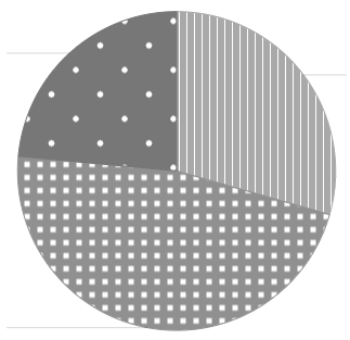
I’m just dabbling with pie charts, and started wondering about setting them up so they work for folk who are colourblind.
Here’s one approach I’m wondering if it would work:

I’m just dabbling with pie charts, and started wondering about setting them up so they work for folk who are colourblind.
Here’s one approach I’m wondering if it would work:
Spontaneous thought: Simply give the pieslice sides a distinct line colour (e.g black)?
There are some color scales intended to be readable for both color-blind or when desaturated, e.g. viridis, magma, plasma.
Here’s an introduction to their implementation in R, it includes a nice comparison of how those color scales look for color-blid: Introduction to the viridis color maps
After a quick search I also found this tool that creates a desired number of distinct colors from those palettes, these could be used as colors of the pie chart: Viridis Palette Generator
I agree.
The next step will be the use of patterns (with the line in the pieslices would be better.)