Analysing TiddlyWiki 5 on GitHub

I came across this fascinating tool that analyses GitHub repos for open source projects, and generates some very interesting statistics and graphs:

https://ossinsight.io/analyze/Jermolene/TiddlyWiki5

Of course it only covers activity on GitHub, but within that constraint gives a good picture of TiddlyWiki’s development over time. In particular, it helps us to look behind the very visible number of open issues and PRs, and see the actually quite decent progress we make on issues and PRs that are closed/merged.

Here are some interesting snippets but I strongly recommend having a look as many of the charts are interactive.

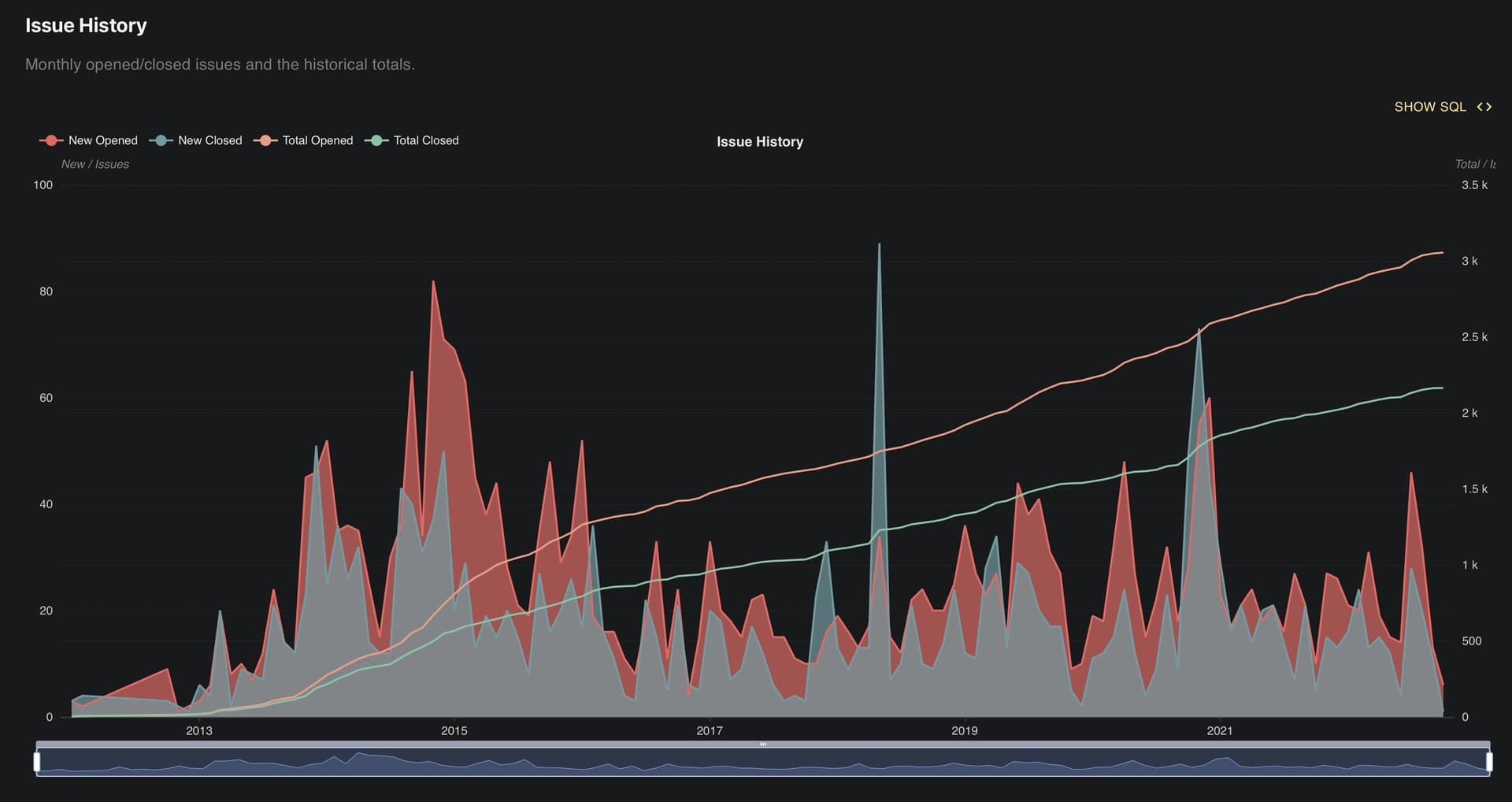
First, here’s a view of the history of the number of issues opened or closed each month. It shows that we do manage to deal with the majority of incoming issues.

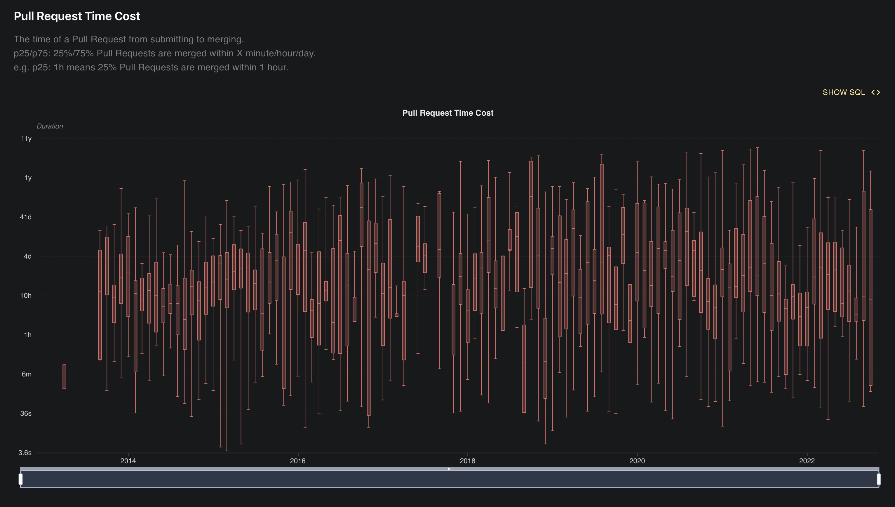
Here’s the time of a Pull Request from submitting to merging. Again, it shows that a decent proportion of PRs are merged within a few hours of submission.

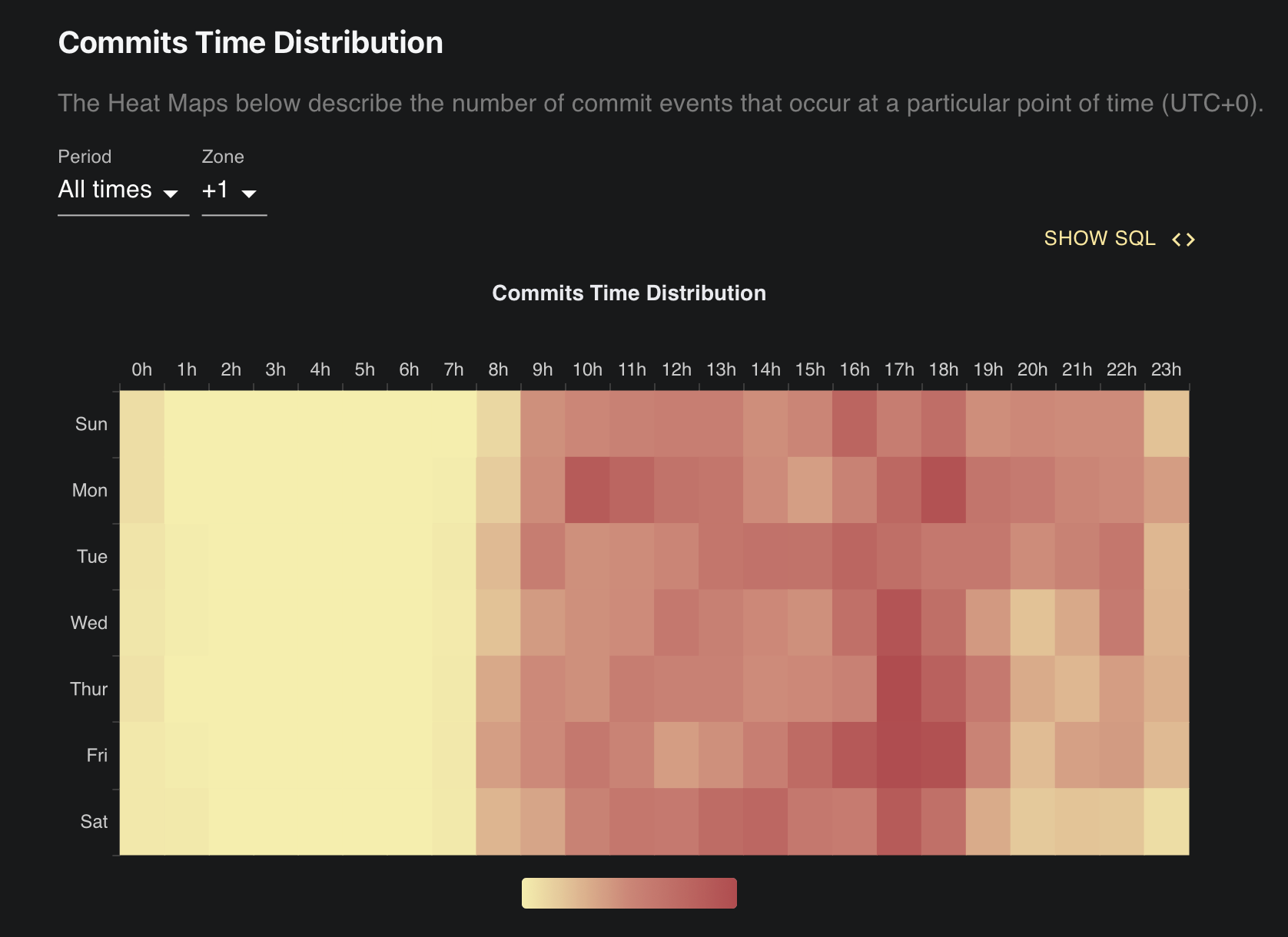
This heatmap of commit times show that Friday afternoon is the most popular time to submit changes to TW5:

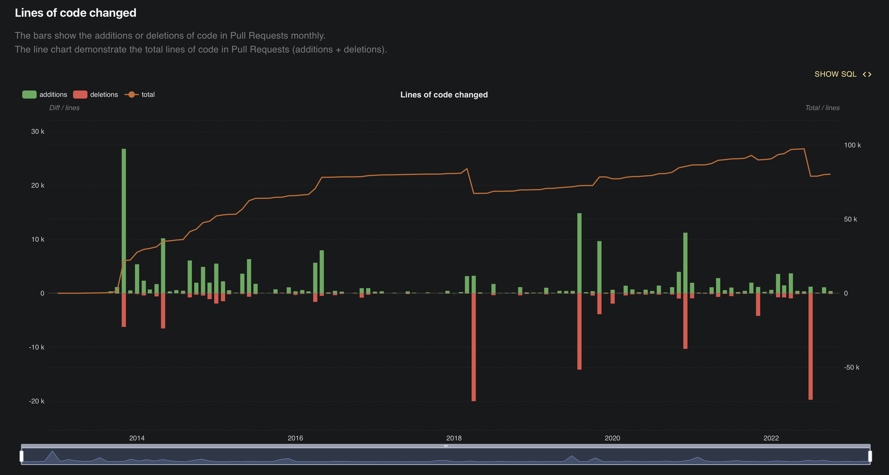
This chart of the change in the number of lines of code shows a gentle but fairly consistent growth:

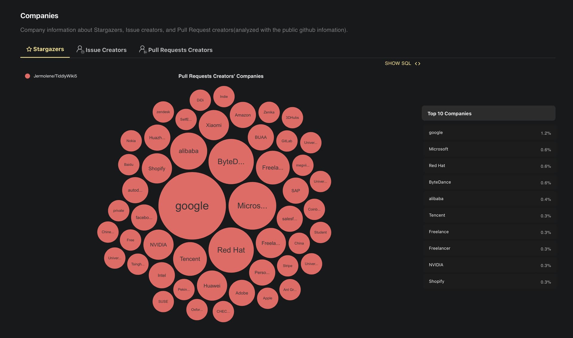
This chart shows the company affiliations claimed by the people giving TiddlyWiki stars. Good to see the big tech companies well represented:

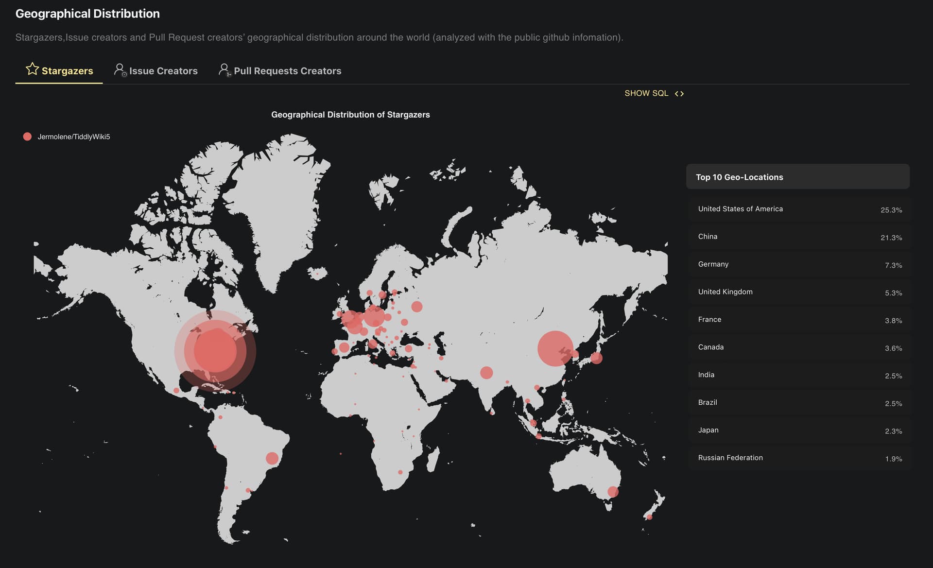
Finally, here’s a chart of the geographical breakdown of the people giving GitHub stars:

6 Likes

Whoah! Seriously interesting and I think useful.

I found the Country Map particularly interesting as a kind of clue to where folk are who are likely seriously involved with TW … (The relatively low level in the UK, and the high level in China, struck me too.) Best, TT

Bear in mind that UK population is around 67 million while China’s is 1.4 billion.

Right.

But my point really is that the expansive real use (& dev of TW) is not English solo (or just of other Europeans who know the English language well).
I was (happily) surprised by that trend.

It is saying something I think?

Just a comment, TT

All these numbers are relative to GitHub. So it might reflect a higher interest in GH, rather than TW, per se.

The concentric rings in the U.S. make it look like that war room scene in War Games.

Yes, I agree. Also to consider that the need for decentralised, open-source software in China is higher than ever.

1 Like

Good point!

Looking at it I really didn’t have my social scientist hat on. Why? I really do not want to have to do work after work! :slight_smile:

Right. (Also Greenland is too big. :slight_smile:)

All of that stuff has “sort of” agendas on presentation that ARE some kinda throbbing soap drama a visual designer fell into.

Nevertheless I think it interesting.
Probably not definitive, but indicative of some usage patterns that may be real?

IF the China thing is real then I think it matters.

Given that the “Chinese Community Plugin Library” is far and away the biggest plugin library we have, I think the China stats in GitHub may be reasonably accurate on actual commitment? Dunno.

TT

You’re right. It’s way too big – bigger than Africa or South America.

1 Like

And Antarctica too small :wink:

But seriously, nothing from California? Washington state?

1 Like

I don’t think the geography is that targeted. Each circle represents one country, but not the precise location inside that country. I think they chose the capital of the country for the center of the circle. What I don’t understand is the multiple concentric circles in the U.S.

1 Like

Lol! I think that “throb effect” is just a designer’s flourish; them thinking that “No.1” should be shown differently?

Side comment, TT