Alternative look for editing fields

I might have posted about this before, but the way $:/core/ui/EditTemplate/fields has changed in more recent versions of TW (5.2.1+) and I have been unable to recreate this look of the field editor where there is less of a visual break between the existing field data and for adding a new field.
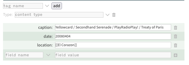
Screen Shot 2023-05-22 at 10.29.45 PM

I did this by creating a new tr and transcluding various parts, as you can see at the bottom of the following attachment.

ModifiedFieldArea.tid (3.8 KB)

Any help in figuring out how to split out the different functions so I can transclude them so I can replicate the look will be greatly appreciated.

This GitHub issue might be related? [BUG] Reuse of $:/core/ui/EditTemplate/fields broken in v5.2.3 · Issue #7054 · Jermolene/TiddlyWiki5 · GitHub
@markkerrigan one of the key differences with TiddlyWiki field editing is the introduction of the Field Editor cascade and instructions how to use them Customizing EditTemplate field rendering.

Pulling the new fieldname into the same table may be unnecessarily difficult because it is not the same as a regular field edit, and an alternative add field can be introduced by tagging it $:/tags/EditTemplate

If you are going to this effort can I suggest a new tag such as $:/tags/field-edit-toolbar that allows the introduction of other buttons with each field editor line.

I have planned to do this myself, so may share back some results.

[edited] I am investigating and see how the change you want to make is not catered for in the new mechanisium. The layout and iteration of the field editors are contained in $:/core/ui/EditTemplate/fields which is itself introduced with the $:/tags/EditTemplate tag. I suggest clone $:/core/ui/EditTemplate/fields and modify it how you want and when finished remove the $:/tags/EditTemplate from $:/core/ui/EditTemplate/fields to remove the default field editor.

@TW_Tones , eagerly awaiting your work.

In the mean time I did manage to get a working solution. I’m sure it could be improved to look nicer but it’s good enough for me.

EditFieldInfo.json (9.7 KB)

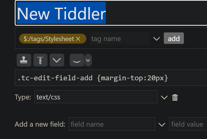
If I understand you right, this should be a simple CSS matter. This shows how the field-adding part is pushed down 20 px (after I created the tiddler, saved it, and repoened). Note the tag and the type:

image