Hi all,
now many years my taskmanager is going onto my nerves, I try again the TW-plugin ToDoNow (https://tid.li/tw5/tdn.html).
But I adjusted it for my needs and want to adjust it more.
For that I have several questions:
1. How to transclude additional information in subtasks?
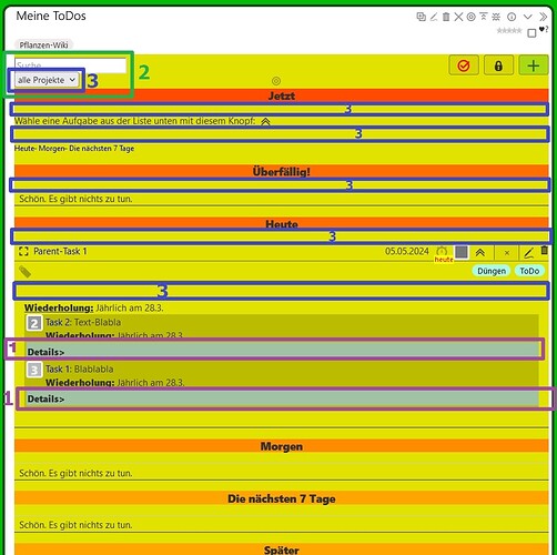
(In the picture lila with number 1)
I have parent-tasks with due-dates and subtasks with priorities.
These subtasks are related to other tiddlers.
And in this related tiddler the subtasks is transcluded.
In the picture I made the parent-task “parent-task 1”. When I click the “…”, then the subtasks are shown (here “Task 1” & “Task 2”). And there I want to transclude inside of the details-widget the text of the related tiddler.
At the moment I solved this wish by writing the details-widget with the tiddler-transclusion inside the subtasks.
But that has the great disadvantage, that these details are also shown in the related tiddler. This is not needed, nonsense, space-taking & irritating. Means the text of the related tiddler then looks like:
Text bla and bla and blablabla
Details
Text bla and bla and blablabla.
How can I avoid that? Or to say: How can I show that “details” in the subtask, but not in the related task?
'2. There is a search and a user-filter (green, number 2) in the “waiting”. This is fantastic, but I need to have it not only for the “waiting” tasks, but for all tasks. How can I adjust them both, so that the search and the filter work for all tasks?
'3. Saving space (blue, number 3)
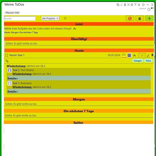
- The project-filter (“all-projects”) should be on the right side of the search (or alternatively, the search on the right side of the project-filter), so both next to eachother.
- The user-filter should be on the right side of the project-filter, so both next to eachother.
- All these -in my point of view- wasted space inside the blue rectangles I want to erase. But how??
Marked picture:
Wished optic:
Thanks in advane for your help 
Noushka
TW 5.1.21, Firefox, Windows 10

