Add tooltip to RangeWidget (slider)

Hello,
any idea, how to add a tooltip when hover slider?
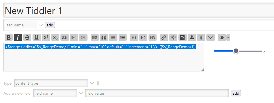
grafik


Here the example from https://tiddlywiki.com/

<$range tiddler="$:/_RangeDemo/1" min="-1" max="10" default="1" increment="1"/> {{$:/_RangeDemo/1}}

Where is the the blue color on the left side of the slider defined?

Thanks, Stefan

The styling of thost things are actually browser defined. You can target the various parts though, do some googling but here is one example. It might be possible to add a tooltip purely via CSS, i.e by using e.g a :before or :after pseudo element and the content:"..." attribute, and then have it show if :hover

G’day,

As a workaround for now (actually, I’d prefer this to a tooltip parameter), give this a spin:

<div title="Some long tooltip message that could be from a transclusion.">
<$range tiddler="$:/_RangeDemo/1" min="-1" max="10" default="1" increment="1"/> 
</div>
2 Likes

Wow, thats it - thanks @Charlie_Veniot :+1:

Thanks for feedback.
I’m using that code, but wasn’t able to style the left side different to the right side of the thumb. (→ will google…)

Took solution from @Charlie_Veniot

If for whatever reason at all you would prefer not use the “div” html tags, you could always use a custom tag.

For example, with a custom tag like, not particularly fun/creative,“thistip”:

<thistip title="Some long tooltip message that could be from a transclusion.">
<$range tiddler="$:/_RangeDemo/1" min="-1" max="10" default="1" increment="1"/> 
</thistip>

You could take advantage of custom tags to document what’s going on, and highlight a block of code.

<RANGE-WIDGET-FOR-SUCH-AND-SUCH  title="Some long tooltip message that could be from a transclusion.">
    <$range tiddler="$:/_RangeDemo/1" min="-1" max="10" default="1" increment="1"/> 
</RANGE-WIDGET-FOR-SUCH-AND-SUCH>