Add Notes and Figures to Tiddlers in View Mode - Tufte Style

Ha Ha, this demonstrates the value of diverse perspectives, My policy is to invest an additional 10-20% effort on the first case (yes 110% to 130%), so the second only needs 80% of the effort and future cases a fraction of the first two.

  • Although I admit this approach may be more important to a person like myself who always try’s to extract concepts not specifics.
  • Although you can see my approach is only “cost neutral” if it needs to be done twice, and cost beneficial if used three or more times.
  • But I suspect there are other attributes of my character that push me to this different approach :nerd_face:

Absolutely!

I do try not to be stupid about it. If an abstraction costs very little I will make it.

But I generally find that if I try to abstract something based only on my first example, I make too many wrong assumptions, and end up wasting time overall as I try to undo the knots I’ve tied myself into.

I find that when I start orienting to the larger problem upon my first encounter with a niggly problem that could recur, I end up — as I’ve learned recently to say — spending most of my time shaving yaks.

1 Like

Careful of your vocabulary, @Springer, or we’ll end up making a full-fledged coder out of you.

And you’ll never be invited to the cool parties again!

SHAVING YAKS (endless)

use your very own mini-Burrough’s machine to find variants like…

SHAVING SEALS (ended before the start)
SHAVING ANTELOPE (I’m fast)
SHAVING RUSTON (something NOT allowed)

Side comment
TT


cc: @jeremyruston

I read the thread with much interest.

I have a general comment on thread naming …

I do have pet peeves on invoking Tufte (ET) on this.

Tufte, greatest book designer of informational books (physical), is NOT really known for web layouts.

So, we are not dealing with physical books. Or Tufte.

Should we call it “Wellufte” instead?

Negative over, I’ll comment more later.
TT

There is a lot of discussion in the thread about “alignment”.

More interesting to me is “CONTAINMENT” within a tiddler …

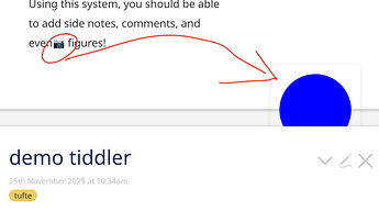
This is an example where it breaks …

Maybe CSS can be used to contain that image?

TT

If the blue circle image is being displayed with a “float:right” CSS attribute then it can “leak” out beyond the end of the tiddler frame. To fix this, you could add a <div style="clear:both;"/> at the end of the tiddler content

-e

1 Like

As a non-programmer I read the thread thinking on THE ALIGNMENT PROBLEM,

Your Bible challenges were very astute & pertinent.

But, maybe lacking, are some more, soft-coding, radical CSS solutions?

My Q: is this a hard-code issue? Or more a CSS presentation? (especially hide and reveal).

Just a thought from a naive
TT

Since v5.3.6 there is are new Utility Classes. One is tc-clearfix, which should “contain” rouge floats.

They have been added to the EditTemplate body, the ViewTemplate body, title and subtitle elements.

So something as shown in the screenshot should be “contained” already. @TiddlyTitch … Do you have a testcase?

1 Like

That was a test case on the author’s site inserting an image (reproduce it at: https://tufte-style.tiddlyhost.com/).

I’m certainly glad to see this demo getting some attention. I was quite pleased with it at the time, and surprised it didn’t receive any attention.

There are definitely alignment problems with it – moreover, the containment issue is one I believe just needs more thinking through in order to find the right solution.

I certainly invite anyone to toy around with it, or to at least offer suggestions :slight_smile:

1 Like

The images have a position: absolute hardcoded – So the browser does what it is told to do. The image wrapper needs to be fixed.

1 Like

Oh, I absolutely want to solve this with CSS as much as I can. I consider myself reasonably adept with CSS, if not always up-to-date with the latest goodies. But I couldn’t find a way to do this on my own. I reached out for help on a CSS forum and received only one answer, one that still relied on JS.

I do believe that the technique I used for the Cornell notes might work for many of the other uses here. They would still fail @Springer’s white-space criteria, but might capture everything else. I will sometime soon (well, maybe not before the weekend) see if I can make them generic enough.

1 Like

@TiddlyTitch, it looks like I had an improved version of the demo available which fixes the containment issue you noted:

1 Like

I’m curious whether there’s anything about the selection (including its start point) that is retained in the background, even though the note flag draws attention only to end-point (much as a footnote does).

Is there a logic to having people select a chunk of text prior to using the context menu, rather than just placing the cursor, given that the note seems to hook only at that single end-point?

1 Like

Oooo, how did I not absorb that fact?

Thanks, @pmario It’s easy to lose track of such things, especially since I had been cobbling together my own workarounds, and there were other flashier new features to learn. But now I’ll start to do it this way, so my solutions will be more uniform and shareable.

The explanation for why this only references the end point was to make it more similar to the tufte style – you make an excellent point that there’s an opportunity here to communicate more information with minimal effort

1 Like

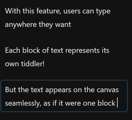
6 posts were split to a new topic: Floating associated content beside main text

6 posts were merged into an existing topic: Floating associated content beside main text