Hello to all you TW experts.
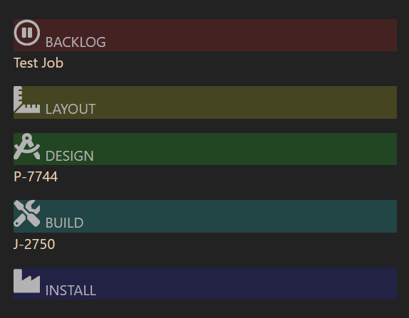
I have a question about tables. I created a table which consists of five columns for my work-related project flow. It is basically a kanban where I drag projects from one column to another as certain stages in the process are completed.
This is the table:
|tc-max-width tc-table-no-border|k
|^{{$:/JMW/dashboard/jobsBacklog}} |^{{$:/JMW/dashboard/jobsLayout}} |^{{$:/JMW/dashboard/jobsDesign}} |^{{$:/JMW/dashboard/jobsBuild}} |^{{$:/JMW/dashboard/jobsInstall}} | |
It pulls in other tiddlers that define what is in the columns and provides a dropzone for changing project tiddlers from one column to another. It looks something like this:
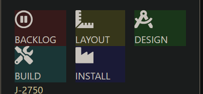
On my phone the columns are too wide and overflow the screen in portrait mode. Is there a way to change the table to instead show something like this for small screens? I am great at cut and paste, not so much at new development  .
.

Basically I would like to see five columns on wider screens and three columns / two rows on narrow ones.

