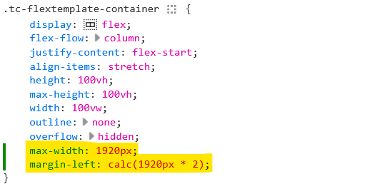
I combine a flexbox based layout with a max-width for columns (which may or may not be story rivers). Without a max-width flexbox based columns get really unwieldy in large windows as you have described.
I see, I plan making the width of the sidebar configurable which is obviously important. For the amount of story rivers I plan that you can use as many as you like. I think it’s better not to hardcode just two.
Would that fit your needs better?
I can imagine setting different widths for different rivers. But I believe I don’t understand your idea well enough…
Thanks,
Simon
I’m not sure about different rivers, unless you mean dividing the river to end up with notional sub-rivers.
Regardless, here’s a quick hack. Note, I may not have chosen the most apt or efficacious placement for it, but it’s constraining the current flexbox/river to the (in this case) third screen:

Not sure that needs to be addressed. Anyone that has code that already messes with the sidebar would want it to remain as-is (I’d think).
But maybe I’m not understanding what you mean… ?
try this:
.tc-flex-second-child {
  display: flex;
  flex-direction: row;
  flex: auto;
  max-height: 100%;
  position: relative;
  overflow-x: hidden;
  margin-left: 50%;
}
Simon, it would be easy to get into the weeds on this, so just focus on this – then you’ll be good, I think:
If that assumption was removed from the code, I’d be very happy. But this is just me – if you want to ignore my requirements, I’ll understand completely. It’s a unique requirement that only I (it seems) require.
Have you considered using CSS Grid instead of Flexbox?
While Flexbox is great for controlling one-dimensional layout, with CSS Grid’s two-dimensional focus, you should be able to provide much more flexibility with TiddlyWiki layout alternatives.
Hi @Craig_Cecil and welcome to this Forum 
No I haven’t considered Grid for this… I try not to use Grid, I don’t know why.
I use Grid when there’s no other solution for a layouting problem.
But I would welcome some examples where it would make sense 
Thank you!
Simon
@CodaCoder there is another approach for multi screen setups. Additional windows spawned from the one wiki.
With recent improvements its possible to build window management tools, Open, close, find and navigate between windows, Advantages include;
- you can design windows with or without a story of its own.
- you can pull a window or another app in front/behind on each screen with the others visible.
- windows can consume only part of the screen they are on or view full-screen.
- windows can all be layered on one screen.
- multiple wikis could be similtaniously spread accross multiple windows and screens and the operating systems tools can also be used to navigate between windows including more than one browser.
- each window could have its own behaviours and be addressed seperatly.
All you need is one or more window templates defined with the content and layout you desire then open the ones you want.
- perhaps a way could be found to select or emulate a different layout in each window.
This approach remains to be explored in depth but it may be superior to a single wiki visible in one window stretched accross multiple screens.
I love watching these layouts develop, and I keep wondering when I’ll find a need for it in my own work. I never seem to need it… which I find sad, as I really like MCL and this looks like it’ll be great too.
How is that different from the default TW layout, which already has that? (Except that somehow it doesn’t in your demo if you switch to the default page template. Hmm…)
hmm, Interesting.
But on my screen the right sidebar uses way too much space. The screen is 3440 x 1440
Thanks @Scott_Sauyet
I love tinkering on these layout, learning CSS and wikitext is fun
It MOVES in and out, the default page template jumps. In my demo in the default pagetemplate there’s no sidebar-button  because it’s removed for a menubar experiment
Now there’s a new invention in link handling
- links to tiddlers that are open in one of the open columns scroll those tiddlers into view instead of opening the tiddler again in the current column
- links to tiddlers that aren’t open in any of the open columns open the tiddler in the current column
- shift-click on a tiddler link always opens the tiddler in the next column to the right
I’ve also fixed some layout problems and made the basic layout for mobile view (it’s not finished)
Best wishes,
Simon
This looks pretty cool. I haven’t really toyed with multicolumn layouts yet. I love the toolbars, headers, footers etc.
For the side bar size have you toyed with plugins like the SideBar Resizer? - Where you can resize it by dragging it wider/narrower?
Thanks @baiguai
In the past I did many experiments with sidebar resizers and things alike and I came to the decision that I don’t need them, but they are a nice thing to have.
If I find one that works very well I could try making it work with this Layout, maybe as an AddOn
Thank you,
Simon
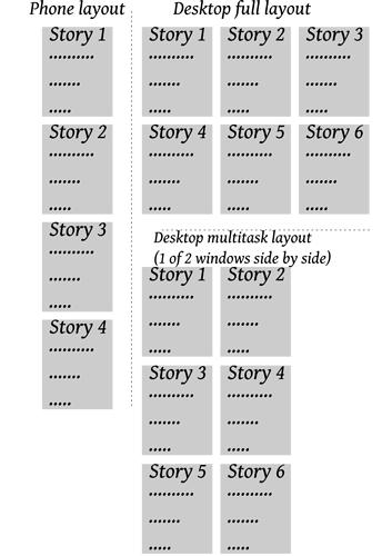
I’m new to Tiddlywiki and going through Grok Tiddlywiki right now to learn. A saw this forum post and thought it was close to what I wanted in layouts compared to standard TW. What I want is a multi column story river which fill the screen (kind of like how email utilizes columns: folders on the left, emails list in the middle, and content on the right). So if I had my tiddlywiki on my computer I could have multiple tiddlers visible and editable if needed, but on my phone where space is limited it would switch to a one column river (default TW). Having learned of MCL and flexbox from this forum post, I tried both out on my computer, but they remain several columns if you shrink the window (meaning you have to scroll horizontally). Would it be possible to have the columns dynamically adjust to windows/screen size? So it has the columns in a full window, but if you tile the window to 1/2 screen it would only display only how many columns would fit in that space without horizontal scrolling. I have a quick drawing of what I mean in case my explanation was lacking.
I think that may depend on how you use it. Have a look at the column count, it may be you have multiple columns open but only a certian number displayed, so it “overflows”, perhaps raise a question, or reply in an existing MCL Focused thread.
I changed the $:/DefaultTiddlers from [list[$:/StoryList]] to [tag[About]]. Add Home button to Page Controls and click on it!
But Home button does not work! Is this an issue with tm-home or something missed here?


