A multi-column Layout / Storyview

#Issues Arising – beta v75.0

Ciao @BurningTreeC

MLC: v75.0
Platform: Win10
Browser: FF & Chrome latest
Ensemble: Unmodified “Default”

Couple of things to do with configuration …

Neither setting is important for my use cases, but I did find it a bit confusing.

Best wishes, TT

@TiddlyTweeter

These changes are only visible if you also set the hamburger top panel to yes

1 Like

Hi all,

I’ve released v0.76.0 which contains some important fixes
The Demo Page now contains a little experiment: A top toolbar in GitHub style. This is not part of the plugin. Maybe I’ll release it as an AddOn …

Best wishes,
Simon

2 Likes

That is looking interesting, the new toolbar. a plugin would be good to allow it in regular tiddlers.

  • My occasional review and feedback (I am testing on large desktop screens, but will mobile eventually)
  • Love the jump to and full screen editing
  • More of my sidebar addons are working now which did not before

A lot of water is passing under this bridge as we pass 400 replies on this thread. Please forgive me if I say something already addressed.

  • I assume you too see the documentation ensemble is unusable at least with those titles and the buttons? Using Panorama if OK
    • I would like to see the buttons go behind a hamburger menu and resize the titles “out of the box”
  • I notice in documentation you use the tag-pill <<tag-pill "$:/tags/TopToolbar">> but not sure why, using <<tag "$:/tags/TopToolbar">> is not display only, it has the drop down so can you can see items so tagged.
    • It also allows access to a suite of tag tools I have a package for that appear in the drop down
  • After installing the plugin in a fresh pre-release it would be good to at least mention in the read me that a layout is installed and to use ctrl-shift-L
  • I like most of the default config options but as a start using the following is easier
    • show the hamburger buttons in a top panel = yes
    • show the page controls in the top hamburger panel = yes

Questions

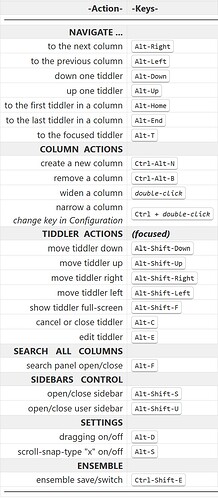
  • How do we use modifier key to make columns more narrow?

That’s enough for now, I will keep reviewing.

Very impressive @BurningTreeC !

Thanks, you mean a separate plugin for use outside of the multi-column layout? That’d be a bit difficult but maybe …

I guess I should split this thread up into another thread?
You can say whatever you like to say, free speech here :slightly_smiling_face:

You mean - the titles are too large and the ViewToolbar buttons take too much space?

Yes that’s true, I will change that

Thanks, I’ll update the Readme

Hmm… yes, that won’t be wrong

Hold the modifier key and double click on the small top bar above the story rivers. That makes a column more narrow if it’s been made wider before

Thank you @TW_Tones !

Best wishes,
Simon

Yes, exactly.

My pleasure @BurningTreeC we are all investing in this, especially you.

I think I remember that I’ve already said before, that I don’t want to make adjustments in that direction. Users should be free to add modifications on their own. I personally am ok with the presentation of the titles and the ViewToolbar buttons but I also understand your point of view. I think you can address both issues in a very simple way and I don’t want to add an opinionated modification to the plugin. The issue with the big tiddler titles can be addressed with max three lines of css and the issue with the toolbar buttons can be fixed hiding the buttons through the control panel for example, there’s an option to do so

But it uses the “$:/tags/TopToolbar” method, right?

I liked it because it is a good example of practical use of MCL??

That is what is great. That you can have many variant layouts under one system??

Just a comment
TT

That’s correct

Yes, that’s what I’m trying to showcase with the GitHub Top-Toolbar

If I’m allowed to comment? :smiley:.

I agree. The point is that with this approach to layout it is very easy for “makers” of wikis to re-style to their hearts content within an “Ensemble”.

What I hope is longer-term there will be a “library of Ensembles” with very diverse approaches to design?

Just a comment
TT

Right. It is far better than my “Kapow!” as it actually does things.

I think it is a better (more flexible) approach than most anything we have had to date.

Just a comment
TT

Yes, I had mentioned this before. I expected you may have smoothed it out with all the activity here.

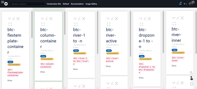
Of course you can address this however you wish. However I think this negative impression of mine may be related to my screen size. If I go to MultiColumn Layout — a non-linear personal web notebook and click Documentation I see this;

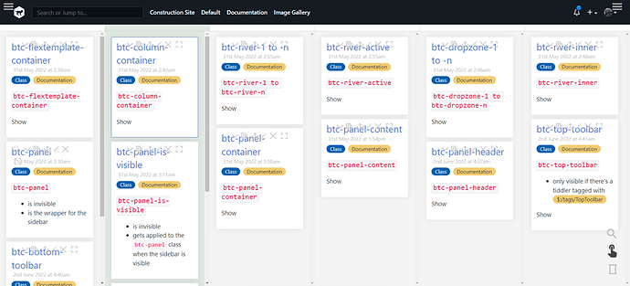
Then I apply my imperfect customisation and it gets a little better;

  • Which still needs work

But arguably this “out of the Box” documentation ensemble is almost unusable, at least on my screen layout. My only obligation is to share what I see and there is no obligation on your part.

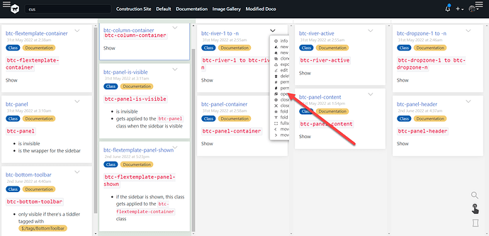
Finally here I did the following;

  • reduce columns by 1, trim padding
  • move all viewToolbar items behind more (to simulate a hamburger menu)
    • Note the z-index and direction needs to be changed for the menu

  • now perhaps the ability to shrink, hide/show the subtitle and tags will make it more readable.

Regards
Tones

Yes @TW_Tones , this is an outstanding task and I’m not quite sure if it’s only a z-index issue
If anyone has an idea how to solve this issue, I’m very open for ideas!

Best wishes,
Simon

1 Like

I’m moving towards that.
I have draft documentation I’ll put on line for you soonish.

Right now I’d be interested in whether you think this kind of approach could be useful?
It is a presentation of stuff you documented already. But in a slightly different way …

Would this kind of approach be useful?

TT

Just an idea. Not sure whether its doable.
Drag the border of the columns to resize the columns

1 Like

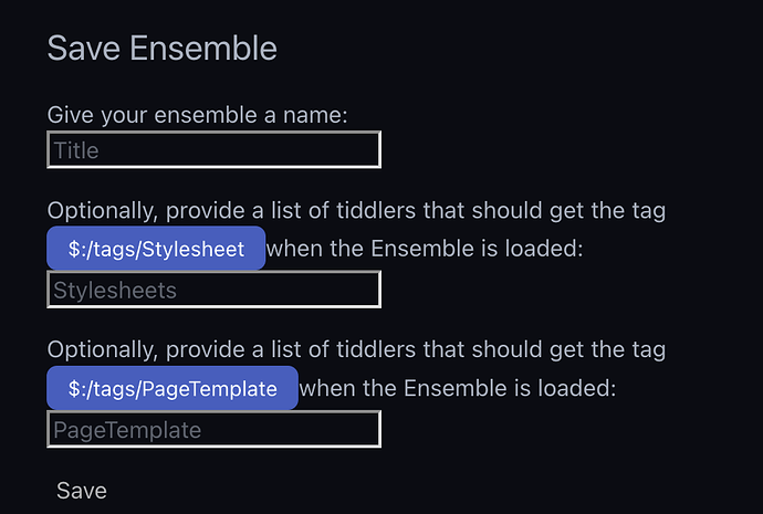
Can there be an option to add a list of tiddlers to get the tag $:/tags/PageTemplatewhen a particular ensemble is loaded?

I think ensemble provides a huge scope for customising our wiki for various purposes. I was trying to make an ensemble with Krystal horizontal layout plug in by keeping the storyview as horizontal (instead of multicolumn) and layout as default (instead of multicolumn). It was working, but I needed one tiddler to have this tag $:/tags/PageTemplate

Very true.

It is a great innovation.

But I don’t think it should be for anything other than dedicated MCL use first.

My thoughts
TT

I was just quoting an example which I tried yesterday. There might be similar usecases for MCL also.

1 Like

Hi @TiddlyTweeter,

yes this documentation approach would be very useful! :slight_smile:

Best wishes,
Simon

1 Like

Hi @arunnbabu81 , doable yes, but I don’t want to add this since it’s very complicated. I’ve already tried do do something like that before and I figured that it’s not worth the effort