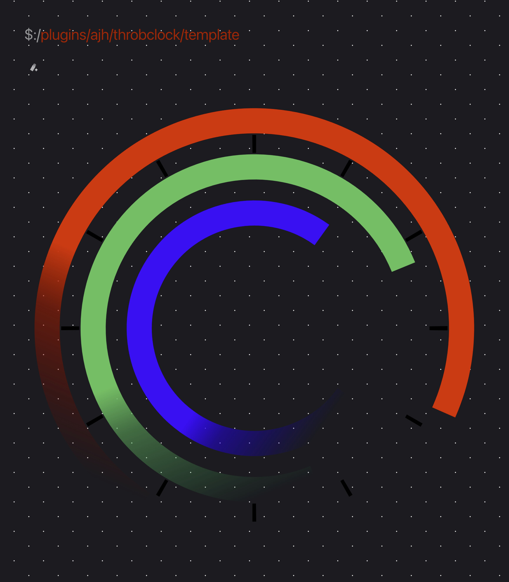
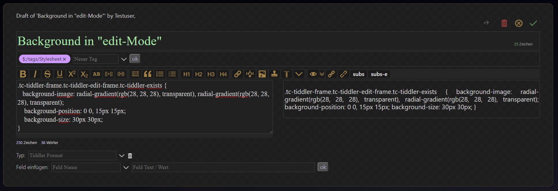
Mohammad, on my browser, your code yields rather distracting tiny dots. But removing the 1px and 0 numbers within the radial-gradient does yield something interesting. So I wonder whether this is what you intended:
Mohammad, I was assuming the tiny dots might not be intended, simply because they didn’t seem to take full advantage of the gradient and transparency aspects of the css. Also, on some light backgrounds I could hardly see the dots, while on dark backgrounds I found the dots could result in a bit of distraction around small text within transparent elements (in a sidebar, for example). Still, they are quite crisp and stylish.
I certainly like your idea of a background-image pattern that looks somewhat different against different backgrounds.
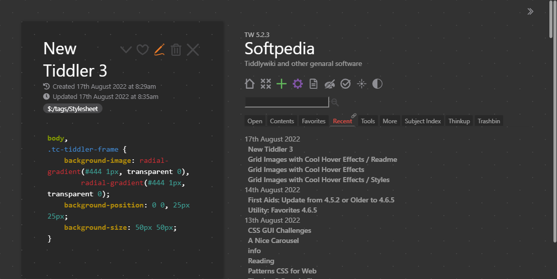
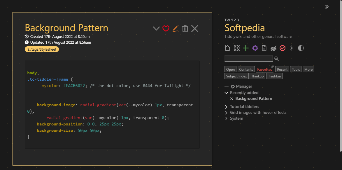
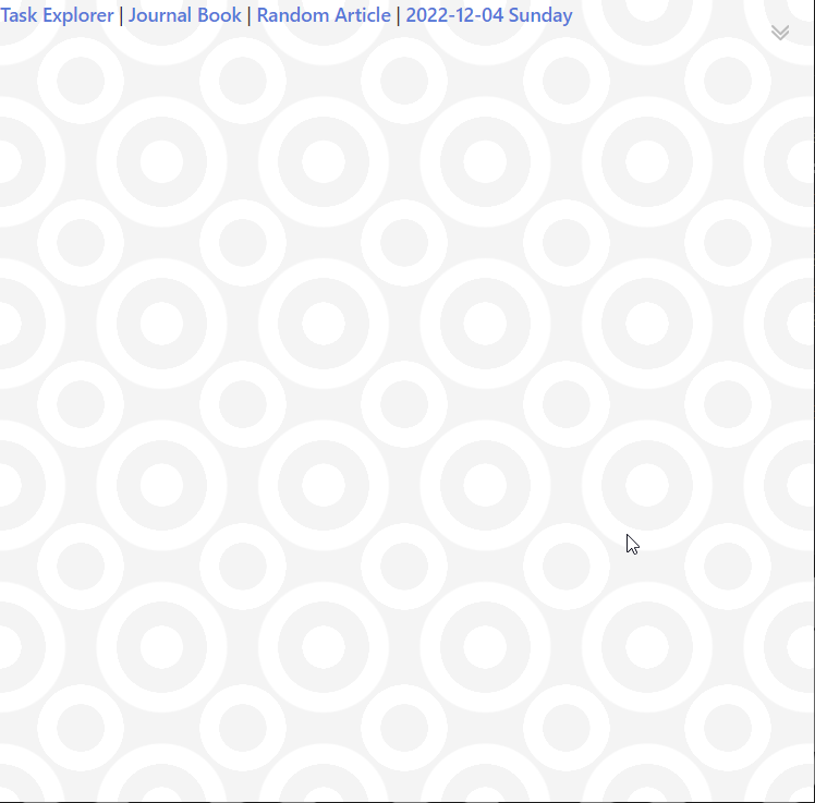
I think it is the problem with dash rule, your stylesheet have to start with \rules except dash.
I have other problem maybe with my computer, I can appreciate any background, but if I remove the line of background-blend-mode: lighten; then I can se the pattern in black and white.
Alvaro, yes the \rules except dash was the trick, in addition to choosing a theme with a non-white background color. I’ve also removed the strangely long decimal values.