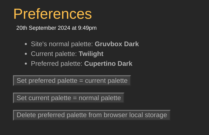
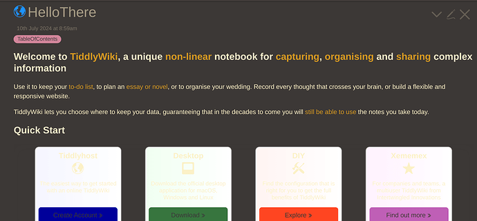
The specific display issue you illustrate in your screenshot is that the “Quickstart cards” text and svg icon color changes with selected palette, but the card backgrounds do not. As a result, the text icons are virtually impossible to see.
The TL/DR response is that the content in HelloThere was designed for use on TiddlyWiki.com with the default palette, and is simply not responsive to alternative palette selections.
Here’s some details about how this happens:
In the HelloThere tiddler, the Quickstart cards are displayed using this wikitext code:
<$list filter="[tag[Quick Start]]">
<$macrocall $name="flex-card" bordercolor={{!!color}} textcolor={{!!text-color}} backgroundcolor={{!!background-color}} captionField="caption" descriptionField="text"/>
</$list>
Examing the tiddlers tagged with Quick Start shows that they each have a background-color field, but NOT color or text-color fields. Thus, the bordercolor and textcolor params passed into the flex-card procedure have no specified value.
The flex-card procedure is defined in $:/editions/tw5.com/wikitext-macros:
\procedure flex-card(class,bordercolor:"",backgroundcolor:"",textcolor:"",...)
and these parameters are used like this:
<div class="tc-card-accent"
   style.borderTop={{{ [<bordercolor>!is[blank]addprefix[5px solid ]] }}}
   style.background={{!!background}}
   style.backgroundColor=<<backgroundcolor>>
   style.color=<<textcolor>>
   style.fill=<<textcolor>>>
This means that when no specific parameter value is passed for textcolor, the card content uses the current pallete’s “foreground” color, which for the default “Vanilla” palette is #333333, but for a “dark” palette (e.g., “CupertinoDark”) that value is #FFFFFF. As a result, when that palette is selected, the text in the Quick Start card is white on a white background.
One possible “simple fix” for this is to edit HelloThere, and change the textcolor={{!!text-color}} parameter to a fixed value, such as textcolor="black".
A similar issue happens with the card further down in HelloThere that are used to show “Testimonials and Reviews”. When a “dark” palette is selected, the text content in these cards is not visible because the palette foreground color is light (e.g., #FFFFFF) and the cards use a light background. However, the “simple fix” suggested above (using textcolor="black") doesn’t work because of some CSS defined in $:/_tw5.com-styles, which includes this rule:
.tc-tiddlylink.tc-card:hover {
	color: #FFFFFF;
	background: #1E1E1E;
	...
}
which changes the card foreground and background colors on “mouseover”, resulting in black text on a dark background. Unraveling this color issue will take some more digging, since there are several different factors interacting (params, palette, and hover styles) to produce the displayed result.
-e

