FYI on a standard Windows PC in the Chrome browser I see …
Best, TT

Hello @TW_Tones
while the issues you mentioned are in nature totally different than the problem I fixed in CSS, I think the text-operation “focus-editor” can be used to restore the cursor position to where it was before clicking those buttons.
Have a look at the functionality of the “preview” button. It restores the cursor position to where it was before clicking the button.
So similarily, the “save and keep open” button could do (if it’s an editor toolbar button) after all his actions:
<$action-sendmessage $message="tm-edit-textoperation" $param="focus-editor"/>
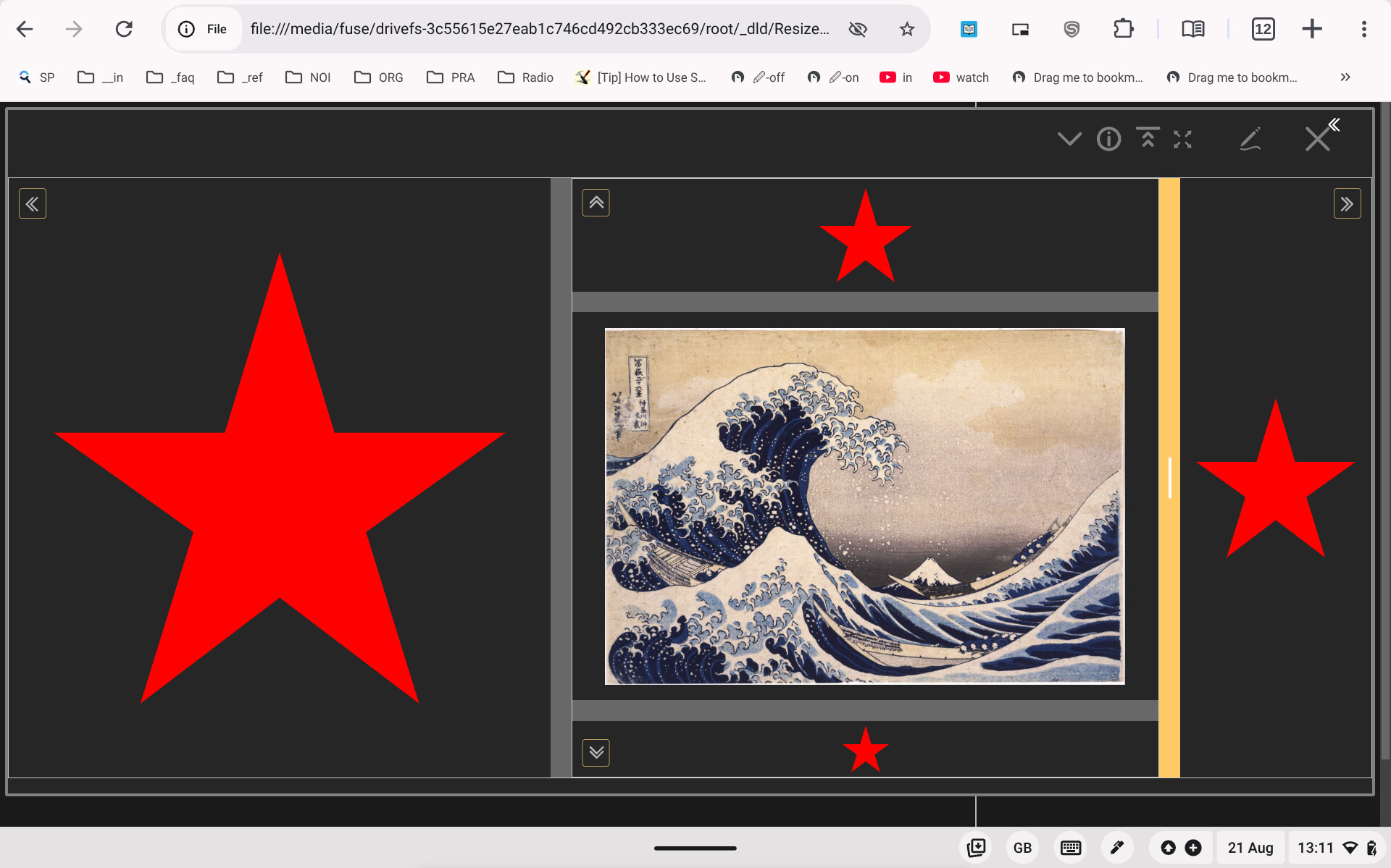
this is how the resizer should look like on a non-Touchscreen device
I’m detecting Touchscreen devices and make the resizer larger on them
Should probably be an opt-in option, or do you have an idea?
It has phenomenal NESTING …
Here I nested one of your examples in another to get a 5-grid …
Great stuff!!
TT
Definitely something a user can choose on in a setting?
Personally, even on a Touchscreen, I’m okay, mostly, with the standard more narrow bars.
But on very small devices (I.e. smartphones) I think it would be an essential first choice?
TT
I expect you will need media queries but remember we already have
| $:/info/browser/screen/width | Screen width in pixels |
|---|---|
| $:/info/browser/screen/height | Screen height in pixels |
and $:/info/mobile
the screen width and height give incorrect values to me (I dont think it’s a TW bug as browserleaks.com gives the same - a 5% higher value than real - which smells a lot like an X11 setting that is adjusting for TV with a fake overscan. Otoh, my macbook (also Firefox) gives different screen sizes between browserleaks and TW’s info! 
(tangent: $:/info/node reports “no”, which is unclear if that’s incorrect because it is a node back-end here, or correct because it’s loaded in a browser - in which case I’m not even sure what that one is for)
Maybe to detect a mobile device correctly (or better a device without a mouse pointer or digitizer that can hover) we can use this media query (need to test it):
@media only screen and not (hover:hover)
Do you use Firefox advanced privacy protection settings? They fake screen dimensions -among other variables like timezone- which might cause these symptoms.
Just a guess…
[Edit]: just tried now on browserleaks, toggling advanced privacy settings doesn’t change reported screen/window dimensions, at least on my PC.
Fred
I have firefox’s privacy tracking protection set to strict.
However… Linux dual monitor setup, each monitor is 1920x1080.
Firefox reports 2016x1134.
Chromium reports 2015x1134
So… not a firefox bug? I wouldn’t put it past being a quirky X11 bug on my setup too, so unless someone else sees the same thing, prob not worth pursuing.
If this wonderful creation is not directly merged into the core, and you instead will only serve it as a plugin, then you may consider letting the user him/herself activate the plugin to overwrite the core tiddler instead of it being overwritten by default. I’ve used the user-activated approach for a few of my recent plugins and it has a few advantages. If your implementation is not merged, I’d be happy to elaborate more.
Hi @twMat ,
I’ll separate the sidebar tiddler from the plugin but make it available on the page for who’s interested in overwriting the core shadow tiddler with it
Hi all,
I’ve updated the plugin to version 0.4.7
hover possibility the large resize handles are shown (@media only screen and not (hover: hover))resizable-table - but only for the wikitextTable attributeBest wishes,
good night,
Simon
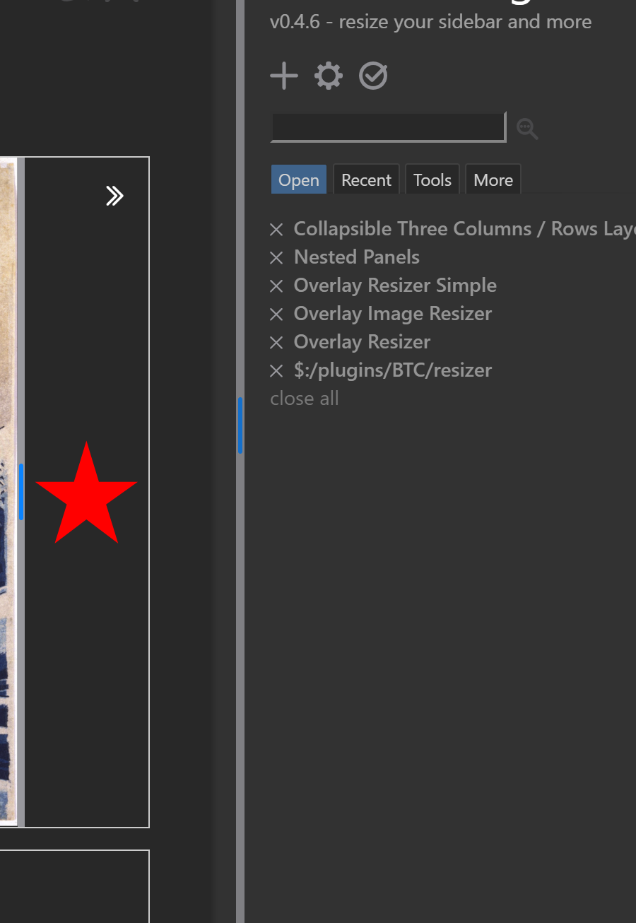
Update version 0.4.11
excel-column and tocharcode filter operatorsexcel-column converts any positive number to the corresponding Excel-style column format (like AA, AB, AKA)tocharcode converts a letter (or the first letter of a string) to the corresponding Javascript charcode (like “65” for “A”)resizable-table procedure if a dataTiddler attribute is passed to the procedure (and no wikitextTable attribute … the wikitextTable always wins  )
)resizable-table also accepts filters but that functionality still needs to be fine-tunedThe format of the dataTiddler:
head <column> <row>: Header Text for column <column> (like A for 1) and row <row> (1 for the first header-row)
foot <column> <row>: Footer Text, same as Header
<column> <row>: This is a normal Cell in column <column> (like B for 2) and row <row> (1 for the first body-row)
caption: The table's caption
classes: The table's CSS classes
Note that there’s a space between head / foot, <column> and row
!! Also be aware that it’s easy to have a typo “AAA” when you want “AA” instead (27 columns for AA, 703 columns for AAA) and AAA may be too much for your browser to handle (I’ve tried BBB which is 1406 columns and it almost broke my wiki) !!
Issues with Sensing Screen Size and Bar Settings …
The drag bars are still way too big on my Lenevo Chromebook in Chromium …
And just right on Firefox on the same machine …
In hardware settings my screen size is … 1350w x 844h.
Physically the screen is about landscape A4 size.
My question: can we please have a setting to override what the YAR is doing for cases like mine? Meaning I need thin bars, not thick.
(TBH, I suspect detection of the user device is, now, not, generally, always accurate)
Best, TT
This plugin looks awesome, however, it doesn’t seem to ‘do’ anything out of the box.
Say I wanted to use YAR to allow ALL view-mode embedded images to have the interactive resizer side-handles?
Say I also wanted to use YAR for sidebar-resizing on the notebook theme?
Are there examples how to include just those specific tweaks to my existing wiki using YAR ?
Just let me know ,thanks!
-Xyvir