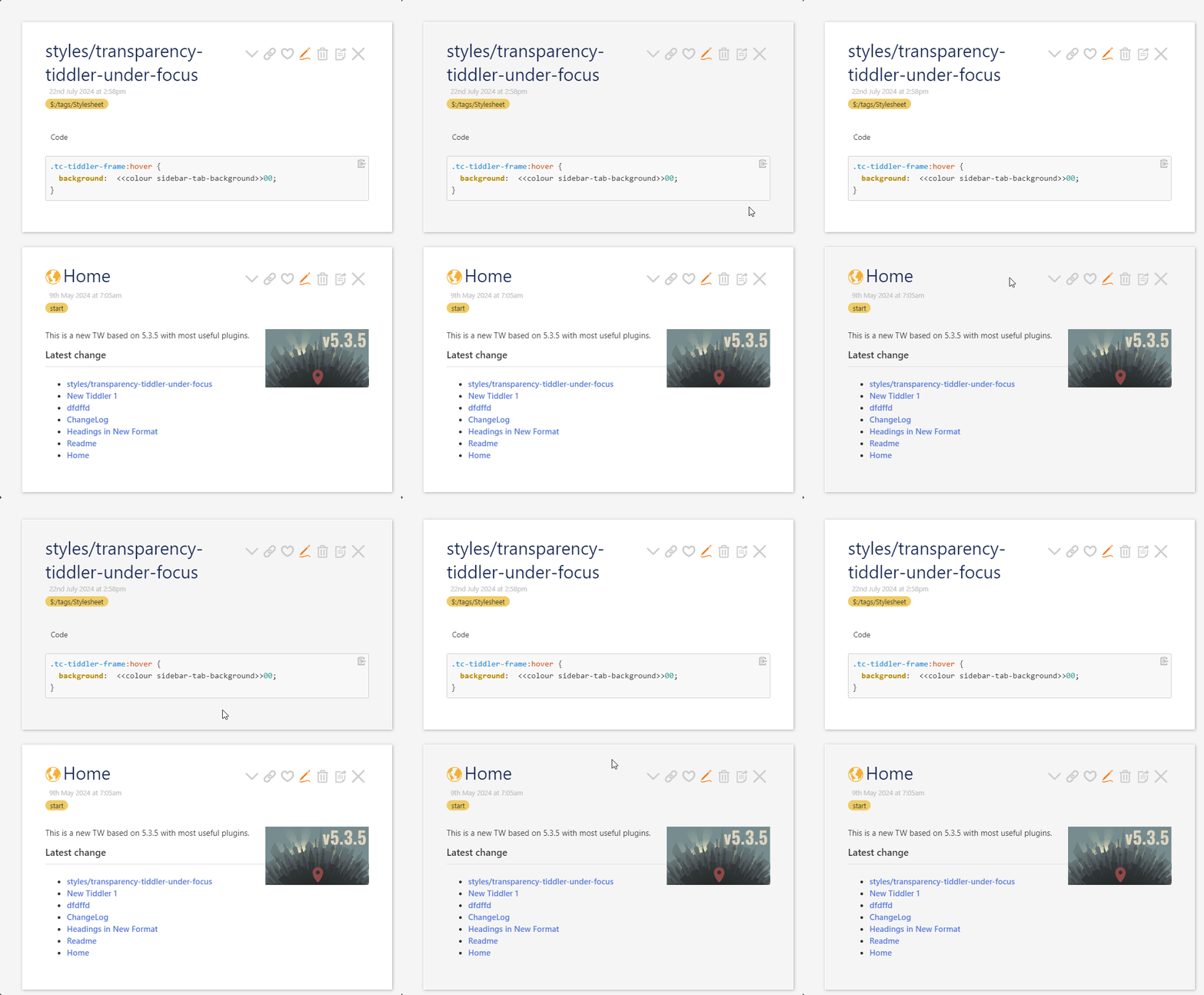
 … I love having a hover effect for a tiddler in the story river… But this recommendation seems hasty and not good practice, to me.
First, to be clear on terms: Alpha value is the opposite of transparency, though you’re still right that in this case you’re achieving transparency by adding an alpha value (the alpha value of 00 — that is, taking away all the alpha opacity value — gets you transparency).
The effect will make background “a little darker” only on certain palettes. This css (assuming the input value is a 6-digit hex value) should simply make the tiddler transparent when you hover. This means hovering causes zero contrast with the page background…
This strikes me as be counterintuitive when you want something to pop. (That is, this stylesheet seems to make a tiddler lose its contrast from background when hovered-over…)
It could also make the tiddler hard to read if the palette depends on strong contrast between tiddler background and page background. Among the default palettes, for example, “Rocker” has a black page background and white tiddler background.
On the other hand, there are palettes that don’t offer any contrast between tiddler background and page background, so this stylesheet tweak would show no effect on those palettes. (For example, the built-in palette Blanca is like this.)
I’d love to see a more palette-savvy way to make a good hover effect for tiddlers. I just was experimenting with using, say, the default tag color, dialed down to low opacity (say, adding 11 to the palette value)… Alas, some palettes — including Vanilla! — use some three-digit colors, and some palettes use values like “transparent”… so adding two more just results in an invalid color value. Folks can also use rgba values in their palettes, or 8-digit hexadecimal values that already include opacity, etc… So adding two digits to change opacity is a bit of a gamble, if you want a solution that travels well… 
Perhaps all this will be easier with more sophisticated css as discussed here. I hope so!

 … I love having a hover effect for a tiddler in the story river… But this recommendation seems hasty and not good practice, to me.

