I think this is a win win. Good synergy and thinking outside the box. While nothing seems to be set in stone you have been proactive in opening the market window and raising the bar to produce something which is best in… Hold on… BINGO!!!
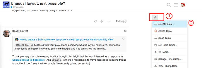
There should be a “wrench” symbol above the quick select sidebar
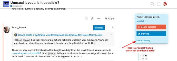
I usually start with “select + reply” because it also selects all connected replies, which is nice for long threads.
Important Then I do check if all the replies are really part of the “communication stream”. Sometimes users select any reply and then “diverge” from a “stream” – I manually deselect those.
Then I use the “move to” button and create a new thread.
It makes sense to invest some time to create a “friendly” new thread title, especially if you “move” a “starting post” from a different user than yourself.
Last but not least. There is a “cancel” button, which is easy to miss 
hope that helps
-m
@Scott_Sauyet best luck with your project and achieving what is in your minds eye. Your open question is an interesting one to stimulate thought, and has stimulated my thinking.
My hunch is to modify the story display to that tiddlers that meet a particular condition is displayed on its own and the others in the story hidden
Here is a brain dump if you are at loss for ideas.
Here are a few novel approaches to consider;
-
Alternative views exist out there from Murri, MCL, Trello and aforementioned slide shows all of which the mechanism may be informative.
-
Consider Creating SubStories with alternates for view and edit templates
-
Consider closing all tiddlers and having your own emptyMessage when the story is empty, Empty Story, all tiddlers closed, TiddlyWiki background see $:/config/EmptyStoryMessage but of course the content can be quite sophisticated.
-
Consider building your own Story View vs classis/Pop and zoomin
- I don’t typically use this but it seems relevant to your needs
- I have only started researching how this mechanism works.
- $list widget parameter, storyview Optional name of module responsible for animating/processing the list
- Story views seem to be driven by javascript
$:/core/modules/storyviews/classic.js
$:/core/modules/storyviews/pop.js
$:/core/modules/storyviews/zoomin.js
-
Use the zoom story view and open a tiddler containing a Example Table of Contents: Tabbed Internal as an alternate navigation. One tiddler open at a time with a frame around it you control - see discussions on
outlier -
Consider novel uses of the Dynaview Plugin
Thank you very much for the detailed instructions. I had gone as far as selecting the posts, but somehow had missed the option there to move to an existing topic, thinking it only created a new one. It’s right there in front of me and I should have noticed. Sometimes I can be really blind!
Thank you for the help!
I like to wrap things up and conclude when I can. Here I really can’t, as while I’ve had some success trying several of the techniques here (plain CSS, telumire’s full-screen), I’ve decided to put this aside for the moment.
I’ll try to get that wiki in good shape, but I asked this before I saw the page in progress. I’m less concerned about this layout than I was at first. I may be back to this when I finish other parts of this silly little project.
But I wanted to thank everyone who participated. I’ve learned a lot, even if I’m not using it yet. Thank you, all!
Its is important to take away the answer to your question that “unusual layouts are possible” and there are many ways to achieve it. Perhaps start a new thread when you are ready asking how to introduce a specific unusual layout feature, and link back to the methods here, that you try  best of luck


