Mohammad, I’ve put your updated version on the gallery site.
I’ve also added one more, which highlights v5.2.1 better, while gesturing subtly toward the “cascade” theme:
-Springer
Mohammad, I’ve put your updated version on the gallery site.
I’ve also added one more, which highlights v5.2.1 better, while gesturing subtly toward the “cascade” theme:

-Springer
Much appreciated Springer!
I like your colorful banner with round border! Very nice!
My two cents. I think Mohammad’s entry good. It visually conveys filtering well.
TT
Mashup, for yuks:
Thank you to everyone once again for your help. I’m afraid non-TW stuff has delayed me for a few days, but now we’re back on track to make the release this week.
I was just looking at Springer’s collection of the entries at https://tw-logo-contest.tiddlyhost.com. My first thought was that I regret suggesting that I should choose the winner because it’s too difficult with so many excellent entries.
Two entries that particularly caught my eye are Springer’s:
And Mohammad’s:
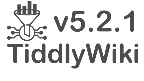
I was just thinking that it would be nice to have those two designs combined when I came to this thread and saw Springer’s mashup which seems to be pretty much what I wanted:

So, I am happy to declare that we have a winner. Congratulations to Springer and Mohammad, and my sincere thanks to everyone who has entered.
Best wishes
Jeremy
Really cool! Congrats Springer and Mohammad - well done!
<:-)
Very cool indeed ! Love the color choice & funnel idea, congrats to Springer and Mohammad !
I’m tickled! I had found Mohammad’s svg for filters to be so visually intuitive that I couldn’t resist playing with it a bit more. Sometimes trying something “just for yuks” is the way to go!
Jeremy, I’m happy to streamline details or optimize the svg-png size (etc.) if that would be helpful.
-Springer
Thanks Springer!
Jeremy, I’m happy to streamline details or optimize the svg-png size (etc.) if that would be helpful.
I thought you’d done so – the image is already only 42KB 
Best wishes
Jeremy
Getting Mohammad’s svg original properly integrated (rather than a hasty screenshot) shaves a few MB off, down to 35MB. I also find my design was a tad bit noisy with the cascade dots after the final 1. I can restore the extra dots if you want to stick to exactly what the design was. 
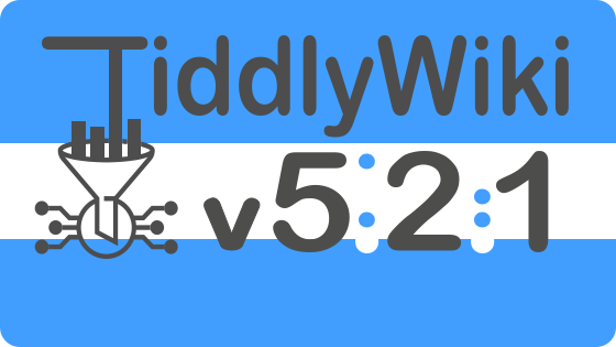
Or down to 15K if I flatten it and make the filter stand out better. 
