It can be done, hovering mouse show the names. It can also be designed such that names be appeared at the bottom.
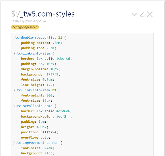
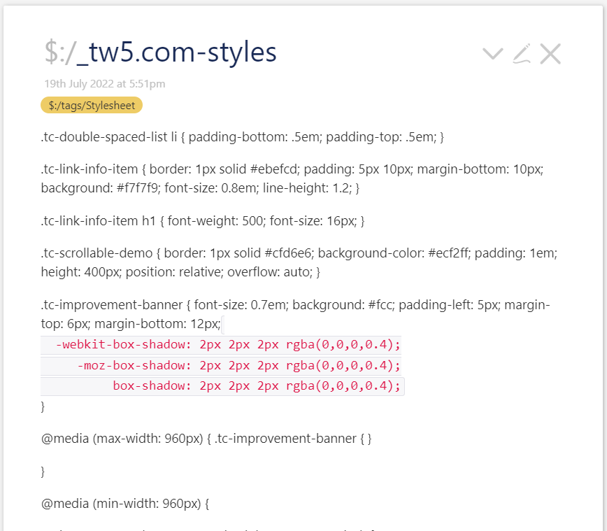
The current form has no harmony with other elements in the release tiddler. The long list with a lot of empty space looks ugly! Note to the font size.
 only the one time I did a PR, but since I am not so sure how to fork the repository (or if I need to) I am not sure how to do it again. I will eventually, but I am thinking of others who are unnamed.
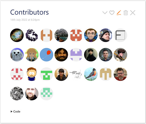
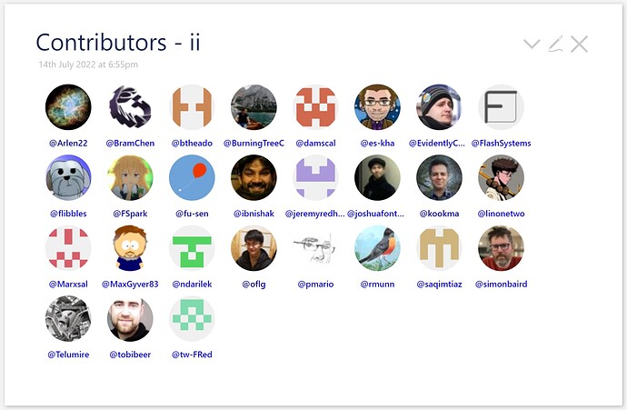
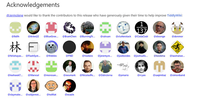
 and live than the previous contributors section! I like to see the faces and am glad to see many volunteers helping and improving TW.
