Perhaps. These have a great deal of flexibility along one axis. They make it trivial to enhance with opacity. But other color spaces have additional axes to provide. There’s a good reason they exist.
Choosing colors
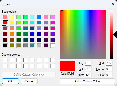
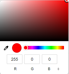
If you look at typical color pickers:
Firefox:

Webkit (Chrome, Brave, Edge, others):

… you will notice that the visual picking does not offer you a way to pick the amount of red, then within that give you a square of the varying amounts of green and blue. While this could be done, it would be entirely unintuitive. We simply don’t think of colors that way.
Color spaces
Both of these UIs offer the selections aligned with the HSL color space. Firefox allows you to choose the luminosity and then gives a square to choose both the hue and color saturation levels. Webkit browsers let you choose the hue, and give a square to choose the luminosity and saturation. Either of them reports back an RGB value. However, that is not what you’re actually choosing, You’re choosing hue, saturation, and luminosity. Other color spaces replace luminosity and saturation with (to me) more intuitive suggestions of how much white, and how much black you’re mixing into that hue. But that’s much the same.
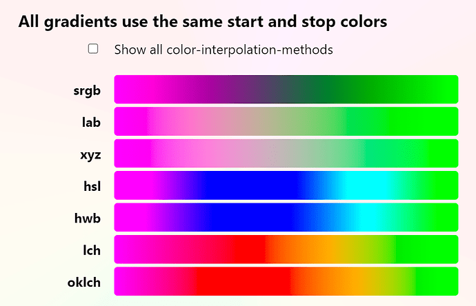
More modern color spaces (OKLAB, OKLCH) work in a relatively similar manner, but instead of using purely mathematical notions of luminosity, they reflect the biology of our vision systems and work with perceived color properties directly. The article, OKLCH for better color in the browserr, has a wonderful demo of the differences in simple mathematical gradients in the major color spaces. It looks like this:
To my mind, the last two, and especially the final one, look much better than the earlier ones.
TW palettes
Why does this matter for palettes? Well, if we want a collection of harmonious colors, it would be really nice to start with some base colors, and then say, “I want this one to be just like that one but a few shades lighter,” or “I want three additional colors evenly spread between these two.”
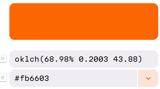
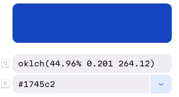
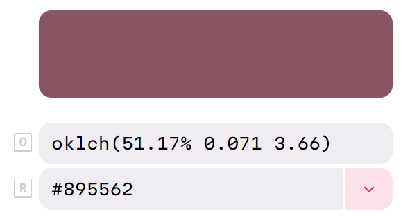
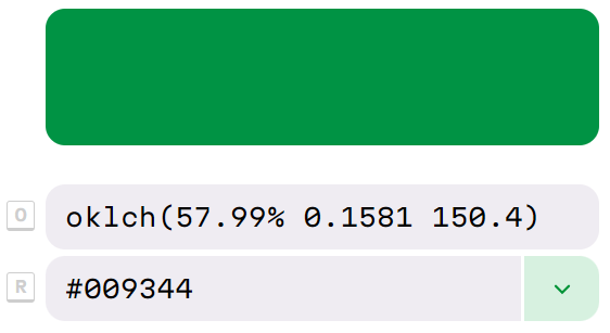
With RGB, to maintain those relationships, we would have to do it with an external tool and port the resulting RGB values. If I’m building a palette starting from the from my high school’s colors (Go Hatters!), reasonably vibrant orange (#fb6603) and blue (#1745c2), and I want a color half-way in between, I could interpolate the R, the G, and the B components to choose #895562, a dull rosy brown, or I could interpolate the OKLCH values and end up with a reasonably vibrant green (#0099344). I expect that it’s not just me who finds the green a more likely match than the rosy red!


Interpolate with RGB Interpolate with OKLCH


We could do a similar exercise with altering the shades or rotating a hue by a fixed amount. Modern color spaces simply make for a nicer way to manipulate colors.
(Note that I originally did this with simpler OKLCH values (oclch(69, .2, 44) and oklch(45, .2, 264), but when I went back to create the screenshots, it was quicker to paste in the #RGB, and it’s not worth going back to correct.)
Opacity
Back to the OP, as far as I know, all color spaces have a similar mechanism for working with opacity. They just have a fourth channel that runs from 0 to 1 or 0% to 100%. It operates independently from all the others. So if we had an automated scheme to add opacity to colors that didn’t already have it, we could do so mechanically for any particular color space. Dealing with multiple spaces is harder.
Summary
If we have to settle on a single color format for all palettes, RGB is the only realistic choice. It’s by far the best known, and everyone from serious professional web developers to dilletantes understand it. But it would be a sad choice, as there are many better alternatives, which would make it easier to build useful palettes. (One L, two T’s, one L, two T’s, one L, two T’s, Scott!). I would rather that we didn’t make this decision.
I would really like to have an expanded mechanism for palette entries to be built out of primitives. The Captivate Theme is a great pass at this, but I’d want something with more customizability.
Caveat
I’ve only recently learned most of what’s discussed above. And I’ve actually had little practical experience of it. This may represent the zeal of a new convert over practical advice.
