This is beautiful, kudos!
Which is why I don’t agree that “Getting Started” is the first step.
Agree here as well, the home page needs serious work. And I think your comparative analysis covers mostly the website. My comments/work are only regarding the template. If we open the discussion about the website, then to correct my amazing (lol) funnel, it would look something like this:
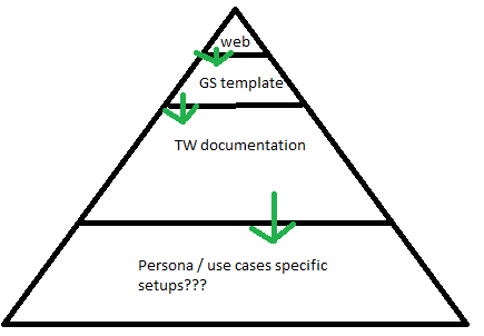
I didn’t know (apologies if I missed it) that having a new landing page/website is on the table. And although I do love TW, I think it should be a proper website IMO which is better suited to create CTAs and track conversions.
And again, the analysis is amazing work, now we just need to take actions  After quickly scanning it, I’m going to read it now.
Edit: Read it and completely agree - I’m not sure why that thread died? Ideally there should be some follow-up actions, maybe a poll to discuss what to replace the current landing page with, what are best-selling points for TW etc…