I think that the links.tiddlywiki.com resource has a lot of potential, and the methodology of it’s assembly is neat, but in my opinion has some large barriers for new users. I’ve put a lot of thought as to how I can help this situation with my limited skillset, trying to do some mockups or something (I was hoping the site was a TW that I could modify, but alas), but unsure the best way I can help. I will continue to think through this, but I think 3 factors could use the most attention: Access, Organization, Ease of use.
#1 Access
While the requirement to contribute I’m sure is relatively quick and easy - almost by definition the requirement of github’s mention is enough to scare people away. I am curious what the general feel amongst you all is what % of TiddlyWiki’s userbase is github literate? While of the users that regularly post here in the forum it might be as high as 50% or higher, I suspect in the total population including casual readers, it’s much lower, maybe even something like 10%.
Regardless of the real number, rather than collecting a sample of what all-users find useful, we instead get a page of links that only the most technically able people feel are good - in effect, a biased listing. I hate to generalize, so maybe instead I’ll say that as a single data point I’m personally a relatively obsessed user and have used TW steadily for many, many years, but have been to Github now only twice in my life. Once to try the github saver, and one to “post an issue” as requested recently - which I had to watch a YouTube video to figure out how to do. This seems to be considerable friction.
In terms of a recommendation, I’m a little stuck here. I suggested using maybe this forum as a platform to house links as it’s relatively easy to sign up, give thumbs up / stars etc. and with the ability to edit posts, seems to be a surprisingly good fit. As a reference point, I’m a big fan of the software paint dot net: Forums - paint.net Forum (getpaint.net). They have threads and plugin areas where people can ask plugin questions, vote, etc. Very handy for casual users.
#2 Organization
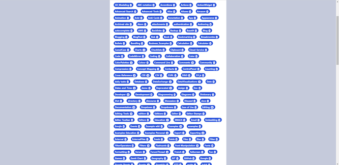
According to the page, there are now 383 topics availble to browse from, and they’re all listed in a giant list that scrolls for multiple pages in a very narrow band.
The “browse” experience currently
Due to the browse experience being so overwhelming, I still find that I keep going back to @DaveGifford’s toolmap
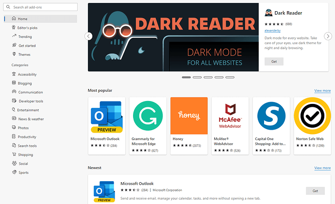
My recommendation would be to have some additional grouping to make it much easier to browse. Aside from a good browsing and search experience, my dream is that we’d also have areas like New / Editor Picks / Popular (need voting!) etc, and then have separation between editions, plugins, themes etc. @EricShulman 's TiddlyTools was a lifesaver in the pre-TW5 area this way. Something like the web browser extensions area would be a good thing to aim for in my opinion.
Chromium Edge Extensions Page - could TiddlyWiki have something like this?
#3 Ease of use
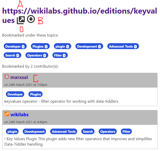
Once you find something you want to learn about, you make it to the page where the resource is. I feel it could be a lot more obvious how to get to where you want. The screenshot below is one example. I almost always want to click where the red A is - which either appears to do nothing at all, and sometimes it take me to a page that says there’s an error. I think others might think they want to download the plugin, so they click on the red B button which looks like download, and it does download something, but frankly I’m not sure what?
From what I can tell, the only think I really do need to click is the red D arrow pointing northwest?
I would recommend making the link to the site first, more prominent, and more self-explanatory.
Anyways, I know this was a long post and one that’s critical of people’s hard work (which I HATE to do) - though I tried to be be as constructive as possible, and I am happy to help be part of the effort to evolve if others agree.


 ), but rather for more casual, less technical users I’m trying to attract. I have worked in Six Sigma / Process Improvement / Change Management for most of my career, so trying to simplify things to the absolute extreme is kind of baked into my thought process at this point.