Large Knowledge Bases - Ideas About Ranking

Thanks,

I will be thinking about something more elegant than what is offered at the moment for interval adjustment and I like your idea of a cancel - turn it off again for this tiddler as well. I am looking forward to an interesting couple of months finding out how this works in practice, one question I have in mind is will I suffer again from what I call “ranking inflation” - the thing currently being looked at always seems to be the most important and so 1st position ranking tends to be awarded too often. The equivalent here would be setting ever decreasing review-intervals in an attempt to make ‘this tiddler’ stand out against the others I thought were so important when reviewing them two weeks ago etc…

I am reminded of a amateur dance show popular on TV - when the judges award 10’s you always think they have left themselves no “head room” when the next act is even better - human beings, psychology etc… :laughing:

My solution for this is a bit simple, but I am in the process of doing an “Annual Review” where I go through every tiddler alphabetically and if there’s something I want to return to later I tag it as “Flagged”. Then I keep a list of the reasons why a tiddler is flagged. But the concept is simple, just using tags.

With help from Eric Shulman I have added the following to my local prototype…

Screenshot from 2023-06-06 15-25-39

The Green ( tiddler not yet due for review ) or Red ( tiddler is overdue a review ) icon now displays the review-interval - in the case shown 36 days between reviews.

The faint small up and down arrowheads after the bell icon can be used to raise or lower the review-interval +1 day or -1 -day - it’s quite quick, easy enough to shift the review-interval by 20 days without feeling you are forever tapping away.

Ideally I would like to have the increment and decrement arrows vertically arranged so as to resemble a split button with two actions but that is a later wish.

I will be replacing the icons with more visible ones. I am keeping them small to not take up too much tiddler toolbar space. I don’t expect to be able to get all of this perfectly scaled with good usability for a phone screen in portrait mode - it works fine but adjusting review-intervals would be tricky on a phone.
In context though the tool is aimed at very large wikis where the user will probably use a larger device for more than casual browsing.

The backup method of changing the review-interval is just to edit the tiddler and edit the field directly.

The bell icon can only display a two digit number so the up/down arrow head buttons are limited to a review-interval of between 1 and 99 days. It is possible to set a larger interval by editing the tiddler field by hand but it will not display neatly in the bell icon.

I have improved the sidebar tab to additionally state the total number of tiddlers in the review-pool.

There was a possibility of course to display a different number in the bell-icon for instance perhaps the number of days until the next review. However this tool was written with very large wikis in mind, so in this context the waiting list of tiddlers to review might be quite long. Somehow I think I will be occupied enough with the tiddlers are that overdue a review and less interested in which ones look like they will on the review list next week etc.

I view the review period as the most important number to display in the icon, I already have over 300 tiddlers in my review-pool, my tiddlywiki has over two thousand tiddlers and I am tending to add around 50 to 100 a day to the review-pool.

The first judgement call is what the review-interval should be - I can stick with the default of 30 but usually I choose a starting value based on perceived tiddler value, how well I seem to remember the contents today and so on but I anticipate raising or lowering the review-interval upon next review, I see this as a medium to longer term settling in process.

I will start packaging it up and put out another plugin json file soon for anyone interested.

1 Like

Latest version

$__plugins_jonnie45_ReviewTiddlers1.json (21.8 KB)

As before please don’t risk it with you only copy of a precious Tiddlywiki !

Issues Remaining: Red and green bell Icons will appear together on the day that a tiddler is due review - issue with days operator, yet to resolve - only one should show.

Please let me know of any other issues :smiley:

Limitations: The clear up code to remove both tiddler fields that this plugin creates is still limited to ten tiddlers per click. Just being careful, limitation will be removed. The clean up appears in the sidebar tab for this plugin, It would be called prior to plugin removal.

If anyone knows how a split button for incrementing and decrementing the interval period could be coded I would be very grateful to hear more, something like this with an up arrow and down arrow all part of the same visual block but with the ability to call different macros, in this case one to increment a value and one to decrement it. In a regular HTML situation components within an SVG image can each be assigned different links but I cannot see how that could be exploited in Tiddlywiki where a button click needs to invoke a macro.

image

I have tried using CSS to use position relative to align the arrow heads vertically but as expected other elements do not flow into the gap created with this option so other tiddler toolbar items would not shuffle up leaving an unsightly gap.

I think the main problem is that you’re using position wrong. The easiest way I can see is to wrap these two buttons in a container, fix its size and margins, set its position to relative and then for the two buttons, set their positions to absolute (which will be relative to the new container) and set the upper one’s top and the lower one’s bottom to 0

\define reviewIntervalInc()

<$button 
tooltip="increment review interval"
class=<<tv-config-toolbar-class>> style="position: absolute; top: 0px; font-size: 40%" >
<!--                                     ^^^^^^^^^^^^^^^^^^^^^^^^^^^^^  --> 
<!-- ... -->
\end

\define reviewIntervalDec()

<$button 
tooltip="decrement review interval"
class=<<tv-config-toolbar-class>> style="position: absolute; bottom: 0px; font-size: 40%" >
<!--                                     ^^^^^^^^^^^^^^^^^^^^^^^^^^^^^^^^  --> 
<!-- ... -->
\end

<!--                                     ^^^^^^^^^^^^^^^^^^^^^^^^^^^^^^^^  --> 

<$list filter='[all[current]!is[system]!tag[z hidden]has:field[last-reviewed3]]'>
<span style="display: inline-block; width: 1em; position: relative; height: 30px; margin: -10px 0 -5px -5px;"> <!--
^^^^^^^^^^^^^^^^^^^^^^^^^^^^^^^^^^^^^^^^^^^^^^^^^^^^^^^^^^^^^^^^^^^^^^^^^^^^^^^^^^^^^^^^^^^^^^^^^^^^^^^^^^^^^^ -->
<!-- Add increment button -->
 <<reviewIntervalInc>>
<!-- Add decrement button -->
 <<reviewIntervalDec>>
</span><!--
^^^^^^^ -->
</$list>

This is rough initial formatting, but you can play with the height and the margins for the container to get what you want. I just played with them until it looked reasonable.

As to positioning, I mostly use relative just to establish a new positioning context. All absolutely placed elements will be based on the nearest positioned ancestor. The display: inline-block means that it will take up space in the button row but not start a new row itself.

$__plugins_jonnie45_ReviewTiddlers_TiddlerButton.json (4.6 KB)

Interesting work @jonnie45 I am watching, I like your icon etc…

To be thorough I did mention an opposite approach, for example for weekly review set a weekly-date field, when you “do it”, :stamp it with now", then have a weekly review tiddler (or part thereof) that lists tiddlers with a weekly-date older than 7 days. In this model you may have fields for daily/weekly/fortnight/monthly/day of week etc… but you can also have more than one review period per tiddler.

  • You could have a review-field with a date stamp and choose the review period in your tiddler that lists items to be reviewed. So you do not need to set it on the tiddler.

Hi thanks TW_Tones, interesting approach using a field for weekly review I will think it through although it sounds as if it would result in quite a number of fields on each tiddler, I would anticipate ten fields to match my current soft limit of 99 days assuming an acceptable granularity of ten days.

Keeping the housekeeping as much as possible on the tiddler itself is a design decision as I anticipate setting and then re-setting each review period quite a few times, it’s a reaction to what I see when I look at the content of the tiddler, I may not be actively thinking about the review aspect of a tiddler initially - I may have landed on it following a group of intertwined tiddlers that represent a sub-topic or area of uncertainty or ongoing research - but when I see it and start reading, musing I start to realise that my recollection of the content is not as fresh as it might ideally be. I might have several things going on, I see relationships that need establishing with links with other tiddlers which I might need to locate via search and so on - there will already be a fair amount of sidebar activity - it is freshingly convenient not to have to do yet another sidebar task to alter the review period, that at least can be done straight away “in situ” whilst I have “eyes on” the tiddler.

I find similar convenience with the star ratings plugin where to change the rating the user only has to click on the golden ( or greyed out ) stars that appear top right on every tiddler. For me that is the nature of working with very large learning/research wikis - ratings, sieves or other methods are used to constantly churn the tiddlers and get back to the valuable but dusty ones to promote, link, cross correlate and spot relationships are a core aspect of the whole workflow and so need to stay with the tiddler itself so that they can be considered every time the tiddler is seen. I appreciate the feature where clicking on a tag pill on a tiddler shows a drop down of every other tiddler sharing that tag, I often use this more than the sidebar options because it says effectively “show me other tiddlers like you - with this quality or aspect” - similar emphasis on links in tiddlers to other tiddlers - back linking and so on so my workflow really revolves around the tiddler not the sidebar, the sidebar just initiates a fruitful avenue of research.

I think there are parallels here with object orientated programming vs structured programming, it makes me wonder if in a future where interfaces might be 3D touch, future crime detectives using software in an investigation ( not a bad metaphor for research in a large knowledge base) might role-play 3D objects representing people, places and objects and access functionality to relate those 3D representations through the 3D representations themselves, perhaps current software where interfaces are structured more around functionality rather than objects reflects on the limitations of mice, keyboards and two dimensional screen space challenges - if these restrictions were limited then certain functional activities might become much more object orientated in terms of their interfaces.

Day dreaming I know but actually writing this post is helping me solidify what direction I think I want to go in with my knowledge base, a preference to initially populate the story river with the principle tiddlers using sidebar functionality but then the next phase tends towards working with the tiddlers themselves in the story river and not the sidebar where tiddlers are usually represented only by titles which in the case of a tiddler that might be a bit rusty only invites viewing on the story river to get the fuller picture anyway.

Thanks Scott I will give it a try!

Reading your response, you seem to make some assumptions about the method I proposed, but no problems.

Except for using a separate tiddler or side bar to review tiddlers within a given review period, I propose nothing more or less than you do. Except that I use a fieldname representing a periodical review cycle and time stamp it now, whenever I actually review it.

  • The review process sets the period of the review not the tiddler, using a different field name eg weekly, or monthly if wanted.
  • Sure your method suits a case where you want an arbitrary number of days for review to be set on each and every tiddler.
  • My method is best when you want to do something regularly in a named period or review list of tiddlers not reviewed for an arbitrary period eg: provide a number of days since last touched.

best wishes

Hi Scott,

Thanks I have had a play. I added a test icon at the end of the tiddler toolbar chosen as a kind of backstop so I could gauge the effect of my additions on any icons that might follow on account of other plugins.

You indicated your code was initial formatting that I might play around with so I played around… :grinning:

margin: -10px 0 -5px -5px

Gives

The icons at their rendered font-size of 40% are 15 pixels wide so all I had to do to close the gap which would otherwise appear on account of the browser calculating initially a 30px overall width so I used…

margin: -10px -15px -5px -5px

Which gives

So yes, thanks for the solution, :+1: 
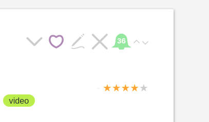
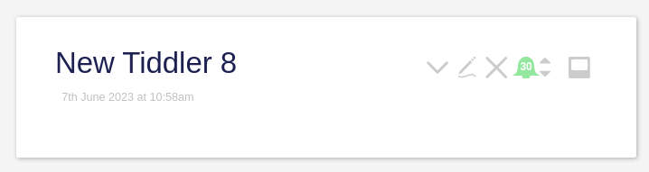
it does indeed allow the up and down icons to be aligned without leaving an idiosyncratic space before any other icon that might follow.

This is now what I had in mind, my earlier naive attempts produced the arrow heads vertically arranged but I was left with the 15px space afterwards.

Great - thanks!

2 Likes

If you can publish an example we can clone and edit for other use cases please do,

1 Like

Yes, I didn’t try it with an icon to to the right, but thought that might be a problem. I personally would increase the space between your arrows and the next icon to the right, but not as much as in my initial pass at this; this would help associate the arrows with the bell and not the following icon. I might even reduce the space between the bell and the arrows a bit more. But I like what you’ve got already, and where this plugin is headed.

I didn’t mention, although I imagine you noticed, that I took the liberty of combining your two separate <$list ...> widgets for the arrows into a single one, since they used the same filter. If you ever need separate handling for the different arrows (perhaps decrement doesn’t show up once the value is zero, or some such), you will need to restore them.

Hi Scott,

Help is much appreciated!

My latest incantation using em instead of pixels

My development wiki is an otherwise unaltered empty tiddlywiki however my “real life” wiki has a larger font on the tiddler toolbar - I cannot recall the method/theme or option that increased the font-size but I do like it, I think therefore for other users who may have done likewise I need to move the CSS over to em rather than px units.

The following incantation gives a fairly ok rendering on both, it’s not an attempt to translate the pixel values from my previous post but instead a fresh trial and error. I had a good look at the CSS for the standard toolbar icons but they do rely on font related CSS. I would be lying if I said that the following was the full result of a full study and understanding of the existing toolbar CSS and no trial and error at all - it’s a bit of a mix.

<span style="display: inline-block; width: 1em; position: relative; height: 1em; margin: 0em -0.4em -0.2em -0.2em;">

I think your comments about moving the arrows a bit towards the bell and a little away from the next icon are right, I will fine tune.

I am hoping a TW guru might take the “up and down” arrow “split button” and find a way to package or define it for other users, I really like this kind of button. I don’t think I have the knowledge or experience to package it as well as that. Of course it’s really two buttons but I am beginning to think of it as a package.

Definitely better. I use pixels mostly when I’m floundering to get hold of someone else’s design. I pretty much always switch to some proportional unit after it’s working if I hadn’t already started with them. Lately I’ve been doing a lot with cqw units; it’s fun to see a whole block scale precisely, but they take a lot of calculation to get right.

Do you mean a ‘packaged’ version of the ‘split up and down arrow’ button(s). I am begining to want to call it a single split button rather than two cunningly disguised separate buttons :crazy_face:

1 Like

I don’t yet have the TiddlyWiki chops to create such a packaged button. In raw JS, it’s easy enough to create a component made of sub-components, and then package their interactions into the Component interface. For instance, you could have a click handler for the outer packaged thingy with the events having a type property of “increment” or “decrement”.

But it would take someone with better TW skills than I have to create this.

I don’t think it has to be as ambitious as a new kind of button. By package I just mean someone taking what we have put together by trial and error (certainly a lot of error my side) and kind of polishing it, I am just wary that on some device or a TW with a particular theme the button might not render properly for reasons I don’t have the depth of knowledge or experience to predict.

It might be no more than a cut down version of the current plugin but made more generic without a specific purpose in mind - just something to include

  • A generic SVG icon - a filled square or something
  • A counter displayed in the icon
  • Accompanying arrows for up and down in a specified range.
  • A ‘dummy debug’ extra trailing icon button so that spacing can be judged, people can always remove it when no longer required, I found it useful.

If other people used it as a starting point then hopefully feedback could be used to improve the ‘split button’ in the TiddlerReview tool.

1 Like

That might be a very nice refinement ! Good thinking !

Or perhaps the arrow might be just ghosted when it will have no further effect due to end of allowed range being encountered.

But one for the back burner for me though :grinning: - head spinning with CSS I am hoping to wrap up version 1 of this soon - just need to find a way to avoid the double display of red and green bell icons and I think I will say that’s v1.1 done and take a little breather before v1.2 etc…

1 Like

Just an update on the the review plugin tool now that I have been using it for six weeks or more.

I now have close to 600 tiddlers in my review pool, some paragraphs and some entire articles, that’s 600 out of a total of over 2000 tiddlers, it’s a big wiki, last time I worked it out I think I estimated it is equivalent to five Bibles in terms of text.

In some ways I am a bit exhausted, it never sleeps and every day throws ten or more tiddlers at me that it thinks I need to review. Actually that is incorrect - I set the review interval in days so actually it is past-me that judged two weeks ago or maybe three weeks ago that this would be a good time for present-me to re-read xyz. I guess all I am saying is that like many creations it seems to take on a life of it’s own, all I do is hit the increment or decrement review interval on tiddlers but as a result a whole future morning’s research changes and relationships are briefly exposed at the surface as each unique list of review tiddlers are considered one after the other giving opportunity for cross-tiddler ideas to emerge.

Of course it would be a mistake to characterise my additional activity as being confined to an expanding pool of 600 review tiddlers, they all contain links and references to other tiddlers and often rather than reviewing the 20 or 30 tiddlers I should review today I end up looking at only one of them…on a trail sorting out some connection or trying to find a tiddler that really should be referenced to the current one, quite often a great deal of work emerges but only one tiddler gets ticked off out of the “overdue a review” list.

Unlike a paper calendar “todo” list - if a tiddler due for review today does not get reviewed then it’s still on the list tomorrow so it keeps me on my toes, there is no current way of saying “look I am on vacation please stop sending logs down the river” - the only way to avoid a large “log jam” is to say to myself “I haven’t got time right now” - I will simply hit the ‘reviewed’ (red bell) button even though I did not invest much time in the review, sometimes just reading the tiddler title is better than nothing, it’s often enough to cause a certain level of recollection.

In summary my Tiddlywiki quality is going up a lot faster than before for the following reasons…

  1. Each tiddler gets reviewed, I correct mistakes, add tags that perhaps did not exist when the tiddler was created.

  2. I spot more opportunities for links between tiddlers that are ‘crying out’ to be made.

  3. Despite of the fact that my head gets a bit dizzy.

  4. But I am making deeper progress in my research, it’s like fossil hunting for connections, my excavations are getting deeper and my ‘finds’ are getting better catalogued and cross referenced.

The workload is defined by the number of tiddlers in the review pool and the frequency expressed in days that I judge the tiddler needs to be revisited. For a new tiddler I might set the frequency at only 3 days, I then extend this over time, in general with all reviews I am asking myself questions about whether the information was current in my head OR easily recalled once prompted OR forgotten.

For quite a while now I have used a system of highlighting ( looking just like neon highlight pens ), a faint purple for really important and a faint yellow for very important - this is proving very useful when reviewing article length tiddlers. If perhaps four or five of these land on my “review today” pile then initially I tended to read the whole article but now I have realised there is an art in highlighting which arises naturally out of a decision to read the whole article once in a while but mostly just to scan the highlighted text - to see if I remember the core points or not. When I read the whole article I am asking myself the question whether the highlighted text does the information being present justice or do I really need to highlight some other key points because I know that 90% of the time I will probably only have time to read the highlights when reviewing. Of course this is nothing new, it’s what highlighting is all about but this particular way of working has really crystalised this for me.

One thing that constantly pops up is the observation that when I mentally say “yeah yeah - all familiar I still get all of this bit” I then spot an important caveat or qualifier that actually I had forgotten about or at least that qualifier was buried deeper in the swamp I call a mind than the other bits. This is the classic thinking you know something but realising what you actually know is your own version of it - and your version is incomplete or includes a distortion.

This is so much more than a simple old school review card system.

  1. The user chooses the review interval and will often change the interval for a particular tiddler over time, there is a feedback loop here governed by the user’s own assessment of their recall, the actual value of the information and so on.

  2. The user can adjust the content of the card each review, spot relationships they did not spot before and add new links.

  3. It’s not all about recall - sometimes I give a review period of a day simply as a way of flagging something that is in progress and needs finishing off, once finished I will then set a review interval based on different factors.

Ranking And Quality

My whole interest in this area started with things like star ratings, numeric ratings ( I have tags called 1, 2 and 3 ) and so on, I was constantly searching for a way to somehow rank tiddlers but at the same time confused as to what I was really after, I was reacting to the ability of tiddlywiki to allow me to collect and collate more information and ideas than my brain was able to hold or at least recall at any given moment. There is of course a hope that as research shows more connections and leads to greater understanding then I will find a more manageable subset makes itself known.

I realised that this review frequency concept was simply a subconcious answer to the question "well if you had a perfect ranking system what would you actually use it for? One answer was simply how often I should re-read certain tiddlers, so I by writing this plugin I evaded the ranking question and moved onto the next step directly.

So how I evaluate the review plugin as a ranking system is a back to front question as long as I make the assumption that ranking only has application for determining which chunks of information get the most attention.

There is a good probability that a really important tiddler will have a short review interval.

There is a good probability that a low importance tiddler will have a long review interval ( max 99 days ).

But there is a good probability that a really important tiddler that I hardly ever forget will also have a long review interval.

So it’s not strictly true that the review interval idea is a true ranking system but it still has value in that direction.

So really I have more questions than answers here but at the same time I have progressed.

Ranking Inflation

I noticed that one of the problems I faced with the star and numeric ranking systems I was using was that after a while I tended to give the new or latest idea a high ranking, the feeling was that I hardly ever looked at lower ranking tiddlers anymore and so really I was just consigning an idea to the bottom of the pond if I gave it a low ranking. The instinct was if in doubt don’t discard an idea so give it a higher ranking than it really deserves. Very often the thing we are looking at ‘now’ seems more important just because it is current.

Somehow the review interval concept is working much better in this area. I often give a newly created tiddler that has a medium to low importance a review period of say 3 days when first created but then as it keeps on cropping up in the review list to be looked at today I think “too often! - not enough value here!” and so I increase the review interval and see how that works out. I know I am not consigning the information to the bottom of the pond - as long as the tiddler stays in the review pool it will get looked at now and then - the max interval is 99 days so nothing stays on the bottom left to rot - everything gets a second chance eventually.

So yes as far as ranking inflation goes I would say “problem solved”.

Future:

There is one minor “buglet”.

A tiddler will display both a Green Bell and a Red bell on it’s review anniversary - the day it needs reviewing. It should only display the red one. The system is perfectly workable but I would like to get it right, I will need to call on gurus to help me with the syntax. The issue boils down to the use of the exclamation mark ‘!’ in filter syntax using the ‘days’ operator which is not co-operative in the sense that it complicates the creation of what we might call pseudo “IF-ELSE” filter statements.

Once the buglet is solved I will put out another “json” export as done previously above, I don’t expect many people will have a use for the tool but I think those who do may find it interesting to work with.

Future Versions:

The original versions did not alter the “date last modified” field of a tiddler for any of the review operations - this was intentional.

Whilst I was on vacation, with my single file Tiddlywiki on my phone ( I usually work on my laptop ) I realised I wanted to know when I got back which tiddlers I had reviewed and to preserve any review interval changes.

This made me realise that these decisions need to be options - should the following actions cause the tiddler date last modified to be changed?

  1. Adding a tiddler to the review pool
  2. Changing the review interval
  3. The act of confirming a tiddler has just been reviewed

In the end I did not perform any manual syncing, I decided to simply adopt the newer version on my phone and transfer to my laptop but I think this flexibility should still be an option.)

2 Likes

Not sure if I previously gave the latest version…here it is…

$__plugins_jonnie45_ReviewTiddlers2.json (22.6 KB)

This still has the harmless ‘buglet’ where both Green and Red bell icons will show up on a tiddler toolbar on the review anniversary - the day that the tiddler should be reviewed - only the Red bell should be showing. There is no loss of functionality or undesired behaviour. I intend to ask the gurus to help nail this one down and release again sometime. For now just ignore the Green bell when both Red and Green are present but no harm done if you click it accidentally - if you click on either Green or Red in this circumstance they will each have the same meaning ie the tiddler has just been reviewed and because the tiddler is no longer overdue a review then only the Green bell will now show.

There is still the safety measure on the feature to remove both review related fields from all tiddlers in the review pool - intended only for use when removing the plugin - just to be tidy - the safety feature means that only ten tiddlers have their review fields removed each time. The review data ends up being a big investment of time - shame to accidentally lose it. I will remove the safety feature at some point.

I added an extra line of info on the sidebar tab for the review plugin, it used to state the number of tiddlers in the review pool, now in addition, it states the number of non-system tiddlers to help the user get an idea of the percentage of their knowledge base tiddlers that are in the review pool.

Please try out on an empty tiddlywiki first if you are new to this, just import the plugin json file above and a new tab with a pink bell should appear on your sidebar and in addition all non-system tiddlers should appear with a grey bell icon on the toolbar. Create a new tiddler and save. Then click on the Grey Bell icon on the tiddler toolbar and it will turn green and show a review interval of 30 days. In thirty days time it will turn red indicating that you need to review it. You can access a list of twenty tiddlers requiring review on the sidebar tab for this plugin - those are the ones requiring your attention. The plugin includes documentation.