King James Bible Wiki

Fascinating! I look forward to try it out… when I get a minute free. Getting back involved in electoral politics during a presidential election year is time- consuming.

While I’m sure I could follow your steps above, I’ve never used Freelinks. Is this something you can post somewhere?

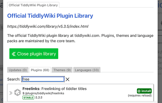
It’s one of the official plugins! Just find it where you find good ruston(-et-al)-vetted stuff like BibTex, CodeMirror, Comments, Internals, MenuBar…, and now the Tour and Confetti plugins:

:slight_smile:

Sorry. The bit about Freelinks was simply that I hadn’t used it, so following your steps might take a bit more work. I was hoping you could post your Bible version, not Freelinks.

But mostly I was trying to avoid doing any more work during my busy evening. I’ll try it myself when I can.

Oops :rofl: Here’s a version hastily uploaded to tiddlyhost: https://minimalist-test-mode.tiddlyhost.com/

2 Likes

Thank you so much @Scott_Sauyet for your bible and @Springer for this very nice addition making this bible TW so much more useful.
This has been a very interesting thread, so much to learn from. I love it.

2 Likes

New Version

I have created a new version, mostly to handle the unique structure of Psalms. It’s at

http://fourwindssoft.com/scott/Tiddlywiki/Demo/KingJamesBible/v5/

The sources are at

http://fourwindssoft.com/scott/Tiddlywiki/Demo/KingJamesBible/v5/sources

Feature Complete

At this point, I consider this basically feature complete. While I’d love to hear suggestions for ways to make the implementation more robust, more performant, more logical, etc., I won’t be adding features soon. I will probably work on creating a better source JSON document. What I started with was great, but it’s not structured in a way I’d like to work with. That will only affect my conversion script, and not the wiki itself. That might also let me easily make an alternate version suggested by @TW_Tones in #10177/30 et. seq.. If so, I might at some point play around with that alternative approach to see which is more flexible and which is more maintainable.

At the bottom, I will discuss some potential work built atop this.

Differences in Psalms

You can easily see the visual difference between the old version (and specifically Psalm 119) the new one (again, Psalm 119).

Psalms has a number of differences from the other chapters:

  • The paragraph structure from other chapters is ignored here, even though such information is in my original source. Instead each verse is its own stand-alone line.
  • The lines are almost universally formatted more narrowly as to evoke thoughts of poetry, not prose.
  • In my original source document, in all other chapters, square brackets represent [italics]which my script converts to //italics//, but in Psalms they appear appear literally in the text.
  • More than 75% of the Psalms have an inscription, an epitaph, that’s not part of the verses.
  • Psalm 119 is broken into what we might call stanzas, each titled with a letter of the Hebrew alphabet.
  • There is a little-noted grouping of the Psalms into “Book I”, “Book II”, … “Book V”. It typically just shows up as a header on the first psalm in the group.

Implementation

The inscriptions are the biggest challenge. My original source includes them within the first verse of the relevant psalm, with no delineation. To fix this, I manually made an updated version of the raw data, Enhanced-KJV.json, adding a pipe (|) delimiter between the inscription and the actual verse text

    {
      "book_name": "Psalms",
      "book": 19,
      "chapter": 16,
      "verse": 1,
      "text": "\u00b6 Michtam of David.|Preserve me, O God: for in thee do I put my trust."
      /*                               ^--- right here                                    */             
    },

and updated my conversion script to generate these:

{
    "title": "Psalms 16",
    "tags": "Chapter [[Psalms]]",
    "book": "Psalms",
    "chapter": "16",
    "inscription": "Michtam of David.",
/*  \_______________________________/------- added */
    "psalm-section": "Book I",
    "seq": "14606"
  },
  {
    "title": "Psalms 16:1",
    "tags": "Verse [[Psalms 16]]",
    "book": "Psalms",
    "chapter": "16",
    "verse": "1",
    "text": "Preserve me, O God: for in thee do I put my trust.",
     /*     \__________________________________________________/----- reduced  */
    "seq": "14607",
    "para": "1"
  },

Then I separated $:/_/bible/templates/chapter into three parts: the general wrapper and the specific handlers $:/_/bible/templates/psalms and $:/_/bible/templates/most-books. The handler for Psalms can now manage the additional formatting and the presentation of inscriptions.

The conversion script also skipped the italic handling for Psalms. That was trivial to solve.

For the “Book I” … “Book V”, you can see a psalm-section field in the Chapter tiddler of the previous example. I created this while I processed the original source using some JS that just hard-codes the ranges:

const getPsalmBook = ((books) => (book) => books.find(({end}) => book < end).title)([
  {title: 'Book I', end: 41},
  {title: 'Book II', end: 72},
  {title: 'Book III', end: 89},
  {title: 'Book IV', end: 106},
  {title: 'Book V', end: 150},
])

(You don’t need any real knowledge of JS to see that I’ve simply associated the "Book"s with the final verse of each one.)

Finally, to handle the stanzas for Psalm 119, I added to the enhanced JSON: a “preface” tag to each verse that starts a new stanza—and I don’t know if “stanza” is what biblical scholars actually call these!—with the text that appears above: a spelled-out Hebrew letter.

To display these changes, I needed to add a stylesheet. I’d been hoping to avoid creating one. I want this wiki to be as minimal as possible. But I couldn’t see a way around it, and at least it’s still small:

.chapter.poetry {
  p {margin: .1em 1em; width: 25em;}
  p.stanza {margin: 2em 0 1em; font-weight: 500;}
  p.inscription {background: #f0f0f0; padding: .25em;}
}

Additional Fixes

There are two other minor fixes included here, ones recommended by @saqimtiaz in a separate thread.

Future Work

A number of people have suggested directions this could go. My core idea here is to collect the biblical text in a way that it can be reused. The wiki itself is meant to be a baseline that users of that textual data could either build upon or ignore entirely. So below I discuss some of the things I’d like to do, but the main point is what other users might like to try.

I’m especially intrigued by suggestions from Springer about handling “theme” metadata, and about abstracting the notions here to handle other sorts of text that inspire close exegesis. I definitely would love to see a version that has a robust commentary feature, with a many-to-many relationship between commentaries and Books/Chapters/Verses, and possibly even a meta-commentary or layered-commentary.

While this started with the King James Version, I’ve hoped all along that other translations could be handled easily. And I think they will be except for the metadata I had to add here to handle Psalms. That should be most an annoyance, though. If you have to edit the inscriptions of 116 of the Psalms, but everything else comes along for free, I think it’s still a win.

I’d like to investigate the pros and cons of moving the textual data to a plugin, making it easy to recover from overlaying the biblical text with our own. I would need to figure out how to do this without breaking the default search. I expect that wouldn’t be too hard, but I’ve never tried enhancing that.

There is one very specific layout change I would love to try. But it’s not one I’ve ever done or even seen done, and I’m not quite sure how to approach it. In the current version, the superscripted verse-number links preceding the verses are the best I could come up with quickly. But I find them a bit of an annoyance. I would love it if instead the text was clean, with no verse numbers in sight. But in a gutter to the left (or the right) of the text, lined up with the start of each verse, are those links. If you click on one, you open the corresponding verse tiddler. But if you hover, you highlight the verse, and maybe have a visible title somewhere so that when you hover, say, "7" you get the full path: "1 John 4:7".

And there’s so much more. How would you see this expanding?
1 Like

I have done some work on a similar approach for tw doco and annotations. Perhaps when you start a related thread mention me?

Basically putting the content in shadows and the annotations in edited versions.

I would also like to develop some related tweaks.

You mean storing to content in a plugin? That’s the easy part for me.

Will do. No idea if I’ll ever get to this though.

My big concern is the built-in searching, which works wonderfully right now. I would have to figure out how to include all my content shadow tiddlers in the search. I haven’t tried, and maybe it will be trivial. That’s my only concern about doing this, though. If I can get that to work, I think it would be a nice improvement.

Could you elaborate?

That is the problem I looked into. First you can simply modify the default search to include shadows, or even just the shadows in your data tiddler. However your own filters will need modifying as well.

  • I do have complementary approach but it possibly belongs in another thread.

Sorry folks. I broke something, and none of the wikis or source material are showing up on my website right now. While I figure out how to recover that, I have temporarily (?) copied the latest version to

https://crosseye.github.io/TW5-KJV/v5/

I hope to recover the other versions soon.

All fixed! We return you to your regularly scheduled wikying.

Great work! I love the organization of this.

I’m wondering if there’s an easy tweak to remove the verse and/or chapter number notations for someone who just wants to read the text in each book without it being broken up by numbers. Would that be a simple change to a template, and where would that be located?

Your work really makes me think about the importance of considering how a project should be organized before you even begin. This is so elegant. One day I will be like that. One day.

1 Like

It’s easy enough to suppress the verse numbers, or style them however you like.

Add a tiddler with tag $:/tags/Stylesheet and content:

.verse-number  {visibility:hidden;}

(To figure out what css class is being applied to something you want to suppress or style differently, the browser’s inspect tool can be really helpful.)

1 Like

Yes. Let’s look at verse numbers first. By far the simplest way of hiding them would be to use CSS, adding

.verse-number {display: none;}

But this will leave some odd spacing artifacts.1

Instead we can change the templates easily enough. Chapters are handled by $:/_/bible/templates/chapter, which then delegates to a specific template for Psalms, $:/_/bible/templates/psalms, and a more general-purpose one for everything else, $:/_/bible/templates/most-books.

We can fix them by removing the related markup from both:

<$eventcatcher selector="a" $click=<<open-verse>>  tag="div" class="chapter" >
<$set name=verses filter="[<currentTiddler>tagging[]tag[Verse]]">
<$list filter="[enlist<verses>get[para]unique[]nsort[]]" variable="thisPara">
  <p><$list filter="[enlist<verses>para<thisPara>sort[seq]]">
    <span class="verse">
      <sup class="verse-number">
        <a class="tc-tiddlylink" data-verse=<<currentTiddler>> href=`#$(currentTiddler)$`>{{!!verse}}</a>
      </sup>&nbsp;<span class="text">{{!!text}} </span>
    </span>
  </$list></p>
</$list>
</$set>
</$eventcatcher>

This looks fine in the rest of the chapters, but it removes the indentation of the Psalms and looks wrong. I would add some CSS for this:

.chapter.poetry p {text-indent: 1em;}

The chapter headers are in the template $:/_/bible/templates/book, and you could just remove this line:

<h2><$link><<header>> {{!!chapter}}</$link></h2>

But I think we’d still want the chapter headers for Psalms, so I think it’s better to replace this:

<$let header={{{ [<currentTiddler>book[Psalms]then[Psalm]else[Chapter]] }}} >
<h2><$link><<header>> {{!!chapter}}</$link></h2>
<$transclude $tiddler="$:/_/bible/templates/chapter" />
</$let>

with this:

<% if [<currentTiddler>book[Psalms]] %>
<h2><$link>Psalm {{!!chapter}}</$link></h2>
<% endif %>
<$transclude $tiddler="$:/_/bible/templates/chapter" />

There’s one more thing we’ve sort of broken in this: The inscriptions above many psalms have an indent they probably shouldn’t. So we can add text-indent: 0; to the p.inscription rule.

To do all that, you can download the following and drag it to the wiki. Once you import, you should see everything looking reasonably good:

HideChapterAndVerseNumbers.json (2.1 KB)

An interesting alternative would be to add a toggle to the sidebar that lets you switch this behavior as you like. I leave that to you, however.

Finally, I just have to quote from an earlier post. This is what I would really like to do:

And now that I think of a toggle button, I would love to do so for this gutter too, if I even spend time on such a change.


1 Also, I see Springer has beaten me to this suggestion. visibility: hidden is an interesting alternative. It leaves all the space where verse numbers had been, which lets you know where the verses start and end, without inserting the actual numbers.

1 Like

Very nice, thank you! There are some good lessons here for me to learn. I will play around with this.

Thank you for both tips!

Better Input Structure

I have done this. It’s in

http://scott.sauyet.com/Tiddlywiki/Demo/KingJamesBible/alt1/

The raw data is now in a nested format: The wiki contains books. Books contain chapters. Chapters contain verses. The other information necessary to display properly is in metadata sections at the various levels. I use a conversion script to turn this into a a JSON tiddler file.

There are four different sorts of metadata, one general, and three Psalm-related:

  • The list of paragraphs in a chapter (including in Psalms, although as far as I can tell, they’re meaningless in this case)
  • The separation of Psalms into Book I, Book II, … Book V
  • The inscriptions above most of the Psalms
  • The stanza breakdown and titles for Psalm 119

Generated Tiddlers

Each of these is in the appropriate place in the input JSON document. They are used to help layout the books and chapters in the wiki; they also get placed into the appropriate tiddlers (mostly as JSON blobs.) This is theoretically unnecessary, since they’re all accounted for in the layout of the book and chapter tiddlers, but I feel it’s still useful to have them there just in case.

Besides this new metadata, there are only a few changes to the tiddler fields, mostly the removal of a few redundant properties. But the book and chapter text fields are now written to match what @TW_Tones suggested:

Instead of templates or cascades for these tiddlers, we use a few procedures, c (for “chapter”), v (for “verse”), p (for “psalm”) and pv (for a psalm verse). The tiddler-generation script uses these together with the metadata to build static pages instead of the dynamic filter-and-list ones from earlier versions.

Static text instead of lists and filters

For example, the text field of 1 John 4 combines the paragraph metadata and the verse procedure like this:

<$eventcatcher selector="a" $click=<<open-verse>>  tag="div" class="chapter" >
<p> <<v "1 John 4:1">> <<v "1 John 4:2">> <<v "1 John 4:3">> </p>
<p> <<v "1 John 4:4">> <<v "1 John 4:5">> <<v "1 John 4:6">> </p>
<p> <<v "1 John 4:7">> <<v "1 John 4:8">> <<v "1 John 4:9">> <<v "1 John 4:10">> <<v "1 John 4:11">> <<v "1 John 4:12">> <<v "1 John 4:13">> </p>
<p> <<v "1 John 4:14">> <<v "1 John 4:15">> <<v "1 John 4:16">> </p>
<p> <<v "1 John 4:17">> <<v "1 John 4:18">> <<v "1 John 4:19">> <<v "1 John 4:20">> <<v "1 John 4:21">> </p>
</$eventcatcher>

And Genesis looks like this:

<<c "Genesis 1">>
<<c "Genesis 2">>
<<c "Genesis 3">>
<<c "Genesis 4">>
<!-- ... -->
<<c "Genesis 50">>

There is some additional handling for the differences in Psalms and specifically for Psalm 119, but it’s a similar approach.

Possible future work

If I play with this further, I will investigate putting the Book, Chapter, and Verse tiddlers into a plugin. I think it makes sense, and it will be easier to do in this version because of the smaller number of filters being used.

At some point, I want to retrofit the other style to use this same input. I think it’s simply more logical. Also the recent plugin compression work from @andrewg_oz could save a lot of bytes. (Speaking of that, this technique does add to the weight of the wiki, bringing it from 11.6 MB to 13.5 MB.)

Pros and Cons

This technique made some real logical sense, as the filters in the other version are never really meant to be dynamic. We’re simply not adding new verses to the Bible!

But it feels harder to reuse many of the parts. We’ve moved from a relational system to a rigid-hierarchical one.

This version is larger, as said above, about 17% larger, or 21% if you ignore the core.

There’s something very right about having a straightforward Book/Chapter/Verse hierarchy. But storing the metadata separately when it’s in fact necessary for proper display feels wonky.

What else?

Which style do you prefer? Why?

What parts of this version could do with some real improvment?

Any other feedback?

1 Like

Yet another version

Ok, didn’t I say I was done making changes to this? :stuck_out_tongue_winking_eye:

I have yet another version:

http://scott.sauyet.com/Tiddlywiki/Demo/KingJamesBible/v7/

This one does two things. First of all it defines its own initial data structure, the nested one discussed in my most recent post, then uses that to create the same structure of tiddlers used in all the previous versions. I think this is a much more logical format than the one I was originally using, which was just a flat list of verses.

The second thing is an attempt to remove the intrusive verse numbers. The previous style was heavily influenced by print. But in a dynamic text environment, there had to be a way to make the verse numbers available when desired but not in your face when you just want to read.

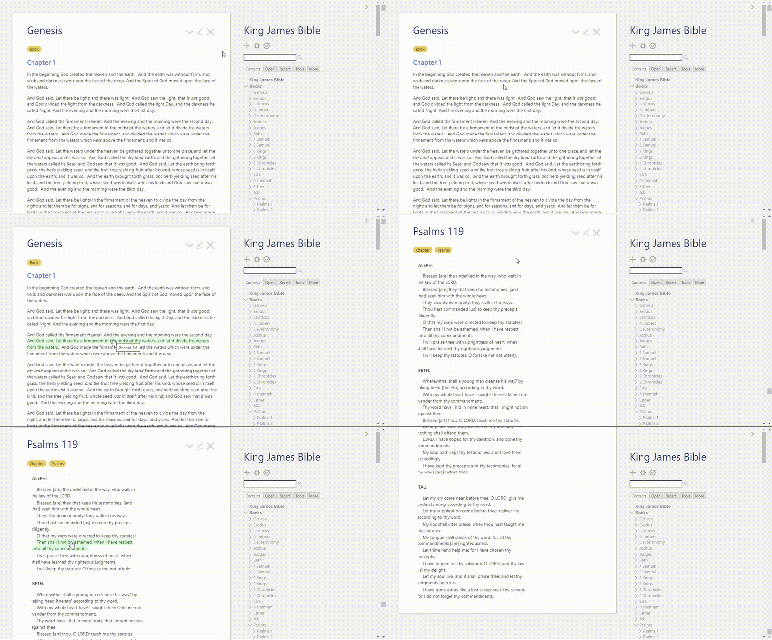
What I came up with is a highlight on hover, with the browser’s automatic title popup to give you the whole Book Chapter:Verse notation when you pause over the verse. If you click on the verse it opens that verse’s tiddler. A short video is below.

I’d love to hear what you think. Do you prefer this to the previous version? Or was it better before I started messing with it?

kjv_hover

Very nice.

Have you thought about touch devices?

Only as far as to check that out works reasonably well on my Android phone (Pixel 7). It treats casual touches like a hover. What you don’t get is the visual title tooltip.

But I don’t know if this is universal across Android nor if there’s something similar in IOS.

Any suggestions would be most welcome.

Can we switch them on again with CSS?