Common Community Plugin Library?

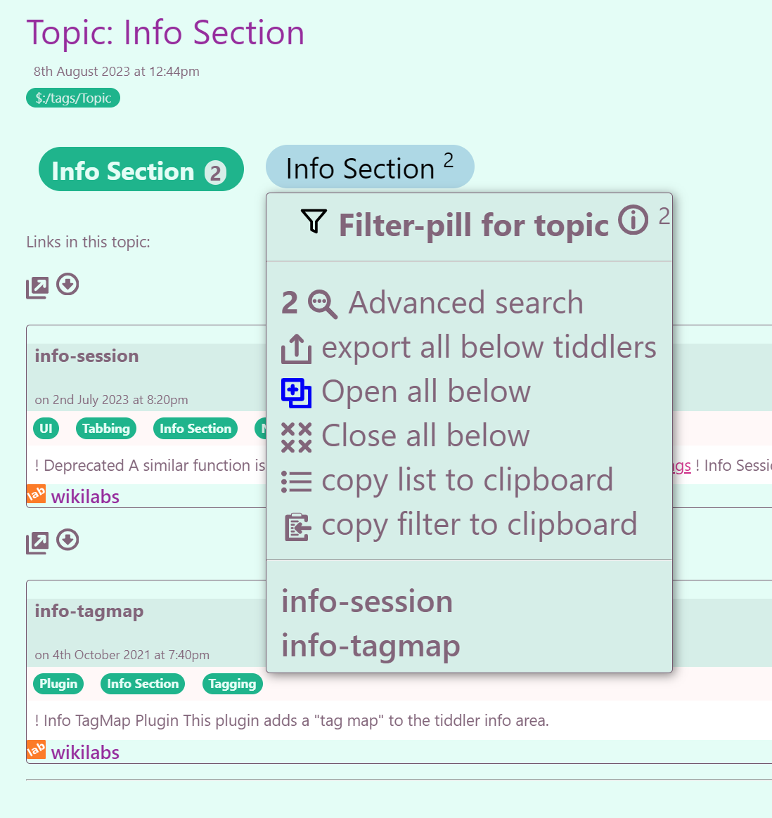
Okay, here are the current search results and entry tiddlers.

My problems with it are

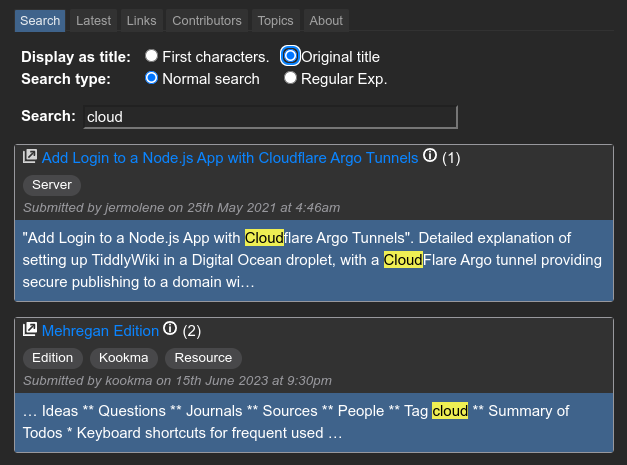
A) the search results crop the title unnecessarily. No meaningful description is that short Make it show the entire “original-title” field.
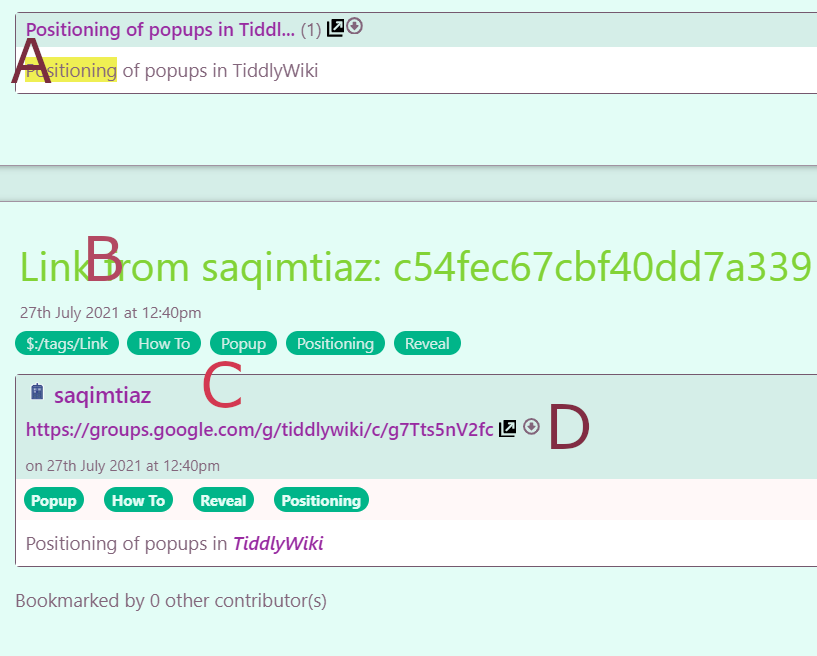
B) The large tiddler title provides information that is useless and distracting to the user looking for a resource or solution. This could be hidden by normal TW means.
C) The information on the contributor is above, and in larger font size, than the information that the user is looking for. Just move this below that information and put it in smaller font size. And put “submitted by” so the user doesn’t think this is a link to something of Saq’s (it is a link to a discussion in which Saq didn’t even post).
D) The hyperlink does not take you to that location, but to the tiddler.

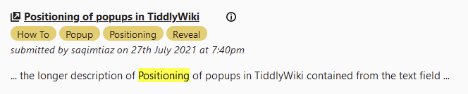
Here is a crude mockup of what I am thinking of for the SEARCH RESULTS and what shows up in the “Topic:” results:

mockup

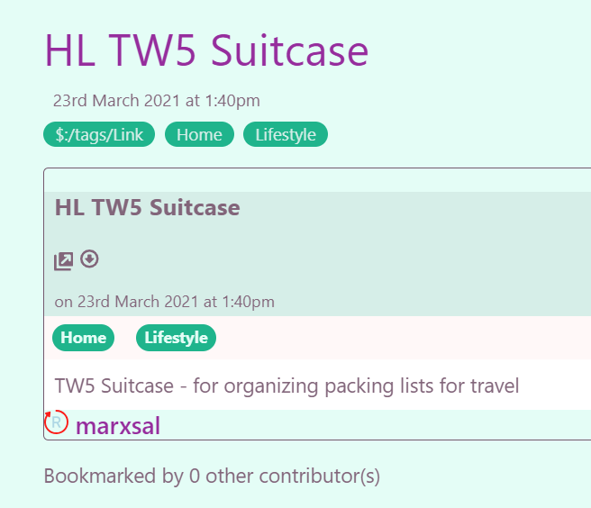
The layout is similar to looking at a tiddler. It uses the information already available in Saq’s tiddler (but the description at the bottom is mine, just a little more info to show what it is).

  1. It is clean
  2. it puts front and center what a typical user would be looking for.
2 Likes

That looks good! Keeping in mind that we’re talking about when the user has asked to see original titles. Also, not all original titles are really good titles (because originally the titles weren’t even going to be used). We should get some feedback from Tones and others and then wave at Jeremy.

That explains a lot (picture my eyes rolling and the words “oh brother” coming out of my mouth). Someone decided that the site was going to be a collection of ‘links’, so then ‘links’ became the abstract, organizing concept that guided the design rather than a user-focused approach.

A link is only worth following if one has an idea that it will be helpful, unless the user wants to just blindly open links one by one and see what pops up. So the link is secondary to some kind of descriptive title that acts as a timesaver (as are the tags). Tags help narrow the search, but they are no substitute for an answer to the question “What the heck am I looking at?”

The title should be the primary focus and should give a brief indication in human words of what the link is to (the plugin name or a brief idea of what it will do for the user. And if need be, the additional text will supplement that.

3 Likes

It was (as I understand it) modeled after del.icio.us: “a social bookmarking web service for storing, sharing, and discovering web bookmarks” (Wikipedia). I think that part of the problem is that something like that requires a lot of participants and an easy on-ramp. But it’s not easy to make an onramp to a project and have it work just like a tiddlywiki (“eat your own dogfood”).

The current requirements are not too arduous: Sign up for Github; Enter your website id in the repository; Host a TW website with properly formatted tiddlers to share URL’s/info.

Only the first two steps are somewhat complicated. Once you have your site going, it’s not much work to add new entries. But it’s probably a bit much for someone that just wants to quickly add a new site they just discovered and want to share.

Some minor changes to @DaveGifford’s great mockup:

image

  • Open-window icon to the left of the clickable title, a common convention in TW buttons, tags, etc.
  • Underlined external link, again to keep with TW convention of differentiating internal and external links.
  • More space between the title and additional buttons, maybe right-aligned buttons, similar to tiddler view?
  • This is more preferential, but I think the info icon conveys the message “more about this thing” better than the eye, which clashes with the external link used to actually view it.
  • Remove the download button from this compact view, reserve it for full tiddler view. Btw, seems it doesn’t even work on links right now, I get just an empty txt file.
  • Keep the date, I think it’s relevant, even in the compact view, how long ago was this link updated.
  • Cropping the description around the highlighted search term is okay for me, it permits long descriptions, but brings focus to the relevant fragment. Only, I would wish these to be longer than currently.
3 Likes

I like this idea very much, independent from the discussed improvements to the links. This would be a very good approximation of what I ideally imagined (all community plugins available right away), a good enough starting point for both newcomers and experienced users (who uses any TW with more than 5 tiddlers without Relink anyway :sweat_smile:). Most importantly, it is possible to implement right away, without much effort.

1 Like

Yes I was in a hurry and forgot to add the date, and grabbed the eye icon quickly. The info button is better. These are great changes. My only request is that the title link not be blue. I like how you have it, bold and black. Blue would make it less easy to read quickly. And like I said, this for me is what the user is looking for.

2 Likes

Great to see all this work, I spent a large part of my day creating a layer to add to improve the presentation, organisation and searchability. Its not rocket science, but it gets a little complex due to the existing design.

  • The existing links site has some fantastic technology behind it for submissions, we just need to improve access to the data it now holds.

My Work in progress

When viewing a link tiddler I replace the title with the original-title, but the title has not changed.

I am enhancing the pill that appears on the topic pills, the ones in the links will change eventualy. Notice how you can goto advanced search filter with this topic, open all or close all in this topic.

I created an alternative list where you use a details widget to see the text field; Later I will add a search to reduce this list according to the search term

As you can see the Plugin topic has 144 entries so we need to add additional filters so we can divide this list.

1 Like

Just so we’re all on the same page.

What does the arrow do? Go directly to the external site, or to the tiddler?
What does the link do? Go directly to the external site (I assume) ?
What does the info button do? Go to the tiddler (I assume) ?

Arrow icon and underlined link - open external site in new tab.

Info icon - open tiddler.

This is where I’m at with the branch I’m working on. It basically looks/works like vilc’s suggestion. The arrow and text link go directly to the site. The info button goes to the source tiddler. If you use original title, then there is no ellipsis. The results include tags and a submitted-by sub-title. The “hit” area under results has been expanded to 60 characters, providing more context. Note that a few days ago Jeremy gave the go-ahead to use a dark theme instead of the pastel-green theme.

image

3 Likes

It’s OK to have a dark palette by default, as long as it is compatible with the existing palettes, so users can switch it. I personally always switch to light palettes.

2 Likes

It is just in the todo list, and there are more prioritized projects, like WYSIWYG editor (slate-write), ts typing (tw5-typed), AI workflow for me … And maybe other projects for other people who are familiar with JS.

So I encourage you to learn JS and do this project if you like to do it, if tiddlywiki is a game, this is a mission for you.