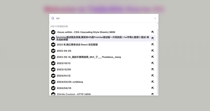
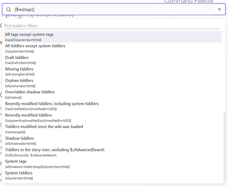
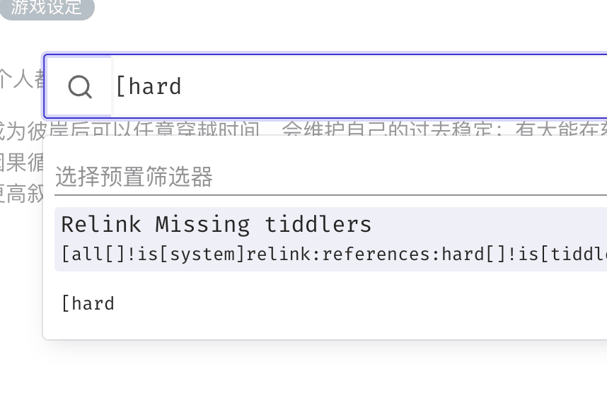
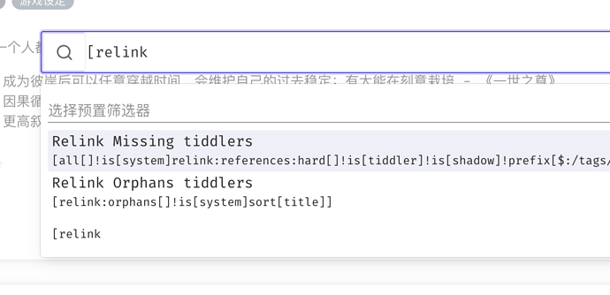
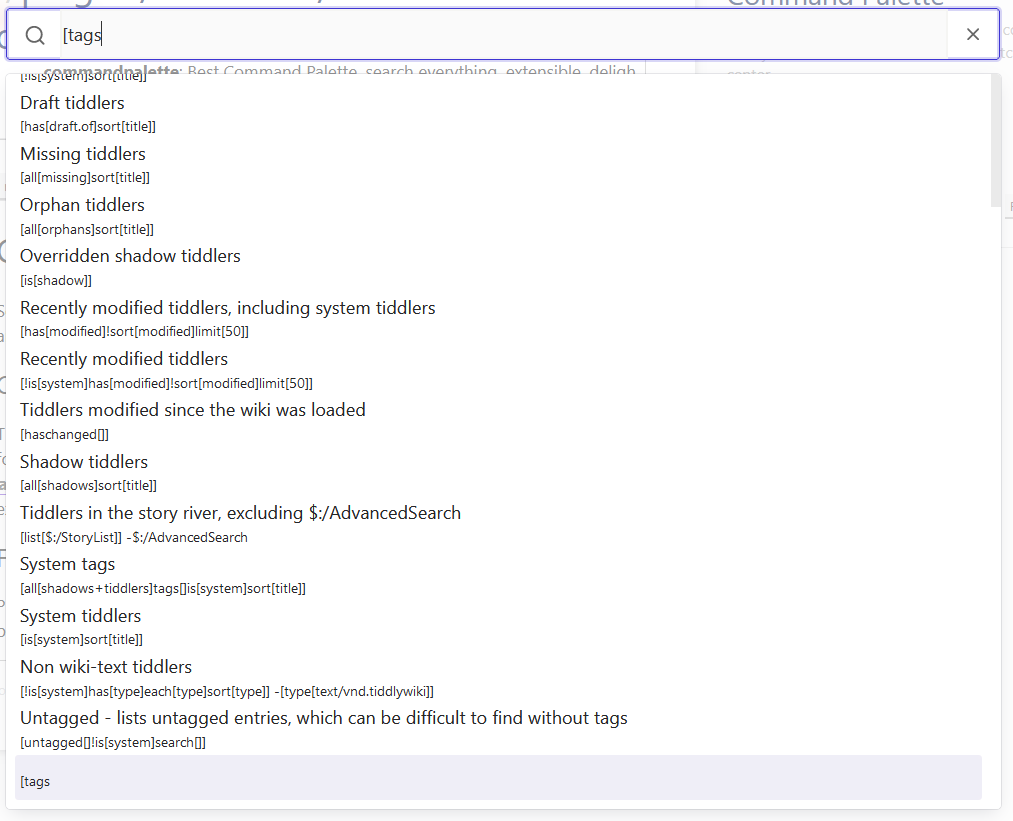
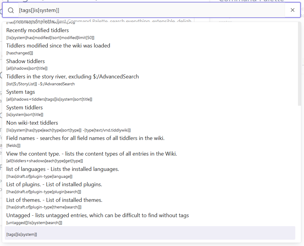
As a long-time user of @Souk21’s original command palette, I really want to like your updated version— and I do like the improved configuration possibilities, and it feels significantly faster in my large wiki! But it does not seem designed for easy searching with custom filters, and that’s really holding me back from adopting it, because that’s one of my most common uses. To demonstrate:
If I type a custom filter, I expect to see it at the very top of the filter list. (Ideally, I could disable the built-in filter list entirely, or cut it down to ones I’ll actually use.) As you can see, the filter I typed isn’t even on screen at the moment, which means I need to navigate to it before I can use it—and this is especially problematic when I can’t click on it in the list. I should be able to type a filter, hit enter, and immediately see its results, rather than having to scroll through a bunch of filters I don’t want.
And when I do apply a filter, there’s no easy way to get back to the “default” view. If I want to search with a different filter (or none at all), I have to escape and reopen the command palette. My intuition is that hitting “backspace” in the empty search field should take me back to the non-filtered view.
I also wish it was easier to modify the widget CSS, since the current style doesn’t mesh very well with my wikis. (Ideally, it would make use of the core <<colour>> macros and the current palette values.) But I can edit a CSS tiddler myself, so this is a dream, not at all a priority.
I hope you can address these issues! I’d like to upgrade to your new and improved version, especially if @Souk21 no longer intends to update the original.


