Something like:
http://www.scss.com.au/family/andrew/tiddlywiki/#Chart%20from%20Json
?
Thank you @andrewg_oz
I did something testing and created a chart based on the one you shared
It is working, but there is some issues I am seeing. Chart data is not getting correctly updated when I add a data in the habit tracker tiddler.
Edit: After adding caption field to those json tiddlers, it’s working as intended…Thank you @andrewg_oz for the help.
No problem. Just a tweak to my code. I think the tooltips look better if they’re the same date. Instead of “86400000” it should be 1 less: “86399999”.
@andrewg_oz
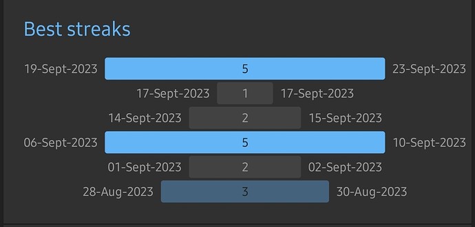
Can candlestick charts be used to create best streaks from the habit json data tiddlers like this
This is not easy because your raw data is a day-by-day yes or no data point. You need a bit of code to process your raw data, identify the streaks and tally up how long they are. I’m certain a JavaScript widget or macro could be written to generate some JSON.
However, I don’t see an ApexChart that looks like your example.
Any idea whether this can be done using the JSON Operators in tiddlywiki ?
If it can be done that way I don’t know. Someone better than me at filters/macros would need to see.
As I said, I think it would be easiest (and maybe only possible) written as a widget/macro in JavaScript.
Wonderful
.…. And then there is https://cables.gl/


///
Visual Programming with cables
Cables is a tool for creating beautiful interactive content.With an easy to navigate interface and real time visuals, it allows for rapid prototyping and fast adjustments.
You are provided with a set of operators, such as mathematical functions, shapes, materials and post processing effects.
Connect these to each other with virtual cables to create the experience you have in mind.
Easily export your piece of work at any time. Embed it into your website or use it for any kind of creative installation.
Hi Andrew, I stumbled across your apex charts plugin and have been looking forward to implementing it into my wiki. I use a dark theme and can’t seem to change the legend label color to white.
I’m trying to do this with your example code. For some reason this seems to work on my iPhone, but I can’t seem to get it to work in a browser on my laptop. Any ideas what I’m doing wrong?
<$apexchart type=pie width=380>[
<<ApexChartDictionaryPieDonutRadial “ApexChart - Pie - Data - Simple”>>
,{“responsive”:[{“breakpoint”:480,“options”:{“chart”:{“width”:200},“legend”:{“position”:“bottom”, “labels”: {“colors”: “#ffffff”}}}}]}
]</$apexchart>
It looks like you’ve put the color in the “responsive” options (see responsive – ApexCharts.js).
Define the color outside the responsive options:
<$apexchart type=pie width=380>[
<<ApexChartDictionaryPieDonutRadial “ApexChart - Pie - Data - Simple”>>
,{"legend":{"labels":{"colors":"#ffffff"}},"responsive":[{"breakpoint":480,"options":{"chart":{"width":200}}}]}
</$apexchart>
