Charting plugins - ApexCharts and Chart.js

The short answer is yes.

The longer answer is that all the chart libraries tend to use JavaScript timestamps (that is, milliseconds since 1-Jan-1970) and that the dates in the JSON will need to be parsed into something that can be ultimately converted into a timestamp. It will also make the date sortable - something I assume you’d want to do and something that can’t be done in the string form the dates are in now.

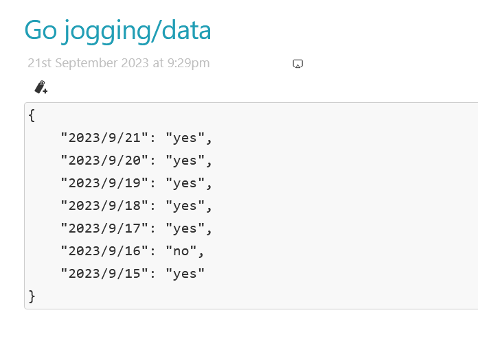
I’ve done some testing and found that the date in your JSON cannot be parsed by the TiddlyTools parsedate function. In other words, “21/9/2023” won’t work, but “9/21/2023”, “21-Sep-2023”, “20230921”, “2023/9/23” will. Other formats might work too, like an ISO8601 or similar. My first preference for writing dates is “21-Sep-2023” since it is clear which part is a year, month, or day. My second preference is ISO8601, so “20230921”

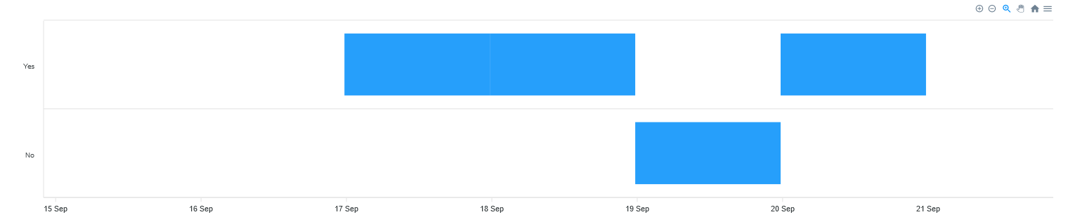
Once date parsing is resolved you’ll be able to use TW widgets to construct a suitable JSON that can be charted.

I’ve just updated my wiki with the following:

http://www.scss.com.au/family/andrew/tiddlywiki/#Test%20Json:[[Test%20Json]]%20[[Data%20from%20Json]]

I don’t know what sort of chart you’re after, but the general idea is this:

  1. Change your JSON date format to something parsable. Ideally it would be directly sortable without parsing, like a TW timestamp.
  2. Use TW widgets to construct a chartable JSON.

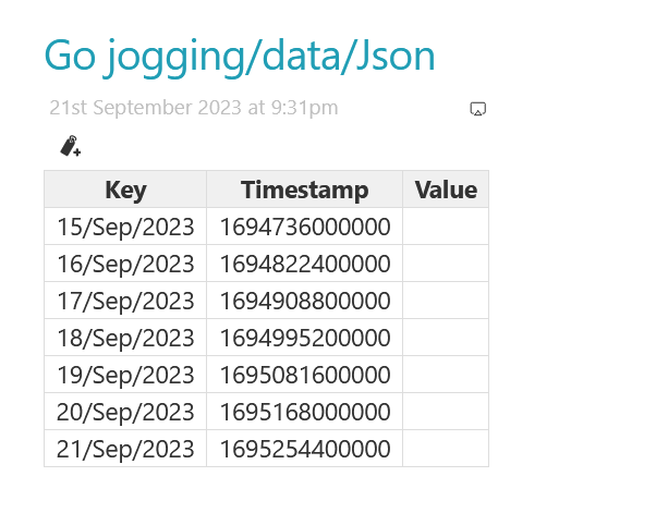
The “Data from Json” tiddler converts the JSON dates into a sortable form (“YYYY0MM0DD”) then sorts them. Then it sets a “key” variable that returns that sortable date back to the original format in the JSON to allow lookups to work. This could be avoided if the dates were already stored in the JSON in a sortable form.

Then an example table is output using the key for looking up data in the JSON, the JavaScript (not TW) timestamp for charting, and the looked-up value (also for charting?)

I’ve tried to keep my chart plugins as “thin” as possible, since I don’t know how other people will try to use them.

I really don’t see much alternative for plugins that want to support charting other than to provide (or allow for) chart-specific plugins.

There are a couple of things I could think of that I could change.

One would be to support a “json” parameter that would provide an additional way to provide chart data to the widget. Another way would be to support a parameter “dict” (for “dictionary tiddler”) that would make use of the dictionary-tiddler-macros I’ve written for my ApexCharts and Chart.js widgets.

I’m not sure of the best way to proceed, so I’m just seeing what ideas people may have before doing anything more.

Thank you @andrewg_oz for taking a look at this issue. As per your advice, I changed the date format in the json tiddler into a parsable format.

But the Value column is remaining empty

image

Any idea whats going wrong here ?

I think the most widely recognized, easily parseable format is the ISO-8601 version with the hyphens, 2023-09-21, which conveniently extends to including times as well. And it’s easy to convert to TW date format. In JS:

const d = new Date()
console.log(d.toISOString())                     //=> 2023-09-21T16:35:48.771Z
console.log(d.toISOString().slice(0, 10))        //=> 2023-09-21
console.log(d.toISOString().replace(/\D/g, ''))  //=> 20230921163612589

Go jogging_data.json (338 Bytes)

2 Likes

When you’re creating the key variable the format string has to match the format in the JSON. In your case, it should be “YYYY-MM-DD”.

@andrewg_oz … There seems to be a problem with Andrew's TiddlyWiki — Plugins and MacrosI does not work with FireFox

Is there a GitHub repo to report bugs?

@andrewg_oz I got it working as you suggested.
Do you know of any charts which can display yes or no data like this from json tiddlers

Timeline chart may fit your needs.

1 Like

@john.edw_gmail.com How to modify the code of this timeline chart tiddler to get the data from this tiddler.

@pmario No repo, sorry. The problem was in the demo data - apparently Firefox doesn’t parse “1793-11-31” as a date (only 30 days in November!)

Something like:
http://www.scss.com.au/family/andrew/tiddlywiki/#Chart%20from%20Json
?

Thank you @andrewg_oz

I did something testing and created a chart based on the one you shared

It is working, but there is some issues I am seeing. Chart data is not getting correctly updated when I add a data in the habit tracker tiddler.

Edit: After adding caption field to those json tiddlers, it’s working as intended…Thank you @andrewg_oz for the help.

No problem. Just a tweak to my code. I think the tooltips look better if they’re the same date. Instead of “86400000” it should be 1 less: “86399999”.

1 Like

@andrewg_oz
Can candlestick charts be used to create best streaks from the habit json data tiddlers like this

This is not easy because your raw data is a day-by-day yes or no data point. You need a bit of code to process your raw data, identify the streaks and tally up how long they are. I’m certain a JavaScript widget or macro could be written to generate some JSON.

However, I don’t see an ApexChart that looks like your example.

1 Like

Any idea whether this can be done using the JSON Operators in tiddlywiki ?

If it can be done that way I don’t know. Someone better than me at filters/macros would need to see.

As I said, I think it would be easiest (and maybe only possible) written as a widget/macro in JavaScript.

Wonderful

.…. And then there is https://cables.gl/

:dna::selfie::open_book:

///
Visual Programming with cables

Cables is a tool for creating beautiful interactive content.With an easy to navigate interface and real time visuals, it allows for rapid prototyping and fast adjustments.

You are provided with a set of operators, such as mathematical functions, shapes, materials and post processing effects.
Connect these to each other with virtual cables to create the experience you have in mind.
Easily export your piece of work at any time. Embed it into your website or use it for any kind of creative installation.

Hi Andrew, I stumbled across your apex charts plugin and have been looking forward to implementing it into my wiki. I use a dark theme and can’t seem to change the legend label color to white.

I’m trying to do this with your example code. For some reason this seems to work on my iPhone, but I can’t seem to get it to work in a browser on my laptop. Any ideas what I’m doing wrong?

<$apexchart type=pie width=380>[
<<ApexChartDictionaryPieDonutRadial “ApexChart - Pie - Data - Simple”>>
,{“responsive”:[{“breakpoint”:480,“options”:{“chart”:{“width”:200},“legend”:{“position”:“bottom”, “labels”: {“colors”: “#ffffff”}}}}]}
]</$apexchart>

It looks like you’ve put the color in the “responsive” options (see responsive – ApexCharts.js).

Define the color outside the responsive options:

<$apexchart type=pie width=380>[
<<ApexChartDictionaryPieDonutRadial “ApexChart - Pie - Data - Simple”>>
,{"legend":{"labels":{"colors":"#ffffff"}},"responsive":[{"breakpoint":480,"options":{"chart":{"width":200}}}]}
</$apexchart>
1 Like