Best practices for alternate editing experiences?

I think this came up recently but I’m having trouble finding it - thought it was @Mohammad’s recent plugin, but maybe not. I’m pretty sure @TW_Tones weighed in a bit too…

Essentially I’m working on a kind of wysiwyg bullet-list plugin (currently just named “bullets”) that will kind of operate in-between view mode and edit mode. I parse the content of the tiddler, and then treat the list stuff differently by adding a bunch of functionality to it to work more like outliners. Because entering into this mode is kind of like an edit-mode, and all changes while editing are stored in a temp tiddlers until they’re committed back, I want it to feel like I’m in edit mode. That means things like switching to (what looks like) edit mode by having similar cancel / okay buttons on the toolbar instead of all the other buttons normally up there.

Having never done this before I’m going through and trying to reverse-engineer from TiddlyWiki.com but thought that there might be some best practice article somewhere or general tips that others may be able to point me to. I’m not stuck yet, it’ll just be slow, but I think the main thrust of my question is around this type of modification and how to do without changing the core ViewTemplate and EditTemplate - which I think is where the hackability discussion came from. I can’t see a way around this, and while easy as others have pointed out, will mean that it will very likely conflict with other plugins that do the same. Again, I don’t think this will bother me so much, I’m just trying to be considerate of other users that may want to try my plugin out in combination with other similar functionality. I hope that makes sense.

As an illustration (and teaser/update) on the functionality aspect, I recorded this quick screengrab. You’ll have to watch close to see me cycle through it’s current functionality, but it’s:

  1. Add, Delete, Promote, Demote, MoveUp, MoveDown, ToOrdered, ToUnordered
  2. Single line versions, and (was complex to figure out!) “family” versions of the same functions
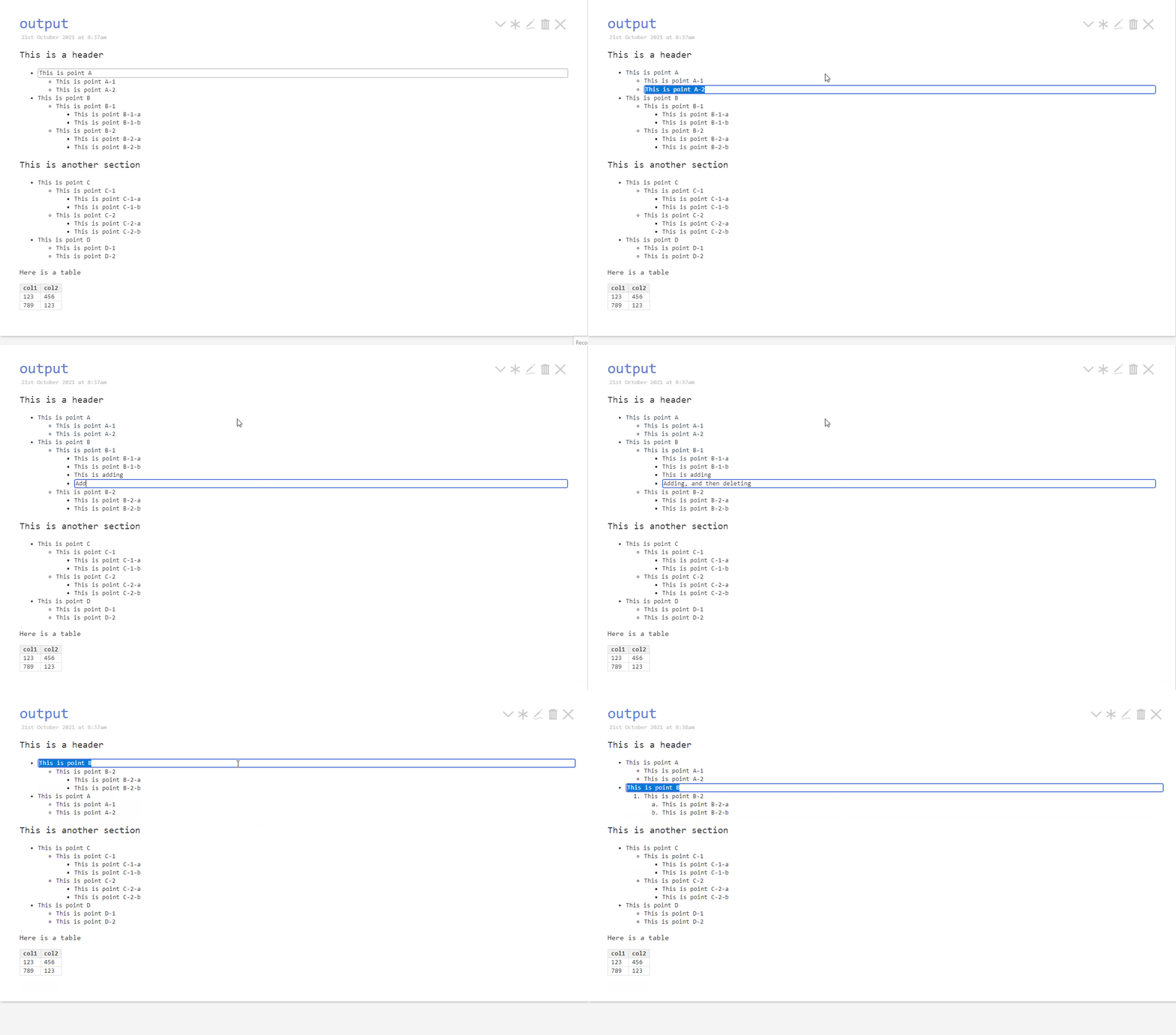
bullets-demo

3 Likes

Kudos @stobot !

FWIW, I don’t see what the issue is - what you have seems to work just fine. It looks really sweet! Do you really think you need draft mode? A toolbar? I for one am not convinced.

TODO: make it work with <p> :upside_down_face:

@stobot Nice to see your progress.

I am not entirely convinced either that you need to change the view toolbar either. The easiest way to do so however, might be to switch the entire view template transcluding the default as needed. However once again if more than one plugin does this, you will have conflicts. See https://tiddlywiki.com/#Hidden%20Setting%3A%20ViewTemplate%20and%20EditTemplate

As an aside, that is what the very first prototype of Streams was called as well, before changing to bulletstream and eventually settling on Streams. :slight_smile:

A different issue to perhaps consider is that temp tiddlers do not survive a wiki reload cycle. So if the wiki or the browser were to crash mid-edit, the edit would be lost. Using non-temp tiddlers would work around this though not without other details to consider.

Thanks @saqimtiaz and @CodaCoder ,

Yes, that’s my point and intent Saq. I like the ability of being able to go into edit mode, making lots of changes, and then changing your mind later to cancel the whole batch of edits. I’m currently using the $:/temp namespace for the purpose of “leave no trace” and the whole concern is that it looks so much like View mode, that people might forget that they didn’t commit it, and move on (close Tiddler etc.) at which point work would be lost post-refresh.

I suppose you’re right that storing in a different namespace would alleviate that issue, but that would also mean that if you always did that, you’d be storing a LOT more content in the wiki than is necessary (the source tiddler might be 20 lines, in the temp state, that’s 20 tiddlers behind the scenes). I guess I’ll think through that a bit more… Maybe just making it visually more obvious that the changes haven’t all been committed would be enough to remind people to click “done” somehow…

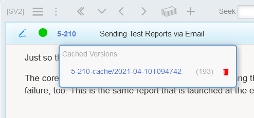
I take a different approach. I have a brand of tiddlers that are considered worthy of caching previous versions. When editing is started, a new cached copy is created. The cached versions are listed in a nearby menu along with cleanup/delete buttons to blow them away:

image

(193) is the word count

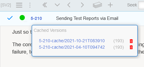
Click the edit icon:

image

So instead of creating tiddler-per-bullet, I’m caching per tiddler. Make sense?

1 Like

That is interesting. So you could cancel the edit of a single bullet, and/or the entire list? The latter would especially be helpful as an undo mechanism for re-ordering, whether via keyboard or drag and drop.

I have had similar concerns related to some of the changes requested in Streams (involves editing in draft tiddlers and differentiating between cancelling an edit and saving and exiting). I haven’t had the chance to really brainstorm around UX for it.

Some quick ideas off the top of my head: a prominent border around content being edited to show that it is not saved (ugly) or, a warning when closing a tiddler that there is unsaved content. The latter would require a couple of lines of JavaScript to invoke actions in response to a hook, and not too far in the future should be possible without JavaScript at all. What that won’t do is prevent data loss due to wiki or browser crashes.

It is worth considering that the overhead for this should be completely negligible, especially considering those extra tiddlers are transient and will only exist while editing.

Plugins like Dynaview, and even the plugin library (or was it upgrade?) mechanism in the core, can create hundreds of temp tiddlers and it doesn’t manifest negatively in any way since it is transparent to the user and does not impact performance.

Yes you can cancel on a per-line (but only until it’s committed via subsequent operation), or in it’s entirety (by essentially discarding all of the temp tiddlers), but I don’t mean to suggest I store logs of the changes for sequential undo-capability, though that would be interesting…

I think based on the above, maybe I’ll just start with what you’re describing (some kind of visual indicator) and then I can evolve it later.

Very helpful feedback - thanks!

Yes we are on the same page, and very neat. The nice thing about being able to discard the entire change is that it would undo any re-ordering operations (drag and drop or via keyboard - assuming that is a supported feature). One of the things I find troublesome in Streams is that there is no undo for erroneous re-ordering, which especially on mobile can be especially difficult to correct.

I’ve focused on keyboard mostly so far. From a mouse-perspective I’ve only added the ability to click on a row (forgot to put that in the demo) to make it the active editor line. I’m planning on adding then the ability to ctrl-click to move the active one “to” the clicked one, and ctrl+shift+click to move the whole family “to” the clicked one. In terms of “to” I haven’t decided if that should mean either the active branch becomes “sibling” or “child” of the clicked line. I think I’m leaning towards “sibling” at the moment…

Happy to rename if you like by the way, it doesn’t seem like you mind, but just checking.

Oh no, not at all. I only mentioned it as I found the coincidence amusing :slight_smile:

@stobot I am working on what you may call “alternate editing” through a number of topics in discourse and my own research. To introduce alternate toolbars or tiddler modes needs investigation in depth.

Keep in mind even within the view template you can introduce some other indicators of an “edit mode” through CSS and coloring, alternatively you could add or manage through the existing edit template however this is structured around the draft mechaisium.

I am replying just to flag this I am looking at some hacks or modifications whilst minimising core changes (if any). I am looking to make configurable any edit or view template item for different “tiddler types”. The idea is to fall back to the current mechanisms unless an alternate is present for a given tiddler type. What is important here is I am not talking only about the view template on the body but whole of tiddler.

A trigger for me was the quicklist example I shared where I am treating the text field in a fundamentally different way, each line is a todo item, it is in some ways similar to what you are asking for. If we add to the mix the custom markup plugin, the unrestricted fieldnames and edit in current tiddler then I think we are ready to empower more designer control over the way view and edit templates are used.

Of course I am keen to solve this for the community not only my use.

Oh another tip,

For conditional buttons (in the absence of alternate toolbars)

  • Clone an existing button
  • Edit the clone to display conditionally with a list or reveal
  • Hide the original button behind more
  • Unhide your conditional button (not in more) in the toolbar.

If you are sticking with using temp tiddlers, consider using the $:/temp/volatile prefix which should provide a better typing experience, especially as the tiddler gets longer or on slower machines.
See https://tiddlywiki.com/#RefreshThrottling

1 Like

Hi @CodaCoder ,
what kind of interface is visible there? This looks very usefull.

It’s part of my wiki. You’re seeing the cached copies of the tiddler currently being edited.

That looks extremely developed and useful. What backend are you using? Have you already presented this somewhere?

No. It’s not very re-consumable. I screwed up there.