The building in your image looks very much like the US Capitol with American flags. This is entirely too nationalistic and seems quite inappropriate given that TiddlyWiki is apolitical and international and is meant for everyone, eveywhere. 
There is a problem with the version number. The “v” has to be lower-case.
Sorry I don’t know much about this area. Since it was AI generated, I assumed there was nothing wrong with it. I will remove this image.
… and therein lies the problem with all things AI-generated 
My view is exactly opposite:
“If it’s AI-generated, I assume there IS something wrong with it.”
-e
Right!
Interesting thread. All the AI generations above miss the point and go for “easy gloss” (visual impact + … – clearly listing what is new).
IMO rampant overuse of AI right now produces illusions.
Okay they look okayish. (This thread is not for my worries that feral AI is a probable threat to TW.)
Q: So, could you try again with showing the actual version enhancements of the latest TW?
Terrible & lazy … 
(p.s. This is over 20 characters, and was already)

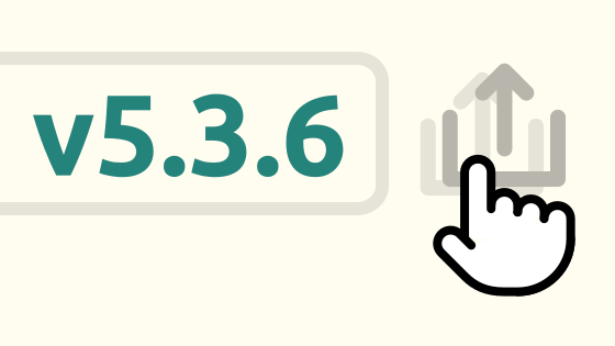
Featuring Flexoki palette and the dragging mechanism for export button in advanced search.
@vilc I like that a lot. Subtle, clean and modern-looking.
Perhaps move the foreground icon a little further up and to the right, separating it a little more from the pale/shadow icon?
And make it flash pink and orange and purple  (just kidding).